From the vacuum packed armchair to the “supercandy”, packaging as a container of goods is dead. Its place has now been taken up by an invisible, but at the same time even more present emotional interface.
Maria Gallo
The leading lights of the mythical images pertaining to commerce, colored, sensual and attractive packaging, that convert the shelves of the supermarkets into psychedelic Wunderkammer, have for some years now been undergoing a slow but radical change. A process that probably already began in the eighties when, while all the same in some sectors such as perfumery but not only that, the imperative was to “amaze”, some packaging already launched timid signs of change. That was just before the launch of the provocative female busts with girdles of the perfumes of Jean Paul Gaultier. At the same time Oréal launched its new line for the young of its hair products Studio Line, with containers clear-cut and simple in their shape, with colored minimalist graphics that stand as clear quotations of Mondrian’s primary squares.
Certainly still too little to start talking about the beginning of the end, but a precise indication as to the way to be taken: packaging, that up to then had been a purely functional container for merchandise, at the most decked with appealing graphics so as to be eye-catching, was on the point of changing into a sort of crystal ball where the consumer was not shown the real world (which we have before our eyes) but the fantastic universe of the paradisian sensations of merchandise. A sort of tongue-twister of images in which one could lose oneself, at least up until their metamorphosis into waste.
Every product has followed its own way, but for many of them the death of the wrapping was an obligatory stage in the process of transformation.
Some emblematic examples are the Comme des Garçons perfume bottles: oval in clear glass, set down like rocks, closed by small anonymous black tops; the flacons were hermetically sealed in transparent vacuum bags.
Today some five years on, the same bottle is covered in a candid white crotchet vestment bearing a set of wings. The “stone” and its new dressing are once again throttled by a vacuum pack.
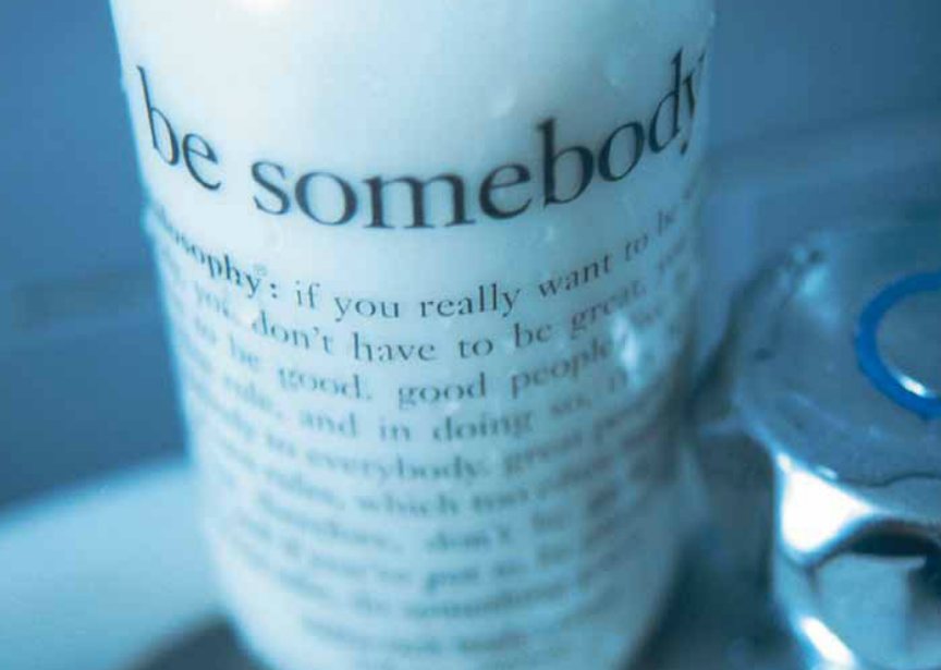
Apparent anonymity also for the pack for the Body Shop, Lush or Shu Uemura products, that for some years now have been selling their soaps, creams, eye shadows and powers in transparent cases, in standard flacons and jars or even by the kilo or that is loose, as was the case forty years ago for pasta and sugar.
Evidently, for some companies, the value of the brand and the world built around it has become more important than the single product. Thus the packaging protagonist has been converted into a packaging-tool by way of which the consumer accesses the world or brands. This means that the era of access described by Jeremy Rifkin as the great revolution by which, in the new economy, more than possessing an item of goods, it will be evermore important to get to a service (be this a subscription to an Internet provider or a car to be used three days a week) could already be said to have begun, only we haven’t noticed it yet.
Already in 1985 Vodka Absolut launched an operation that, from then on has involved hundreds of artists and designers from all around the world in order to reinvent to infinity their anonymous bottle. In this way a sort of artistic network has been set up where the consumer not only takes part by visiting itinerant exhibitions, but also by buying the vodka. Even so today, this emblematic product, is launching new signs. In the latest advertising in fact the bottle is present in all its “normality”, offering an almost aseptic showing of its sham functionality: some captions, with relative arrows, explain to the consumer the meaning of each writing, symbol or image present on the bottle. Quotation or an about-turn in trends? It is too early to say.
What is more “the aseptic” is one of the categories that is most exploited in the packaging marching towards transformation. A category with scenic presence strong enough even to inspire the creation of true and proper commercial empires.
Non brands such as Muji, the Japanese shopping chain that sells a bit of everything, from beer to chairs to clothing, created in 1980 with the slogan “lots of ways of taking your fancy”, imposes the overall minimalism of the merchandise as the only rule of being “part of the family”, this naturally also including the packaging. Set up in Japan, today Muji has many sales outlets in London and Paris.
The Ikea brand can be considered as one of the archetypes of the minimal pack, what is more applied to a field, that of furnishing, that has always had a troublesome relationship with packaging, in general for good reason; objectively though its minimalism has never ever turned into seduction.
Against this there is a piece of furnishing history, the UP5 armchair designed in 1969 by Gaetano Pesce for B&B, the primary packaging of which, a PVC film within which the armchair was sealed and vacuum compressed like a slice of processed cheese, played a leading role in the overall product. Once you opened the PVC bag, the air returned slowly to the cells of the foam and the armchair once more took shape.
Minimalism, the reduction of shape and material, the skilful use of technological features, for example vacuum technology, in the end become metaphors for the skin of the product that can be shown direct to the customer overcoming the medium of the packaging as occurred in the past.
The same result can even be attained by going in the reverse direction, as Nestlé did with their Polos and with mini Smarties. Here it can in fact be shown how packaging can also die due to an excessive presence, by the will to inform on a gigantic level. We have an example in the tale The purloined letter by Edgar Allan Poe, in which the Queen’s letter is “hidden” by placing it where it can be seen most (the embarrassing document is “hidden” by simply putting it there where it can be seen, amidst other innocent missives). In the same way the gigantic Polo in white polypropylene, that contains the actual small sweets, disappears to our eyes as packaging and becomes a precious and seductive testimonial of the product philosophy. It is hard to find someone who has had the courage to throw away this little/great piece of everyday pop art.
But if the merchandise burst in like bodies on the commercial scene, it goes without saying that they will also end up as coming under the tough law of life and death.
However there is someone who has seriously decided to play with death, finally breaking down one of the greatest taboos in merchandising. We are speaking of the “adbuster group”, the subversives of global trade that for some years now, every year organise a “no-buy day” as a sign of protest against prevailing consumerism. The unwilling tool of one of their shock campaigns has been the camel that for many years now, has promoted Camel cigarettes. In its honour an alter ego has been created, that in truth, is not in the best of health, called Joe Chemo, that has in fact become one of the leading lights of the anti advertising campaign invented by adbuster. As the name suggests, the poster contains a comic strip with a camel with flebos inserted in its body as it wanders around, with its eyes half-shut, along the hospital corridors: the image suggests that, after having smoked so much, Joe Chemo is now dangerously ill and is about to end his days. It is clear that the death of the camel would immediately mark the death of one of the most famous packaging items in the world. In October of the year 2000 on the adbuster’s Internet sight bore the request for contributions be able to purchase a large space in order to be able to display Joe Chemo. But already then the cigarette producers had unleashed their legal campaign. To this date we do not know whether the market of the force of the image has won.
All the same death is a prelude to the advent of something new, perhaps unexpected, but not for this necessarily horrendous. So, rather than viciously attacking those that have chosen to give voice to a cardboard camel, the companies might do well to deal with the cultural mutations if, also in the future, they wish that their cans continue to be part of our everyday fantasies.