Very often the world of cosmetics draws inspiration from nature. More than not it is the products that stand out for their fresh and delicate formulas, but, in the case of the young Greek concern Korres, the packaging also manages to transmit “the breath of the Earth” at its best.
Sonia Pedrazzini
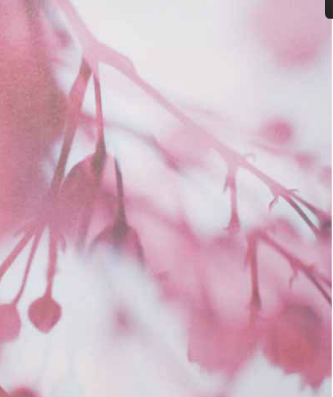
Korres natural products is a concern that has been dealing with beauty and nature since 1996, direct emanation of Athen’s leading homeopathic chemists. Currently Korres offers a variety of around 150 body and hair treatments, sun products and herbal based compounds. The ingredients are all naturally derived and high quality; mineral oils and their derivates (such as paraffin) are not used but only vegetable oils compatible with the skin. The silicon based compounds have also been replaced by special vegetable combinations that do not block the pores of the skin but nourish and soften the same. Thanks to advanced extraction technologies, the active principles of the plants remain unaltered and guarantee maximum efficiency. These are the main values around which the concern has built up a success that is growing continuously but, as well as the quality of the product, what strikes one about the pack is the graphics used to clad the solutions. The flacons, tubes and jars are without frills, sober, essential, designed to carry out their functions. The images that cover the same on the other hand are anything but minimal: they are close-ups of flowers, seeds, fruit, herbs instilled with a life of their own. They are visual incursions into the world of nature and its vegetable and mineral contents, that appear different when seen close to; they become abstract patterns, vibrations of color, movement, waves, and are a foretaste of an immersion into a world of wellness.
If packaging ought to express its contents, Korres’ packaging surely goes further, it acts on the psyche and transports the mind far afield. Yet there is not only nature in the photos, but there is also the analytical gaze of the entomologist, who scrutinizes the interstices of the world, and there is the creative gaze of the artist, who freely composes matter. Hence these packaging items are neither naïf, nor are they banal and they poetically represent the cold distance of the scientific approach along with the warmth of life at one and the same time.
Impackt interviewed the art director of Korres natural products Giannis Kouroudis, who is responsible for the company image and winner of many awards and acknowledgements, among which the First Packaging Award & Merit for Corporate Identity 2002, the Golden Star Packaging Design Award 2003, and the First EB-E Award 2004 in packaging and advertising.
What is the concept and the philosophy that lie at the basis of the Korres image?
We have mainly based our approach on minimalist and geometric abstraction; at the same time the company image in its entirety aims at showing quality in aesthetic terms, without in any way overshadowing the natural feature of the product.
How would Korres like to be defined as a cosmetics company?
Our company concept is a well-balanced combination of three basic elements. Firstly, thanks to the company’s pharmaceutical background, every process is well documented and is produced following pharmaceutical type procedures. On top of that, all active ingredients are naturally-derived. The third element is the “joy” that features throughout our entire product range. Our intent is to offer products that are good for you, that are attractive both inside and out, which means that they smell good, have a pleasant texture that of course have nice packaging.
Why did Korres come into being? To satisfy a specific market, to respond to given needs?
Korres natural products was founded in 1996, primarily due to the demand from the customers of the Korres chemist’s for natural and homeopathically compatible cosmetics. Hence, working in that direction, plant extracts with significant medicinal properties were used for the creation of safe and effective herbal products. Now, despite commercial success and broadscale recognition, product development has stayed ingredient-oriented and not marketing-oriented. We assiduously take part in research & development programs, and we are constantly seeking new ideas to best exploit plant properties in cosmetics.
Who is your ideal customer?
At this moment in time our ideal end user is not demographically or socially definable. Our products are intended for men and women of different origins and social standing, persons that share our ideas, common values and even the same aesthetic tastes: we have many consumers and this is why our products are used on markets that are apparently very different from each other.
Can you tell us about your role in the company and how you normally work?
I am the company art director and am responsible for the company’s image in its entirety. My team works on product and communication design, on organising shows and fairs, on merchandising and even on our stationery, all this on a daily basis. I normally develop new products or new concepts along with Gorge Korres, and our working relationship, that also thrives on a strong personal friendship, is very inspiring for both of us.
Can you recall a special feature of your Korres experience?
There is a funny story linked to some of our new brochures and our company calendar, all having been given an intentionally rough finish. Initially some people were led to believe that they were mere proofs or that a mistake had occurred during their binding, and that they weren’t the real product.
Korres has been able to give itself a very strong image thanks also to its packaging: how did you achieve this?
While my influence was certainly decisive, our success is due to the energy of a team of young designers who work at my side and with whom I share common values with. Along with our team George Korres, the designer – Stavros Papagiannis, my colleague Chrysafis and all the members of the general Korres team have all helped build this image by pitching in with their personality and their aesthetic taste.
Who is the photographer who created the striking images that deck your packs?
Our photographer-designer is Stavros Papagiannis, a real talent. He has the task of creating the company image and he is capable of turning a simple idea into a work of art; I mean to say his photos are the starting point for all our concepts.
As art director, what is your point of view on packaging in the cosmetics sector? Are there new trends or behaviours that are worth pursuing?
During the last 15 years, consumers have become more aware of other parameters besides the quality of the product, for example they pay greater attention to how the packaging has been made. This is why design plays an evermore important role on the market in general, and not only in the cosmetics sector.
The above explains why a growing number of manufacturers are paying more and more attention to packaging, a trend heralded by Korres. Indeed predicting future trends is a very tricky business. For us trends are made by people and thus depend aboveall on their values and on a host of personal aesthetic tastes, these being always in the making.