Much color for colors and paints

Even though with only a brief entrepreneurial history behind it, Waldo Trommler Paints – a small Finnish colors and paints producer  – has decided to open in the USA and aims at packaging as a visiting card, with the firm intention of standing out from everyone. Leveraging on this principle, with the intent of highlighting the features of cordiality and quality of the company, as well as their innovative spirit, Reynolds & Reyner have designed a packaging line that is original in its simplicity and immediacy.  Indeed the identity of each products and a broad range of bright colors that determine the identity of each product, according to the various sectors of use. (www.awwwards.com)
Waldo Trommler Paints, packaging design system and brand identity by Reynolds & Reyner (2012)

Man cannot live on bread alone

Is it a provocation or merely just for fun? What thin thread of logic unites a coffee tin with the Cartier brand or a bag of flour with Prada?

The exhibition Wheat is Wheat is Wheat, currently at the Museum of Craft and Design, San Francisco, attempts to look into the role of designer and that of consumer in an era of mass “signature” compulsion.

One cannot deny that the fine images of prosaic food such as: salami, yoghurt, coffee, milk, eggs etc. clad (appropriately said) with the brands most loved by the fashion buffs of all climes – Prada, Gucci, Nike, Apple, Tiffany, LV to cite but some, arouse curiosity.

peddy_mergui_luxury_brand_food_350_webThis is luxury packaging, recognisable by the graphics, colors, details, especially reconstructed by the Israeli artist-designer Peddy Mergui on conventional broadly consumed products, and for this very reason with the power (the power of the brand!) to make salami appear even tastier, flour more refined, coffee even more aromatic.

But beyond curiosity, what remains?

As the selfsame artist suggests on his website, Wheat is Wheat is Wheat leaves more questions than answers.


chanel_500_WEB

eddy_mergui_luxury_brand_food_500_web

salami3_500_WEB

La Belle Haleine

What do Chanel No. 5 and the history of art have in common? Can a bottle of perfume be considered a sculpture? Is the most expensive Eau de Voilette in the world a play on words? A bizarre journey through the paradoxes of the art of perfume and perfumes of art. 

Marco Senaldi

How can a perfume become a work of art? How can something invisible like an aroma become the subject of an object made for the eyes? The archetype is with all likelihood Chanel No. 5, wrongly considered a “classic”, when in fact it was a revolutionary artifact, born not by chance during the “roaring twenties” (1921) from the creativity of Coco Chanel, a friend of artists like Picasso, Claudel and Stravinsky, which only later became a must have, an indispensable point of reference even for those who have never bought or worn it.

It’s no coincidence that during the 80s, a decade in which certain fashions that had originated during the mythical Jazz Age were taken up and revisited, the Chanel image made a huge comeback: the high priest of this consumer neo-iconophilia, Andy Warhol, followed the suggestion of the Feldman Fine Arts gallery to create a series of prints dedicated to modern myths, and he didn’t forget to include No. 5.

The sober, rational bottle in Deco style, in its Warhol version, takes on a new dimension: made transparent and almost evanescent, a pure profile standing out in unreal, almost television colors (Warhol claimed that the idea of saturated color screen prints came to him while watching static television), the series of Warhol prints sublimates the object beyond its meaning as a consumption product: a spectral image of itself, the enormous Chanel incarnates a myth always beyond our ability to consume it, eternally desirable and eternally indestructible, a sort of – to paraphrase Oscar Wilde – “icon without enigma”.

By a twist of fate, or rather history, more or less in the same years, a surviving proponent of the historic avant-guarde, Salvador Dalì (who among other things, with his theatrical gestures and eccentric muses like Amanda Lear, was the secret master of Warhol’s extravagant style) also designed his own personal perfume.

Since then, Dalì Perfume, established in 1983, contained in a bottle shaped like stylized lips with a nose stopper, as if it were a fragment of an ancient statue, also became a classic in its own right. This perfume is proposed as a small collectible: the container is almost a sculpture, and the mark of the Catalonian genius is absolutely unmistakable. The full red lips are a citation of a citation: they can’t but recall the famous lips-shaped couch of the 1930s – in its turn inspired by the lips of Mae West, the famous American pin-up model and actress. But the whole ensemble creates a typical double image à la Dalì: its silhouette carries the gaze behind the negative image of the face to which mouth and nose should belong, with an extraordinary hypnotic effect.

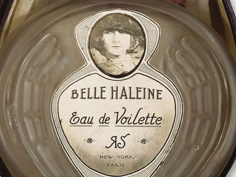
But the fascination of artists with the world of perfume, for the allusions it reveals, for the forms with which such an impalpable thing wraps itself concretely, can be traced almost to the same years in which Coco was creating No. 5 as a work of art. Famous, for example, is the assisted ready-made Eau de Voilette, signed, again in 1921, by Marcel Duchamp, who in order to make it used an authentic Rigaud perfume bottle, remaking the label and then inserting it into a purple velvet case.
On the label can be made out the face of Duchamp, in a portrait by Man Ray, showing him as his feminine alter ego Rrose Sélavy (the label features the initials “R.S.”).
Even the title itself is a head-scratcher: in lieu of Eau de Toilette, as one would expect, it is an Eau which isn’t even “de Violette”, as one might expect in reference to the essential oil – but “de Voilette”, as if it were a typo (this is all an obscure reference to the poem by Rimbaud Les Voyelles, in which the “O” is from the “viola”).

Even more obscure is the meaning of the play on words beneath the image of Duchamp: Belle Haleine, which recalls “Belle Héléne”, but with a significant alteration: “de longue haleine” in French means “of long breath” but for Duchamp, who was passionate about impalpable things, which he defined as “infrathin” (“inframince”), the air, breath, smoke, perfume, etc., etc., these were artistic dimensions as undervalued as they were essential, to the point that, to one interviewer who asked him what he did for a living, he responded: “I’m a breather, isn’t that enough?”.

Maybe thanks to these (typically Duchampian) streaks of genius, maybe because only one exemplar of these modified readymades has survived – the fact is that Eau de Voilette has become the most expensive perfume of all time: and we believe, if it’s true that this last copy (which once belonged to Yves Saint-Laurent) has been auctioned at Christie’s for the “small sum” of 8.9 million euro.

Such a fascinating story could not leave indifferent younger generations of artists. Italy’s own Francesco Vezzoli has been seduced by Duchamp (or maybe by Rrose Sélavy?). Ninety years later, in 2009, Vezzoli decided to re-propose an art-perfume inspired by Duchamp’s Eau, but to call it (in a highly postmodern concession) Greed.

In practice, the bottle is still the same one as Duchamp’s, but in place of Rrose appears Francesco/a, himself also vaguely effeminate. The remarkable thing, however, is that Vezzoli has commissioned a video spot as if for the launch of a real perfume, or even better: the short is signed by none other than Roman Polanski, who directs Nathalie Portman and Michelle Williams. How to say: what counts now, everybody knows, is no longer the perfume itself, but the perfume’s “scent”, its disembodied media experience, cloaked with the unmistakable aroma of glamour given off by glories both old and new like the Hollywood they originate from. To sum up, the next step to the Warholian glorification of merchandise: the glorification of the imaginary.

Does the story end here? Not by a long shot. To make a contemporary artist, some say, means to move the peg of the impossible always one notch higher up. One would be tempted to say that that is what another Italian artist, Luca Vitone, managed to do at Venice’s 2013 Biennale.

Invited to the Italy Pavilion, he opted for an extreme choice: to bring a work of art “that’s not there”. In dialog (this is the curatorial concept) with the photography of the great Luigi Ghirri, Vitone thought to play his part without descending to the plane of the visible, but rather the olfactory. Thus, he installed in the space an odor, which “at first you like, then becomes unpleasant, then sticks in your throat, then makes you want to swallow” as he explained himself. An odor that recalls another, this time anything but glamour: the odor of eternit. Thus, although impalpable, Vitone’s work speaks to one of the most tragic events in recent history, and in order to achieve this effect, the artist had to turn to the “nose” Maria Candida Gentile, showing that even a perfume can inspire thoughts and carry the mind far, far away…


Boxes (d’artiste) and bubbles

Founded in 1729, Ruinart is the oldest champagne producer in the world.
The first to use ancient caves carved out of the stone beneath the city of Reims in order to age its wines. The first to store its bottles, starting in the 18th century, in wooden crates and the first to reinstate the traditional champagne bottle.

With these things in mind, the Dutch designer Piet Hein Eek created the wooden crates for Ruinart’s Blanc de Blancs.
And naturally his Nordic style is very “eco-chic”.


In order to avoid unnecessary waste and optimize transport while minimizing the solution’s environmental impact, the designer conceived and built a trapezoidal chest whose profile has been appropriately refashioned, with a series of minimal touches, against the physical space occupied by the bottle.

What results is a truncated pyramidal crate which, – in addition to serving as a designer packaging – with its shape reminiscent of the keystone in an arch, as if it were a recurring architectural feature (or a piece of “Lego”), can be stacked in a very compact manner and used to create grandiose scenic installations.


In line with Eek’s typical approach, the wood used in the crates is recycled, but in order to better reflect the colors of Blanc de Blancs an essence of pine was patiently selected in hues of pale gray, white and cream and then treated on the surface with lacquers to make a precious finish. Each case has been handmade in the studios of Piet Hein Eek, in Geldrop, near Eindhoven, and has been signed and numbered to make it a unique item, like the bottle it contains.

video


Would you want a bag like that?

borsa_mudac_01

Eternally present, for good and for bad, plastic bags are in many ways the prime symbol of our globalised society. Now even in a museum, carrier bags the likes of which have never been seen, between art, sustainability and design, a show that invites reflection.

The show that has just finished at the mudac – musée de design et d’arts appliqués contemporains, Lausanne, is one which, facing off stories of day-to-day life with art and design, reveals how the humble carrier bag can also become object of ones desires.

Comprising some thirty items, the show brings together international designers and artists and highlights the history behind the plastic bag seen through the lense of culture, aesthetics and politics. Cult packaging or rubbish, revered or slighted, the plastic bag splits opinions and reveals the consumer behaviour of the people who use them.

If on the one hand due to its graphic contents and iconic power it can bolster our status and our identity, on the other, excessive and improper use (especially in terms of its disposal) causes problems of environmental decay that cannot be ignored.

And thus, thanks to film clips and debates on possible alternatives and on the evolution of materials, and via installations, sculptures, photos, paintings and objects – not only contemporary works but also pieces from private Swiss collections, like Joseph Beuys’ bag made in 1972 for the installation Büro für Direkte Demokratie durch Volksabstimmung at Documenta Kassel – this show, original and well-conceived, has been capable of carrying out a critical, indepth analysis on a packaging item that is as banal as it is impossible to ignore.

I’M Glam

Sometimes it happens that high and low meet in the middle, that luxury and the mass market intersect, that haute couture and packaging join forces and generate worth. It happens above all when the protagonists of the new edition of Nivea Glam are a cult cream and a visionary couturier such as Antonio Marras.

Sonia Pedrazzini

Marras’s style is unmistakeable, both in the world of fashion – where he is a unique case in Italy with his imaginative and unconventional idea of fashion – and in those other cultural and artistic activities in which this tireless creative man is constantly involved.
The key elements of his work are the story, ornament and a revival of craftsmanship.
At the root of every collection there is always a narrative idea, a story, often focussing on people and events linked to Sardinia, the place where he has chosen to live and work, far from large cities and the most important centres of finance.
Recurring and deeply-felt themes are identity and difference, travel, nostalgia and loss but what makes his clothes speak, what constitutes its communicative aspect, is ornament, for which the designer declares an unbridled passion.
Thanks to ornament the form may involve us emotionally and physically. This leads to a genre of fashion, such as that of Marras, which is lavish with details, sartorial works which require extraordinary manufacturing techniques and often call on the knowledge of the artisans of Ittiri, keepers of the Sardinian tradition of embroidery.
Story, ornament, craftsmanship.
Marras has used the same ingredients in order to redesign the packaging for the special edition of Nivea cream.
The protagonist of this story is a stylised female figure with a retro look and dreamy eyes who changes clothes on every page, while the legendary crème, redesigned with maxi polka-dots on a blue background, continues to peep out from the cut-out window, until, on the last page, the Nivea-doll actually comes into life. Indeed, she can be removed from the book and dressed like the paper dolls we used to play with.
The book is held together with a ribbon made of burgundy cloth and comes in an ecru canvas shopping bag which appears to be hand-drawn. The whole has an extremely sophisticated and well-crafted look and is produced in a limited series of 2,000 numbered pieces sold at a price of 30 euros.
It does not matter what the response is. In this case the fairy tale has a happy ending as both the designer’s fee and the sales profits will be donated to Emergency in order to back an important project: the creation of a children’s surgical ward at Lashkar-gah hospital in Afghanistan.

Antonio Marras, you have dressed the packaging of a historic and highly popular product like Nivea cream in your own style. Can you explain how this partnership began?
The offer to invent a limited edition of the ultra-famous Nivea cream arrived exactly one minute after I had promised myself once again never to accept another offer of work due to having far too much to do. But the instinctive liking I feel for this white cream, that oh-so familiar image and that unmistakeable perfume, meant that, once again, I was unable to keep the promise I had made to myself.
For a curious person and style lover such as I am it was impossible to resist the temptation to “desecrate” this true, immutable icon. Is there anyone anywhere in the world who wouldn’t recognise this blue tin with its white lettering, unchanged for over 50 years, one of which is found in every home? Indeed, it is no coincidence that I wanted to work on the most classic packaging, excluding the handbag version, which is very pretty and practical, but already far too “fashion” and modern compared to the project I had in mind.
The first instinctive idea was to “dirty” the severity of the blue with white polka-dots and to give it a texture thick to the touch. In concocting a box to contain it the idea gradually emerged of a book-object-doll who comes to life on every page. In the end one might say that the container has almost got the upper hand compared to the original object we were asked to work on, taking into account the fact that it all comes in an ecru canvas shopping bag with a print that looks handcrafted.

Speaking of packaging in more general terms what does packaging mean to you within the context of contemporary taste?
For me it’s fundamental! I have bought things merely because I’ve been absolutely fascinated by the packaging that contained them and totally uninterested in the content… On the other hand, I have always paid a great deal of attention to what is required in order to announce and communicate the object. From the very start I have invested a great deal not just in economic terms but, above all, in philosophy and creativity, when designing the invitations to my shows. As I treat my collections as though they were stories to tell, the shows are the backdrop to the story and the invitation is a kind of introduction. The same thing goes for packaging.

What is luxury? A lifestyle, product quality, a mental state…
The word luxury, taken by itself, is meaningless. It is too broad and generic to have a unique and shared meaning. Luxury understood merely as a costly object seems to me to be very far from being a mass phenomenon, above all in these times of real hardship. Only luxury palliatives can be defined in those terms.
Personally, the luxury I most aspire to is time: not free time, mind you, but time to manage to do all those things I would like to do and dedicate more time to.

The world of fashion increasingly dialogues with that of contemporary art. How do you see this relationship considering too your direct, personal experience such as your partnership with artists like Maria Lai, Claudia Losi, Carol Rama and the events which you create every year on the occasion of Trama Doppia?
I think that today these categories should be partly redefined. It is no longer a question of lending or reciprocal interest. What happens is that the boundaries between art and fashion become increasingly blurred to the point that there is a whole swath of intermediate experiences, difficult to classify in one or the other environment. Personally, I have always felt the strong necessity and importance of working on spaces of autonomous creativity. Freedom is a luxury which allows me to create something which is transversal to fashion, something which emerges from independent moments in my life, as in the case of meeting Maria Lai or Carol Rama. Their mode corresponds naturally to what I have always created. I am certainly someone who is lucky to do what he loves: a job which allows me to mix everything, clothes, music, theatre, cinema… I have just thought of an episode involving Maria Lai herself. Once I told her I was going to copy one of her designs. She replied “Art is continuous theft. Don’t worry, I steal from all over the place. When you steal something the work becomes yours”. There, perhaps the relationship between art and fashion could be summed up in that image.

In your opinion, what role does fashion have in our society and which direction is it moving in?
Fashion is one of the most efficient means we have of self-representation and therefore it has an extremely important function, even though for most people, including, sadly, those who hold in their hands the fate of the Italian economy, it is a frivolous and insignificant act. It allows us to announce our ethnic group and political, ideological and cultural affiliations but it also allows us to play with appearances, to construct and deconstruct the identity we wish other people to see. More importantly through fashion we can symbolically elaborate change, passing time, the reality that is transforming us at an increasingly rapid pace. We can agree to leave the past behind, to open the door to the present, to look to the future.
Given the critical economic situation we are forced to face, the need for fashion is destined to have more and more influence on the demand for products distinguished by true identity and unique design.
From this point of view Italy is currently unable to compete with other countries who have made experimentation and innovation their strengths.
Therefore, this sector’s potential for growth seems to me to be linked to its ability to renew itself by expanding its creativity. That is what I wish for the good of the sector and for its positive future development.

Antoni Muntadas: Packaging as a Medium

In the works of this Catalan artist, packaging is a meaningful container, but also a sharp condemnation of the consumerist world.

Marco Senaldi

The interests of Antoni Muntadas – a Catalan living in New York who has worked as an artist for more than thirty years and is a veteran of Documenta and the Biennials – are directed towards what he, since the 1970s, has called the “media landscape”. By this, he means not so much the invasive presence in the urban landscape of screens, videocameras, advertising hoardings, light-boxes, neon signs and so on, rather the fact that mass communication has eroded the significance of every other form of communication in advanced societies.
All the works created by Muntadas over the years, most of which are gathered together in the large anthological Proyectos which Madrid’s Fundaciòn Arte y Tecnologìa devoted to him in 1998, speak of this theme: the disappearance of meaning in an age when it has become easier and easier to transmit it in many forms.
In This is not an Advertisement of 1985, for example, he used the most famous advertising screens in the world, those in Times Square, New York, to transmit the phrase which is the title of the work – creating a clear short-circuit of meaning. In another work, Exhibition (1987), he constructed a completely empty exhibition, devoid of exhibits, using only the typical equipment necessary to stage an exhibition: spotlighting for paintings on the walls, a video projector switched on but with no video, pedestals for sculptures, a slide projector, illuminated display cases for drawings, etc. It is clear that with works like this Muntadas is telling us that a large part of the fascination engendered by works in museums is due not so much to their content – which is secondary – as to the elegant surroundings in which they are displayed.
For Muntadas, in this age of mass media, it is a fact that the medium truly ends up being the message, the context imposes itself on the text, the frame becomes more important than the picture and, in the end, becomes a part of it.
In this respect, it comes as no surprise that this artist has devoted much of his attention to the subject of packaging, not so much as a container dominated by its trade mark, or as a vehicle for advertising, rather as a frame which encloses the contents over which, in the end, it prevails. On the other hand, the frame, a component which separates, which marks the difference between interior and exterior, between the contents and the environment surrounding them, between the product and consumer, is also a concept which is of itself interesting, because in its turn it can become a vehicle for new and unforeseen meanings.
Called upon, for example, to think of a project for the Maison du Rhone for contemporary French art, Muntadas rejected large structures for the streets or squares of the city in favour of a much more “modest” solution, but one which loomed equally large in local public life – the production of a bottle (of unlimited production, therefore not to be considered as an artist’s “limited edition”) bearing in relief an image of the Maison itself. As Muntadas himself says, “Deep down, is not the Museum perhaps a form of packaging?”.
But the work which is most surprising in its stark simplicity dates from 1987, and is entitled Generic Still Life. In essence, this is a display, on the shelves of the Gabrielle Maubrie Gallery in Paris, of a series of packaged products, and of their “photographic portrait”, as if they really were works of art. The fact that the products selected do not depend on their external graphic appearance, strictly in black and white, nothing but the name of their contents, undoubtedly gives the exhibit the almost refined and elegant tone of a skilful “conceptual” construction.
The artist himself (whom we met during a workshop in Turin) explains that we are simply dealing with goods which really exist, and which can be bought in any discount store, where they are clearly sold in this way to contain the costs of packaging and graphic design.
«I am more interested in this type of cultural approach to detail than to grand theories», he says, confirming that this still life work is in effect part of a larger project on “generics”, or rather on those objects, facts or meanings which, through habit or weakness, we have ceased to consider as “specific” and therefore worthy of attention.
«In Generic Still Life there was a slight reference to the Merda d’Artista by Piero Manzoni, but also to the Spanish canvases of bodegones (Baroque pictures of carafes and bottles); the idea was that of an anonymous product which, if not actually original, takes on another presence, changing its context a little».

Through this attractive displaying of goods in their “generic” form and, even if packaged, totally devoid of decoration, the viewer is forced into contrasting reflections on the status of objects and the desires of the consumer. On the one hand the goods, stripped of the gaudy apparel in which we are used to seeing them on the supermarket shelves, seem grey, monotonous and almost sad, without that seductive appeal which we have been used to for so long. On the other hand, displayed like this, within the aristocratic framework of a fashionable art gallery in a European city such as Paris, they assume an additional value, an aura of artiness which imbues their modest graphic facade with a sense of metaphysical abstraction.
Above all, Generic Still Life demonstrates an extreme formal cleanliness of line which by no means coincidentally recalls Spanish still life of the 17th century, together with an almost Morandian composure – very beautiful features which do not, however, erase the subtle condemnation of the frenetic consumerism which characterises our relationship with objects at this stage in the century.

«I don’t like packaging very much, I’m quite anti-consumerism… If I have to buy something, I get hyper-nervous. The thing that has always surprised me here in the United States is that people go shopping together, as if it is a socialising event; although in Spain, too, you hear people say “vamos de compras” (let’s go and buy)» says the semi-nomadic artist.
«I don’t even like collecting things. The only thing I’ve collected for years – and I’ve got loads of them – are those cards they put in aeroplanes with instructions on how to save yourself. They’re things which nobody reads. Strange, because they would help to save you – if something happened, you’d look really stupid if you hadn’t read the instructions. They are amusing because they are based on figures but, although the message is always the same, the pictures are different; each country and each airline interpret them in different ways, Lufthansa is different from Iberia, Quantas from Alitalia, and so on. They tell you a lot about the culture of the country they come from; but even though the pictures try to be generic and clear, the fact is that this “clarity” is a concept which can change – in some cases, for countries like Korea and Japan, it is downright baroque. This is why I have used them for something I’m working on called On Translation, something I’ve been engaged on since 1997.
What really interests me is this relationship between the standardised and the specific.
I’m also engaged on a work for Barcelona, on the museum merchandising of Mirò. La Càixa, for example, a very large Spanish bank with an intensive cultural program, has taken its logo from a design by Mirò, as has Iberia Airlines, and also the Spanish Tourist Authority, for its advertising. At the Fundaciòn Mirò it’s all merchandising, which goes from plates to t-shirts, from socks to underwear! Then, when I was in Cuba for the Havana Biennial, I saw that the same thing had happened with Che Guevara…In Spain, the museum has exploited the merchandising, there the whole country has used it!».

Muntadas’ charmingly intelligent musings make you think… Are, perhaps, even states, countries and nations being transformed into gigantic packages, with their bold colourful logos and instructions for use, without us, being generically unaware, even noticing?

The Queen of Waste

Enrica Borghi’s artwork scrap and rubbish are the prosaic materials from which poetic and magical works are born.

Federica Bianconi

Enrica Borghi, 35 years old, Queen of Recycling, began by creating installations using material for recycling drawn from the female universe (fake nails, rollers, various ornaments) and/or the domestic world (shopping bags, Plexiglas, labels and packaging, empty bottles…)
In 1995 she exhibited fancy women’s clothes and the series Veneri at Galleria Peola in Turin. Then, in 1997, she took part in the group exhibition curated by Lea Vergine Quando i rifiuti diventano arte at the Museum of Contemporary Art of Rovereto. In 1999 she held an exhibition entitled Regina at the Museum of Contemporary Art in Rivoli. Until 30th October 2005) her work is exhibited at Mamac in Nice. With an ambitious project in progress in a dream location – Asilo Bianco – an ancient palace close to Lago d’Orta. The purpose: to represent through different shades of white, through the temporal rhythms and echoes of flowers, clouds and smiles the eternal finites of human existence…

Recycling, manipulation, combination, repetition, pastiche, metamorphosis, magic…In your work different notions merge in complex projects. How far are these dynamic and poetic systems removed from the recycled material which is a vivid basic element in your work?
Recycling and manipulation. I believe strongly in the potential of scrapped objects. Not just things thrown away in the rubbish but society’s rejects too. I like looking at what people define as useless and defunct. My manual skill, the endless time I dedicate to reassembling the scraps is a time for reflection, the magical transformation in which everything can be reintegrated, regenerated. My installations truly undergo a metamorphosis of the object. I shift the attention, the tension to the point where the object can no longer be recognised… It has to be read as having a totally new and magnificent identity. In the case of Mandala for instance I assemble thousands and thousands of plastic bottle tops in a geometrically perfect way, like a precious inlay or a Persian carpet… the work goes ahead for two or three days and then, at the end of the exhibition it is all destroyed in order for it to be put back together again. The idea that this geometrical perfection is liquid and unstable, that it can be shown again in thousands of different shapes stimulates me and gives me the energy to repeat these patterns infinitely… On one hand I am interested in the fable-like aspect but on the other hand the aspect which is not only ecological-environmental but also subtly social is intrinsic…The idea that there not only things but ideas, men, ideologies which are scrapped, held to be no longer fashionable, dated, destined not to have a second chance to be interpreted in a different way… this stimulates me and gives me the strength to work incessantly.

What value does the single object have and what surplus value is given by your ability to sense the soft aspect of a material, destabilise it and release its expressive potential ? How much is salvaged and how much is re-examined?
An object taken singly, destined for the scrap heap, interests me precisely because it was conceived to be used and thrown away rapidly. I am thinking of all that seductive and coloured packaging, the idea of collecting it and rethinking it is suggested to me by the object itself, by its shape, by the intrinsic chemical make-up of the material. For instance, PET bottles immediately made me think of glass, and their ductility to heat for example heightened their infinite working possibilities.
The goods I buy always give me a sense of insecurity.. even food, everything that is consumed, devoured, eliminated creates in me a strong sense of instability and perhaps this is why I decide to lock myself into my studio and lick my wounds for hours on end.

What kind of conflict or complicity do you have with things? Do you perceive immediately that a material is incapable of being part of a project, or rather that it is versatile, open, not bound to the sole physical and functional dimension? Which objects are too far removed from your work?
Which objects are removed? Good question.. certainly those which are a little synthetic, chemical, skinless, lacking in seduction. A material or object isn’t automatically excluded from my work. Sometimes it just needs time. I am not always able to pick up on the potential of a material or instrument which allows me to work, and transform a material. In some cases it is the material itself which suggests emotions, creations and accumulations… In other cases I let the interest in the packaging settle in order for it to resurface loaded with a new value.

Are you simply sensitive to environmental issues or do you have ecological obsessions and fads?
I am a normal member of society who recycles rubbish. Without getting too obsessed I try to pollute as little as I can and to lead a healthy and balanced life. I have chosen with my partner Davide to live in the hills, abandoning the frenzied life of the city, conscious of having to face some difficulties in my work… I have chosen not to be at the centre of the debate… but nowadays the theme of centrality is very much debated and perhaps glocal is very much present in this small town too.
What role does manual skill and technique have in the definition of the work? Do you have collaborators who help you to produce your installations?
The role of manual skill is a significant factor in my work. It is precisely by working slowly and fussily that I manage to recreate its magic. The clothes of 1996 made out of slashed and knotted bags were knitted together and it is by keeping faithful to the spirit of female manual skill that I proceed with my work. Time is no longer hysterical frenzy but becomes something else, rescued from that disposable consumerism I am so seduced by. During the making of large installations people or students from the Academy or Art school often help me. The aspect of contemporary art as a learning experience and shared collective moment is significant in my work… it becomes a collective ritual.

Will you tell me about the magic of yours which worked best?
I think my most successful magic is La Regina at Rivoli. I assembled about 10,000 transparent plastic bottles, rejects. I was helped by the Teaching Department of the Museum and many students and it was done inside the room where we then installed the wok. In this case too, as always happens in my work, the project for an installation for children and the idea of working inside a castle suggested the idea of a Queen to me… the Queen of fairy tales, like a dream, a transparent and intangible apparition. The large room also suggested to me that I should work on something emphatically out of scale.

When you go shopping do you look for a brand and enticing packaging or do you prefer the anonymous product? Do you happen to buy something purely because of the packaging? And do you then keep it for one of your works?
Supermarkets and large stores in general give me a hybrid sensation of nausea and seduction which I would often like to turn upside down in my work. I love going to supermarkets, scrutinising the goods like a private detective.. reading the health warnings, controlling the logos, the colours. I almost always buy something for its packaging and never for its contents… when I am abroad I love getting hold of things which are not sold in Italy, coloured plastic bottles, essentially plastic packaging, from the bag to the three dimensional container… Logically I keep and pile up the scraps which might be useful for one of my works – sometimes they remain piled up for two or three years to then emerge like little acts of magic.

How much of your private world and your dreams are reproduced in your art? Do you have new projects in the pipeline at galleries and museums?
A great deal. I was able to become a queen in a world of rubbish… a queen nobody wanted however… I was able to have precious clothes and jewellery, made of recycled plastic but anyway unique: a kilometre – long bright path with snowflakes as big as balloons, dazzling enchantments, rooms from the Arabian nights. Art allows me to have that famous magic wand all children would like to have.

Will you tell me something of your current work at the Museum of Modern and Contemporary Art in Nice?
The exhibition at Mamac in Nice consists of new materials created specifically for this event. A few years ago I visited an aluminium foil factory and I was electrocuted. I have often collected chocolate wrappers as a fetish but to see them in industrial quantities was a vision. I immediately thought that sooner or later I would use this incredible material. The seduction of this material is truly thrilling: the silvery, shimmering, opaque, shiny, satiny colours like precious silks and fabrics. Visiting the museum of Nice I decided that finally this material might match the place, atmosphere and concept I wanted to explore. On one wall of Mamac I installed about 12,000 little balls wrapped in coloured aluminium foil and arranged so as to compose an arabesque pattern.
The Arab influence is repeated in the carpets on the floor and walls. They were made by twisting the foil into long strings which are glued in a swirls moving outwards. The theme is therefore the curved line, an echo of Nouveau Art, the Belle Epoque and the memory of the Cote d’Azure. A precious twinkle and glow, the sea… To complete the installation there is a room that is entirely covered in blue aluminium with a six metre blanket on which thousands and thousands of blue roses were placed, woven, tangled. All made by hand, like the 12,000 little scrunched up balls. The flowers reminded me of the making of votive paper flowers but also the decadent flavour of the end of the 19th century… a sensation somewhere between claustrophobia and seduction. Roses spill out of the cupboard too, from the lamp, on the table, on the bedside table, again a thin line, the obsession of a material but a misleading reinterpretation of the same.

Federica Bianconi is an architect and works on setting up exhibitions and commercial spaces. She has curated contemporary art exhibitions and contributes to trade magazines.