Cardboard of excellence: Italian pride

For the first time in the history of the Carton Excellence Award (promoted by ECMA- European Carton Makers Association and Pro Carton), an Italian company has won the “Carton of the Year” section.
The company is Lucaprint, which on 22 September at the awards ceremony at the Residenz Building in Salzburg, received the prestigious acknowledgement for a packaging made with BillerudKorsnas carton for Geometrie Cividât gin produced by the Domenis 1898 distillery in Friuli.
The jury, called to evaluate the sector’s European excellences, was struck by Lucaprint’s distinctive features, its customer approach and approach to each single project, that results in the typically Italian talent of interpreting design as a synthesis of functionality and beauty.
The pack, only apparently simple, is appealing to the eye: a diagonal cut moves the symmetry and rigid geometry of the box, arousing interest and curiosity. But the true surprise comes when one opens the pack, which reveals a spherical bottle, perfectly protected and presented, thus giving an impression of a great equilibrium of shapes. The attentive packaging design has in fact enabled the refined and harmonious integration of all the product elements, drawing the consumers’ interest when on the store shelves.

Lucaprint Group has been working in the field of cartographic printing for 64 years. Made up of four companies – Lucaprint, Sa.Ge.Print, Co-Ver and WorkUp – integrated into the business image chain, from project to packaging, to print, to web and multimedia image, the group employs 120 persons, invoicing around 19 million euros and operates on the Italian and European markets. After a growth process along external lines made in recent years, the Vicenza group headquartered in Pianezze is now among the top 10 Italian converters. An in-depth review of its own production model according to the principles of Lean Manufacturing, has allowed it to streamline organizational, business and production processes, significantly increasing overall efficiency. It works for the food & beverage, industrial, detergent, optical, parapharmaceutical and cosmetic sectors.

Africa-struck

Cristina Simen and Emanuela Sauve are two interior designers who, after various trips to Africa, stricken by so much beauty, decided to share their passion offering a collection of objects and accessories decorated with African motifs. Among other items, flacons, bottles, tetrabriks, various packs that, instead of ending up as rubbish….
A contamination that we love.

Cristina and Emanuela live and work in Rome and Milan; their professional training was traditional (fake marble, fake wood, trompe l’oeil and everything regarding classical decoration) learned at the prestigious Institut Supérieur de Peinture Van der Kelen in Brussels. It is there where they met and have been working together for ten years in total accord, developing ideas and projects and daring to experiment even on extremely orthodox ground.

suavesimen_3_rossi_WEBAs they themselves admit, inspiration may strike anyplace anytime … a crumbling wall, a stroke of light, a rusty piece of iron, as in this case, by a trip, for example to Africa.
The colors, drawings, the WAX fabrics – printed using a special wax technique – their imaginative way of recycling poor objects destined to be thrown away started off the creative process that led them to create a collection indeed called AFRICA.

This immediately led to the painting of table sets, placemats and centrepieces decorated like the African fabrics that fascinated them so much: and then coffee tables/trays, plates, bags in light wood. Lastly, a series of vases created from packaging of various types: plastic detergent containers or  cardboard milk cartons, carefully chosen and subsequently decorated and painted.

A new dress, simple and to great effect, to embellish and give new life to what we usually  all too hastily throw away.
Next time, think things over a little more carefully, the apparel makes the man. The same also goes for the packaging.

Back to basics

Why not rediscover the pleasure of holding a bar of scented soap? The solidity of an object that gradually melts between our fingers, that we can spread over our skin, like a caress, that seduces us with a minimal, ephemeral but highly elegant packaging.

London Fields Soap Company is an East London company that, in an era of innovative, liquid and creamy detergents, has the ambition of relaunching the classic soap bar of the past.
London_soap_05_WEBTo do so it turned to One Darnley Road, a young company of designers who worked on the identity of a brand coherent with handmade and sustainable, craft and biological products but also to better represent “the aesthetics of cleanliness”, products that ‘looked nice’.

All London Fields Soap Company products are made in small lots, at zero km, in Hackney, East London. Main ingredients include tea and peppermint (ingredients so good you would want to eat them, company head Tabitha Kleinert claims!).

For the new brand, that had to combine craftsmanship and a modern sensitivity, a typical Art-Deco atmosphere, comprising graphics (especially those of the fabrics) and  typographical characters, somewhat updated, were resorted to.
London_soap_01_WEB
The packaging too draws inspiration from a local tradition: London’s East End, in fact, boasts a long tradition of textile design and manufacture. You only need cite, for one and for all, the historic silk and satin manufacturer Warner & Sons, that for over two hundred years has produced wonderful fabrics for the Queen and the nobles of the United Kingdom.

God save the soap

Man cannot live on bread alone

Is it a provocation or merely just for fun? What thin thread of logic unites a coffee tin with the Cartier brand or a bag of flour with Prada?

The exhibition Wheat is Wheat is Wheat, currently at the Museum of Craft and Design, San Francisco, attempts to look into the role of designer and that of consumer in an era of mass “signature” compulsion.

One cannot deny that the fine images of prosaic food such as: salami, yoghurt, coffee, milk, eggs etc. clad (appropriately said) with the brands most loved by the fashion buffs of all climes – Prada, Gucci, Nike, Apple, Tiffany, LV to cite but some, arouse curiosity.

peddy_mergui_luxury_brand_food_350_webThis is luxury packaging, recognisable by the graphics, colors, details, especially reconstructed by the Israeli artist-designer Peddy Mergui on conventional broadly consumed products, and for this very reason with the power (the power of the brand!) to make salami appear even tastier, flour more refined, coffee even more aromatic.

But beyond curiosity, what remains?

As the selfsame artist suggests on his website, Wheat is Wheat is Wheat leaves more questions than answers.


chanel_500_WEB

eddy_mergui_luxury_brand_food_500_web

salami3_500_WEB

The Crystal Skull

Inspired by the legend of the crystal skulls, actor Dan Aykroyd (ex Blues Brothers) and artist John Alexander have designed the bottle for Crystal Head Vodka with the specific intention of cladding one of the purest vodkas in the world with an outstanding packaging.

Crystal Head Vodka is famous for its selected ingredients of the highest quality, additive free and distilled four and filtered seven times over. Over the last three steps it is purified through 500 million year quartz crystals, the famous “Herkimer diamonds”, found only in very few places in the world.

These quartz crystals are the most valuable, clear and powerful of all the known ones; they seem to have the ability to absorb and radiate energy, and allow one to reach high spiritual vibrations; they are attributed powerful metaphysical properties and are said to be of help in astral voyages because they connect the cosmic to the physical plain.
The mysterious thirteen crystal skulls of a popular Mayan legend were said to be made from this very type of quartz crystal compound. The legend has now been disproven from a scientific point of view, but still very involving and appealing, to the point of being a great cue for excellent marketing.

And it is inspired by this myth that Aykroyd and Alexander devised a glass bottle shaped like a skull that has already become cult. The prototype was built by the Milanese glassworks Bruni and the entire design process lasted more than two years and has had to overcome enormous complexities, but, as it seems, it was worth the effort.
crystal_50_rolling_web

After garnering a huge commercial success, the “Crystal Skull” has been in fact chosen by the legendary Rolling Stones as the official vodka for the celebration of their 50 years on stage. Crystal Head Vodka and Universal Music have therefore designed a limited edition box set that presents itself as a display case with zipper, which incorporates the cover of the legendary 1971 album Sticky Fingers. Inside are the distinctive skull-bottle, a cap-jewel engraved bearing the famous Rolling Stones logo and two compilations of live tracks recorded exclusively for this special edition.

In 2013 Crystal Head Vodka was awarded the Gold Medal at the Salon Prodexpo, Moscow, even beating the best Russian vodkas.
The crystal skull is definitely bringing luck.

Les Pet Petits. New sustainable craftwork.

Questions of design and environmentalism. Plastic products in general and mineral water bottles in particular are accused of being the greatest “pollutants” if left in the ecosystem. But has anyone thought about how to turn things around and transform a drawback (in the ‘green’ way of course) – the virtually infinite lifespan of PET – into an advantage: a series of very cool, artistic and long lasting bracelets.

Wojciech Łanecki is a Polish designer and entrepreneur whose wishes create products with a strong emotional charge and bearers of values such as: respect for the environment and for manual work, care for craft quality in the era of mass production, focus on sustainability.
The Les Petits Pet bracelets well represent all this, being new concept contemporary “jewels” in that  they derive from the creative reuse of PET bottles.
lesPETpetit_e3ee_WEB

These objects, however, not only arise from the intent of promoting ecology and recycling but also aspire to being appealing, glamorous and fashionable.

Due to their aesthetic minimalism derived from the work of young artists, these colorful, lightweight ornaments suit  all styles and outfits; they are available in eight colors and two sizes, and are made by hand with great attention to quality.

Each piece has been painstakingly crafted down to the last detail, including the packaging that contains them, a round box whose graphic and material codes portray contemporariness and the “green” spirit.
Something seemingly luxurious but at a very, very democratic price.
which is what “sustainability” is all about.

Mascara behind the scenes

A packaging must always come to terms with the product it contains, especially in the field of cosmetics. But what is hidden behind a simple “blink of an eye”? Answers from Renato Ancorotti, president of Ancorotti Group, an R&D leader that creates makeup and skincare products for the most important international brands. Sonia Pedrazzini

What successes have you had in the world of cosmetics?
I began in makeup production in 1984 when I founded Gamma Croma.
In the beginning things were adventurous and intense, the experiences of a tiny business of three people.
In 2008, when I sold off my shares, we were 350, and the company had become the world’s number two player. A year later I came back to the sector, founding Ancorotti Cosmetics with my daughter Enrica. Unlike Gamma Croma, which produced a little of everything in the way of makeup products, we decided to specialize in mascara, which is absolutely the most difficult makeup product because it combines a brush, packaging and formula that must be perfectly balanced. The formula, in particular, is extremely delicate in this case, and without optimal conditions it can easily lose its necessary properties.

Ancorotti_mascara_WEB

Few people imagine how much work and professionalism is required behind the scenes to produce a mascara. How does Ancorotti Cosmetics operate, and who are its main customers?

Without naming names, we can affirm that we produce the most widely sold mascara in Europe, as well as the most sold in Russia; we have also overtaken part of the notoriously difficult French market. We pursue all market ranges and sell in Italy as well as abroad. Wherever customs fees are high, we send only the formula which is then packaged on-site. In other cases, the customer supplies the pack and we fill it with our product and put it on the market.
The trend will in any case always be that of offering a full service, even going so far as to ask the customer who wants to buy only in bulk to supply a few packaging samples, so that we can test it with the formula. This is in order to be sure that the product we are supplying will be adequately preserved.
It’s not a given, in fact, that the best formula and the best packaging, when put together, will result in the best mascara. For every type of formula there will thus be a specific brush – whose fibers will be determined by the viscosity and density of the mascara –, a particular reducer to establish the quantity released, and even the material of the packaging will have to be carefully adjusted and tested for compatibility with the formula in its stable form.

Ancorotti_fill_service_WEB_okIn cosmetics, what most fascinates you in a packaging solution?
Today what I find most striking is quality; but also the ability of those who, in a sector such as ours, manage to create new objects without by this innovation altering the ritual, the act of putting on makeup. With Mascara, for example, you open it and you use it in a certain way, it’s always been the same way; changing these gestures seems to me impossible. Thinking about packaging, I would like it to be heavy and important, made of modern and sensuous materials capable of conveying refinement, value, emotion. Applying mascara has become for many women a daily ritual, just as they use body care products like soap, toothpaste, creams… In sum, cosmetics play a “social” role in our lives and behind it all lies technical complexity, research and the prevailing atmosphere of the concern involved: these factors are less visible, but for me they are the more intriguing.

What suggestions would you make for a packaging designer or concern producing cosmetics packaging?
Designers need first of all to have a profound knowledge of the sector for which they design; they need to have technical knowledge, know the materials and processes, but also the humility necessary to sit down with a concern and its technicians in order to develop the product within the correct limitations imposed by feasibility.
The concern, for its part, needs first of all to ensure that its product respects all parameters of quality, as well as to demonstrate more attention to the world of design, which is often seen as vacuous: I’m sure that if a designer of great substance worked with the cosmetics sector we would have some pleasant surprises.

There is plenty of talk about “Made in Italy”. How are we perceived abroad as far as concerns cosmetics?
In recent years, the value of our image has been considerably enhanced. Italian style is well received, not only in food, fashion and design, but also in cosmetics. Perhaps not everyone is aware that 70% of the world’s outsourced makeup production occurs in Italy, and that our skill is prized, especially in this area of Lombardy.
Production in Italy is certainly the necessary condition for considering a product “Made in Italy”, but that alone does not suffice: it’s necessary that the product be made with certain characteristics. The foreign customer expects from us high quality, in the vein of Ferrari or Brunello Cucinelli, but for the Made in Italy moniker something else is needed, a sort of certification guaranteeing the level of quality of Italian production.

And which, in your opinion, are the talents in the cosmetic sector that should be better known to us Italians as well?
Dario Ferrari, president and founder of Intercos, is definitely the point of reference of this excellence. His concern is number one worldwide, a veritable beacon of product research and development that has managed to offer customers innovative and high quality marketing and product solutions.
In Italy, outsource contracting is no longer mere grunt work, a matter of supply, but entails research on the cutting edge. It’s a comfort to know that a great many of the most exclusive products currently on the market, with very prestigious brands, are conceived and created in Italy.

With the foundation of Ancorotti Cosmetics India, you have made a decisive leap in scale. What is this division in charge of? Compared to western markets, what are the major challenges?
We created this division in order to satisfy the needs of the emerging markets of India and Asia and to produce cosmetics on-site formulated according to specific requirements. We are partnered 50% with Indian concerns, so that we always have our finger on the pulse of the situation and know, for example, which products sell best in that part of the world, which at the moment are products for lips. Mascara is, in fact, still little used by Indian women, who are only discovering it now. It’s a complex market that is continuously evolving, not only from a strictly industrial standpoint, but also due to the public’s sensitivity with regard to cosmetics.
Certainly one of the major problems is dealing with Indian bureaucracy, which is much more complicated than ours, which says a lot, and which consumes a lot of time.

ancorotti_mood

Are the formulas produced directly in India?

At the moment, we prepare them in Italy and transfer them to India, but we are training technicians in order to make our partners autonomous and lead them to create a high quality product. Producing in India means, for us, leaving behind an important legacy in that land, which is to say our experience and knowhow, which will yield fruits from a local concern created for that market. But, to be clear, we will never offshore our Italian business.

Indeed, your desire to reinstate the value of the Italian territory and see its productive forces implemented is also clearly expressed in your promotion of the “Cosmetics Pole”. Could you explain what that is?
At the moment Italy is in the middle of a major crisis, and I see no signs of recovery. I also believe the situation is quite critical because our economy is largely built on small and medium enterprises that are often unprepared for dealing with a crisis such as this one. In this context, I believe organizing as a system is the only panacea: when small businessmen and women and artisans come together and constitute a supply chain, they can achieve a lot. But it’s not enough, for they also need to look abroad and gather the forces necessary to promote their products internationally, since it is impossible to avoid facing the fact that we operate in a globalized and interconnected system.
The “Cosmetics Pole” was formed in 2006 with the very idea of bringing together concerns of the area around the town of Crema engaged in makeup production and packaging. The organization has an ambitious double objective: combining forces in research and development and establishing an ethical code. Indeed, all members are required to grow, not only in terms of turnover, but also with certifications, quality, and especially training, in such a way guaranteeing a base of technicians and experts who speak a common language and have specific knowledge. In light of this, a “product and process industrialization technician” course, conceived by Sogecos and Ancorotti SpA, in collaboration with the Galilei Institute in Crema in order to train technicians for local concerns, is now offered in Crema as of January of this year.

“I love you Italy”

We have to stop pitying ourselves, moaning the whole time, underrating Italy’s wonders.
We are a strange people, combining genius with rulelessness, artfulness and skill, and amidst all the beauty that surrounds us. We are Italians, we are made that way.

Let’s look sharp and open our eyes, we are in a recession and it won’t be over quickly, but one of our best qualities is our ability to reinvent ourselves.
Up with our heads, out with our pride, “I love you Italy”… it’s even written on the pack.

A fine declaration of love that expressed by Collistar with a capsule collection designed by Antonio Marras and featuring nuances inspired by Italy and its symbolic places; one only needs cities like Venice, Milan, Verona, Rome and Syracuse to suggest the palette of reds, shades, glosses and earths.

ti-amo-italia1_WEB
At a graphic level, the lead thread that unites the entire project is the typical sign of the Sardinian designer, this time in the shape of the silhouette of a woman’s face, elegant, essential, poetic and that seems to be inspired on the timeless profiles of the great Modigliani.collistar_bazzani12_web

Interesting the seamless  integration between design (the woman’s eye) and brand, Collistar’s “c” symbol that, along with the use of ruby red – Marras’ signature color – to paint the woman’s mouth, represents the solid but discreet union between two brands that epitomize the beauty of Made in Italy.

Olfactory replicants of memories

Calvi, 1972. A summer stroll along the Ocean shore.
Santa Monica,1994. Wafts of creamy and captivating sweetness.
Paris, 2011. Flower market.
Florence, 2003. A lazy Sunday morning.
Oxfordshire, 1986. Promenade in the gardens.
Brooklyn, 2013. Evening at the Jazz Club.
Six fragrances (and relative packaging) designed to evoke the most intense memories: this the contemporary vintage of Margiela.
The perfumes of the Maison Martin Margiela’s Replica collection have been conceived to capture thoughts and emotions; created by perfumier Jaques Cavallier, they have been devised to instantly evoke memories, images and impressions experienced by most of us, like the Lazy Sunday Morning, that with its chord of white musk smells of clean washing and linen sheets, or like the Promenade in the Garden, a flowery perfume inspired by a stroll in the gardens or again Jazz Club, the first of the series dedicated to Man, a cocktail of rum, vetiver and tobacco leaves.

Margiela_replica_web
The fragrances are sealed in a flacon shaped like the laboratory vials of yesterday’s pharmacists, and are accompanied by a cotton label, bearing the where/how/when of the fragrance: all the technical and poetic information needed to best savour the atmosphere trapped in the bottle.
The same indications also appear on the cardboard case, which also bears a photograph, a snapshot of a particular instance, that which determines the story behind every perfume.
The Replica projects also encompasses the #smellslikememories exhibition, a collection of photographic works of artists from all around the world, that have put their own sensorial and olfactory memories down on film and that now continues on a digital platform replicafragrances.tumblr.com.

For anyone wishing to join in, the organizers’ are desperately seeking olfactory (and photographic) memories.

Pump up the Parfum

If you want to be a true and proper pop star and be remembered forever by your fans, you must have your own perfume. Celebrities the liks of Madonna, Lady Gaga, Nici Minaj are relaunching with beauty and packaging becomes a weapon of mass seduction.

Sonia Pedrazzini

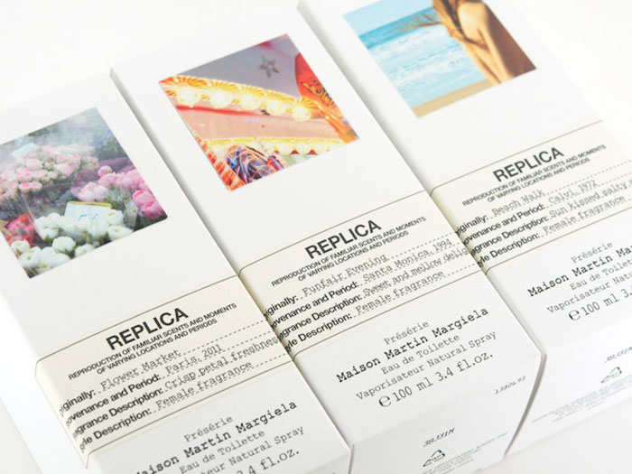
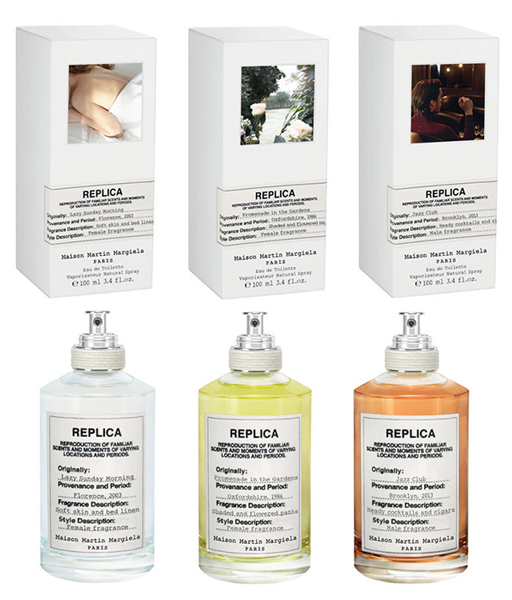
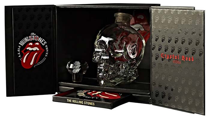
On the global image market the celebrity fragrances are a growing phenomenon. Perfumes are no longer the result of passionate research done by timehonored beauty maisons but true and proper objects for branding or for communicating brands now even representing people, or rather “celebrities”: pop stars, film stars, models or socialites, who create their own personal perfume, an object that by offering emotions as well as visual or olfactory sensations, stands as the media essence of the character they represent. Aboveall, in the case of popstar fragrances, the packaging is often exaggerated, even ugly, all the same it is never banal because it incarnates the look, the style, the aesthetic taste of this or that personality, a sort of accessory-fetish to delight fans, to be looked at, touched, smelled.

To consolidate the imagination of the public, the scents of pop stars are always launched on the market accompanied by a story, a video, a song. The advertising campaign is signed by big names of international creativity, photographers and filmmakers who band together to create a perfect product from all points of view, music, video, graphics, design, fashion, and naturally, beauty are interwoven to give body (packaging) to an icon, and in a short time the perfume bottle enters the distribution and viral marketing circuits. An accessible piece of a dream but, aboveall, a true business.
The marriage between the entertainment and the beauty industry is an interesting union as well as a union of interests, and both sides have much to gain, which is why in the future we are likely to see more and more “star-parfumes”.

One of the first celebs with her own fragrance was the singer and actress Cher, who launched Uninhibited in 1987, a perfume with a sumptuous and decadent appearance; Cher made the presentation to the press in a “Cleopatra” dress style and the publicity photo portrayed her as a symbolist Salomè, a sinful Cher alla Franz von Stuck, metaphor of an essence that allows itself to be bottled, but not held back, as the claim announced.

cher


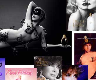
After Cher came Elizabeth Taylor’s Passion and White Diamond, of course crafted around the image of a gorgeous Liz and her unfailing passion for jewellery. White Diamond has a very feminine bottle, precious and…brilliant; it enjoyed an enormous commercial success and today is still one of the best-selling perfumes the world over.

liz_taylor


From the 2000s onwards there has been a succession of new perfumery and “celeb-creations”: Jennifer Lopez, Britney Spears, David Beckham, Gwen Stefani, Antonio Banderas, Shakira, Bruce Willis, Beyonce, Mariah Carey, Prince, One Direction, Rihanna are just some of the celebrities who have dealt or dallied with the world of fragrances.

mix_celebrities


In 2010, as a sign of her passion for cats, the pop singer Katy Perry made Purr (the name was intended to allude to “perfume”, “perfect”, as well as “Perry”) the bottle, sketched out by the performing artist, is in purple glass in the beloved cat shape, with diamond eyes and metal details. To find the right fragrance the distinctive notes of her favourite fragrances were captured and blended together, to constitute her personification contained in the bottle. Given the success, Kate Perry tried again the following year with Meow, yet another cat perfume with an onomatopoeic name, the bottle being the same as that of the previous year, no longer purple but a pearlescent pale pink. In 2013, finally, came the breakthrough, Kate abandoned the cat (and kitten) icon and relaunched as a powerful, seductive woman.
The transformation is symbolized by “Killer Queen“, a new essence which takes its name from the pop-group Queen’s planetary hit written by Freddie Mercury. «Since I was 15 years old – says the singer – Killer Queen has been in my vocabulary. Mercury’s lyrics speaks of the woman I wanted to be, magnetic, powerful, who conquers all and finally, after all this time, that’s just the way I feel» and to express this marvellous sensation, the shape of the bottle is ruby red studded with gold, it is the point of a sceptre that, in the advertising campaign, Queen Katy brandishes with pride.

kate_perry


One of the most striking pop stars both in life and for the design of his iconic perfume is the American rapper Nicki Minaj, who in 2012 launched “Pink Friday” to express the unique style of his voice through another dimension, that of the sense of smell. The bottle, designed by Lance McGregor, incredibly kitsch and self-referential, is a bust of the same singer with the famous pink wig: impossible to remain indifferent to such abundance and formal semantics, the fatal mix of production technology, sculpture and pop culture.
But it is for this very reason that Nikki’s scent has something magnetic and appealing.
The last one, Minajesty, dated 2013, is no less iconic in terms of force, and the packaging maintains the same concept, the statuary half bust of Minaj but with a new look for the wig, the top and the corset. If this continues you would want to start a collection!

nicki_minaj


We cannot conclude without mentioning the scents of the most famous pop stars in the world, those who, along with Michael Jackson, made their image the prime mission of their lives (and not just medial), notably and of course Madonna and Lady Gaga.
Truth or Dare was the first fragrance Madonna put her name to and draws inspiration from an olfactory memory, the smell of gardenia and tuberose that reminds her of her mother. A fragrance that evokes something nostalgic, primitive and mystical in her. With this project, Madonna confirmed her determination to appear ever less the “material girl” and ever more spiritual (of course in the mix typical to her: Catholicism, Judaism and Kabbalah, yoga, Opus Dei). The bottle, designed by Fabien Baron, is white with gold logo and cap, a touch of preciousness that hints at the opulence of certain churches.

madonna


Lady Gaga is an extreme experimenter who here too does not deny herself.
Her first fragrance “Fame” (September 2012) represents a step forward in the realm of perfumery. First, the liquid fragrance is a striking black color which, on contact with the skin becomes transparent, the composition of the olfactory bouquet, instead of following the traditional pyramid structure (top notes, heart and bottom), uses an innovatory push-pull structure, in which the various odours simultaneously interact to set off and heighten the characteristics of each note without any dominance or hierarchy.
The bottle was designed in collaboration with photographer Nick Knight and has the appearance of an alien magic potion, the black liquid of the bulb and the top looking like a gold harpoon makes for a mysterious and aggressive object. Just before the commercial launch rumour circulated that the pop star was looking for a perfume aroma of blood and semen, subsequently stating that, although the fragrance was based on the molecular structure of these substances – and in particular on sampling of the molecules of his own blood – that was not the odour (thank goodness for that!). Lady Gaga’s provocations are never gratuitous anyway, and thanks to the powerful commercial launch and advertising campaign shot by Steven Klein, in just one week “Fame” sold 6 million units, becoming one of the best-selling perfumes worldwide.

lady_gaga