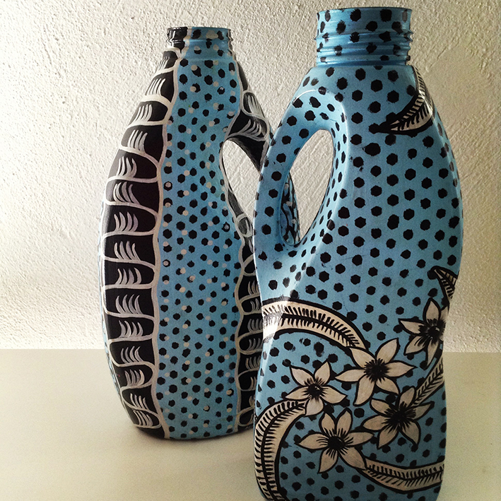
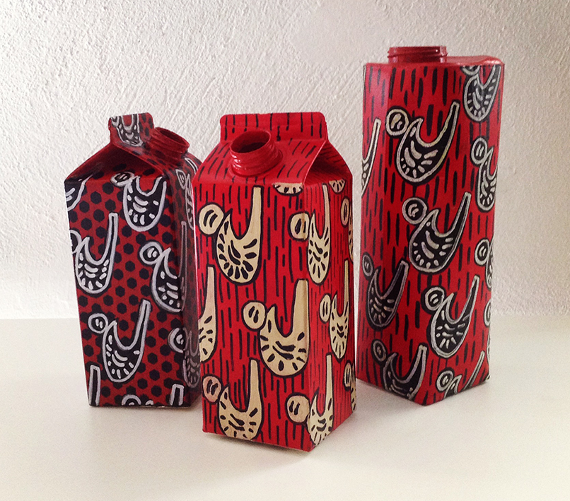
Cristina Simen and Emanuela Sauve are two interior designers who, after various trips to Africa, stricken by so much beauty, decided to share their passion offering a collection of objects and accessories decorated with African motifs. Among other items, flacons, bottles, tetrabriks, various packs that, instead of ending up as rubbish…. A contamination that we love.
Cristina and Emanuela live and work in Rome and Milan; their professional training was traditional (fake marble, fake wood, trompe l’oeil and everything regarding classical decoration) learned at the prestigious Institut Supérieur de Peinture Van der Kelen in Brussels. It is there where they met and have been working together for ten years in total accord, developing ideas and projects and daring to experiment even on extremely orthodox ground.
As they themselves admit, inspiration may strike anyplace anytime … a crumbling wall, a stroke of light, a rusty piece of iron, as in this case, by a trip, for example to Africa.
The colors, drawings, the WAX fabrics – printed using a special wax technique – their imaginative way of recycling poor objects destined to be thrown away started off the creative process that led them to create a collection indeed called AFRICA.
This immediately led to the painting of table sets, placemats and centrepieces decorated like the African fabrics that fascinated them so much: and then coffee tables/trays, plates, bags in light wood. Lastly, a series of vases created from packaging of various types: plastic detergent containers or cardboard milk cartons, carefully chosen and subsequently decorated and painted.
A new dress, simple and to great effect, to embellish and give new life to what we usually all too hastily throw away.
Next time, think things over a little more carefully, the apparel makes the man. The same also goes for the packaging.
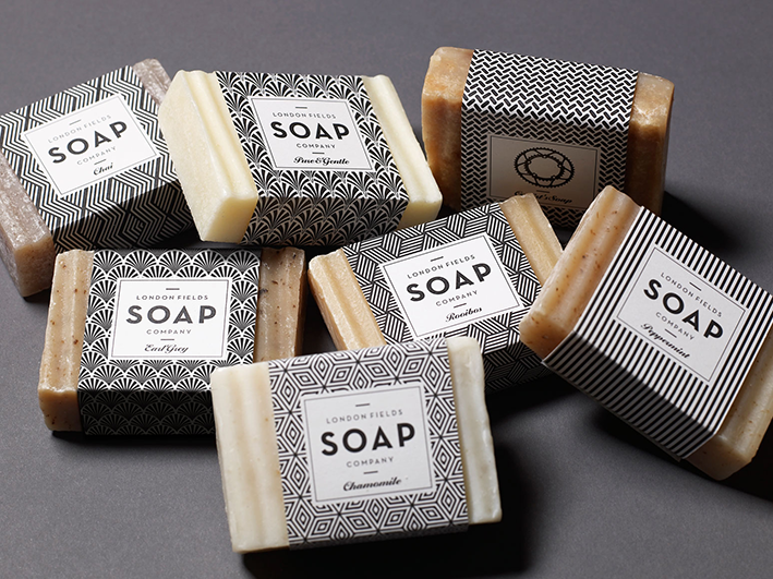
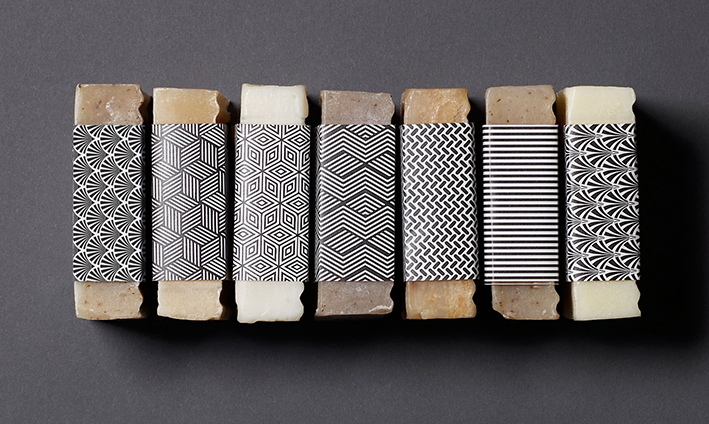
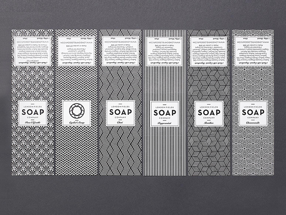
Why not rediscover the pleasure of holding a bar of scented soap? The solidity of an object that gradually melts between our fingers, that we can spread over our skin, like a caress, that seduces us with a minimal, ephemeral but highly elegant packaging.
London Fields Soap Company is an East London company that, in an era of innovative, liquid and creamy detergents, has the ambition of relaunching the classic soap bar of the past. To do so it turned to One Darnley Road, a young company of designers who worked on the identity of a brand coherent with handmade and sustainable, craft and biological products but also to better represent “the aesthetics of cleanliness”, products that ‘looked nice’.
All London Fields Soap Company products are made in small lots, at zero km, in Hackney, East London. Main ingredients include tea and peppermint (ingredients so good you would want to eat them, company head Tabitha Kleinert claims!).
For the new brand, that had to combine craftsmanship and a modern sensitivity, a typical Art-Deco atmosphere, comprising graphics (especially those of the fabrics) and typographical characters, somewhat updated, were resorted to.
The packaging too draws inspiration from a local tradition: London’s East End, in fact, boasts a long tradition of textile design and manufacture. You only need cite, for one and for all, the historic silk and satin manufacturer Warner & Sons, that for over two hundred years has produced wonderful fabrics for the Queen and the nobles of the United Kingdom.
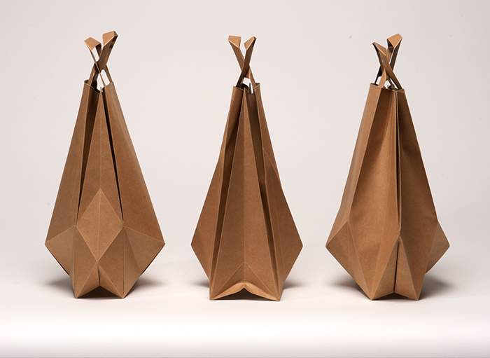
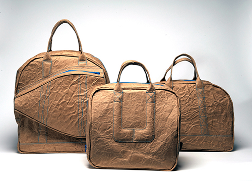
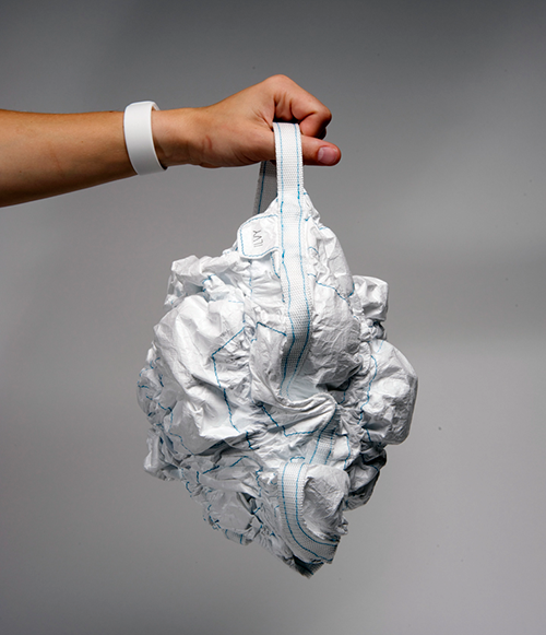
The classic carrier bag, reinterpreted by the skilled hands of the Dutch designer Ilvy Jacobs, takes on refined and elegant forms of a light, humble and ephemeral packaging origami, becoming a chic and original accessory. Ideal for someone who feels like going to the supermarket in high heels.
Ilvy Jacobs holds a diploma in Product Design but her specialty is creating bags inspired by the world of packaging and that adopt the qualities, materials and functions of the same.
In Ilvy’s work the conceptual and research aspects (like in the series of “Cordbags” that hark back to the artist Christo’s work of “wrapping up the world”, and for which she uses bags in Tyvek, a material that can look a lot like paper with which she manages to emphasize the aesthetic appeal of the object)
But also the theme of sustainability is always present (like for example her leisure time activity “Sport crunchbags”, made of a special material, paperboard laminated to cloth, that, like a sophisticated eco-leather, reshapes the silhouette of these highly particular sports bags.
Going back to the elegant origami Foldbag, it costs 25 euros and can be ordered from website specialised in paper products bl-ij.nl. or directly from its creator. Perhaps with her signature as brand.
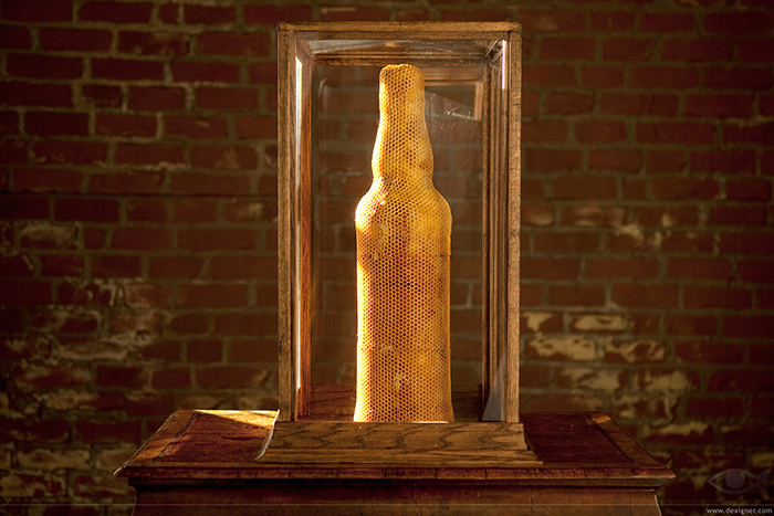
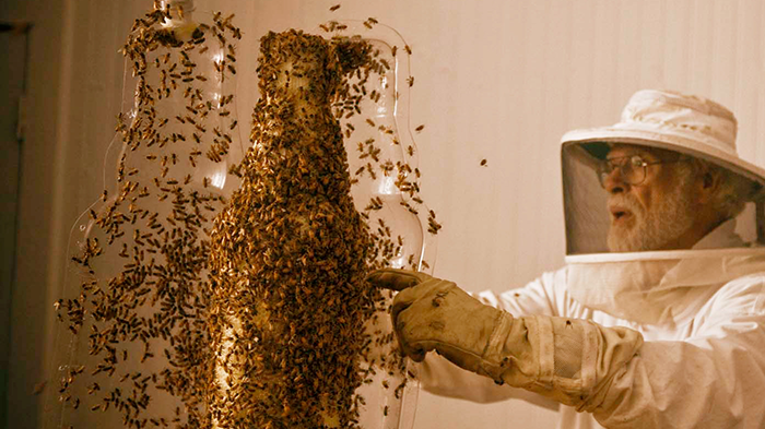
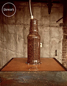
To celebrate the launch of its new honey whiskey, Dewar’s had 80,000 bees create an enlarged copy of the bottle. Under the supervision of an expert beekeeper, the tireless worker bees built the hive following the shape of the mould. The work was completed in around six weeks. An incredible result of the coalition between nature and technology.
When Dewar’s decided to create a sculpture for the launch of Highlander Honey Whiskey, it exasperated the concept of 3-D printing using the ability of the bees and gave shape to an apparently impossible project, the “3-B Printing Project”. But how can you direct a swarm of bees to build a hive in the shape you want? The Ebeling Group (that can boast a reputation for solving the most incredible projects) and master beekeeper Robin Theron were able to come up with the answer. Aboveall the Ebeling team created a 3-D model (press-moulded in the traditional manner) that could be used by the bees as a base on which to build their cells and closed it in a transparent hull, just slightly bigger than the same, so as to reproduce the real space in which the bees move in the hives; this also enabled a perfect view of the “work in progress”. Entry and exit paths for the bees were then created to enable them to search for pollen and, lastly, thousands of worker bees were introduced.
The entire process took around six weeks, requiring two entire colonies of bees, the first of which was completely removed before the second was introduced; aboveall, to avoid the honeycomb filling up with honey and other eggs being laid, the queen bee was kept isolated for a given period. The bees moved around freely and to film them as they landed on the flowers and tools, everyone wore protective masks and overalls. Once the honeycomb had been created, the plastic hull was carefully removed and the end result was surprising and scenic: a splendid bottle-shaped hive.
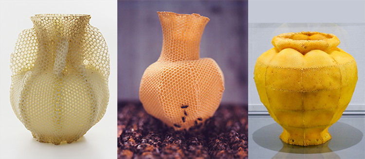
To be fair and correct one has to cite the Slovak artist Tomáš Gabzdil Libertíny, clearly the source of inspiration of the agency Sid Lee – that followed the campaign for the launch of the new Dewar’s whiskey. Libertíny’s work, carried out in 2007 using a very similar technique, used 40,000 bees and was called “slow prototyping”
Contemporaneity, the design project, packaging: free-spoken reflections of one of the most acknowledged exponents of contemporary design, Karim Rashid.
Sonia Pedrazzini
Karim Rashid is an Anglo-Egyptian designer who grew up in Canada and is resident in New York.
He is a multifaceted and prolific designer, he has designed all kinds of things, from cosmetics to furniture, to products for the home, to objects, to lights, clothes. He has imposed his creative touch on sectors such as design, graphics, communications, art, music (he is even a popular DJ) and his products have been used in films and in programs on MTV. Rashid’s work is much appreciated and sought-after by the big international brands (including, to cite but some, Sony, Armani, Shiseido, Prada, Issey Miyake, Yahoo) but also by young concerns that make design and innovation their own winning force, like the Californian concern Method, for which the designer has created dispensers and flacons revolutionary in concept and unusual in shape and use, pleasing to touch and appealing to the eye.
But not only this. His design projects are on show in the most important museums and art galleries the world over. He has also written, published, taught and held conferences around the world.
Karim Rashid considers himself a cultural provocateur and does not hesitate to express his ideas on design, on objects and on the contemporary world with force and conviction.
Karim, what is a “design project”?
I must define design. Design is not superfluous decoration. Design is not a bonsai arrangement, or hand painted decoration on flowerpots, this is all arts and craft. To design is to create, fashion, execute, or construct according to plan – to conceive and plan out in the mind, to make a drawing, pattern, or sketch for a specific program. Therefore it is a methodically planned program not an incidental craft. Design is really to develop a construct, a new condition for our manufactured world. I really define design as addressing and fulfilling our contemporary needs and desires. Design is also not about old styles or replicating past decoration but it is about developing contemporary solutions that are about the modus in which we live. A company today that engages designers and is design driven, deals with the social, political, creative, aesthetic and behavioural issues of today, not of the past. Today in a consumer society we do not need a lot but we desire a lot. Design is not anymore problem-solving but a way of developing solutions to these desires, to our poetic, aesthetic, emotional, and cultural aspirations. Design is also the means to progress and innovation, and design is a necessity for companies to develop goods that meet these new consumer expectations. If a company does not perpetually innovate today they cannot survive on the global playing field that has now opened and is here to stay. One cannot think locally anymore.
Did you have an ideal project (not necessary in design) that you had the possibility to realize?
I am proud to go beyond the industrial design field.
I have shown artwork now for five years (Sandra Gering gallery, Deitch Projects NYC, Elga Wimmer gallery NYC and many museums such as the Institute of Contemporary Art) and have been published in art reviews but the art world has trouble taking me seriously especially when you can buy my democratic products for very little. I am one of the few designers in the world that produces and shows fine art and I am proud of crossing that boundary.
I am also making music, film, and fashion. My real desire is to see people live in the modus of our time, to participate in contemporary world, and to release themselves from nostalgia, antiquated traditions, old rituals, meaningless kitsch. If human nature is to live in the past, to change the world is to change human nature. I realized that design has the power to radically change social, political, and human behavior, that design was a means to shaping our betterment, to sculpt a world of ease, a world, of beauty of intelligence, and of comfort, I realized that design is a term that describes the notion of contemporaneity, that when we refer to design, we are speaking about addressing contemporary issues, that we are shaping “the now”. When I was young imagined a world that is robotic, where all our objects and products would be produced without laborious hand labor. I also saw a world that would be seamless with technology, a place where we could communicate audibly, visually, in real time everywhere, anywhere, and I saw our environments as intelligent, energetic, hyper aesthetic places. I also believed that new visions of building, cars, products, furniture, clothing, art, would be really inspiring digital, infostethic, and I went to Expo 1967 in Montreal almost everyday with my father and brother and the world I saw being shaped by people like Buckminster Fuller, Sarrarin, Colani, Nelson, and so many others was the world that I was hoping I would grow up into. AND THAT WORLD IS HERE and even more beautiful, more digital, more visceral, more behavioral, more communicative, more phantasmal than ever and I want to continue that mission, so that we all can embrace and engage our contemporary world.
Concerning creativity and design. Do you follow a particular method when designing your products?
Every project has slightly different methodologies. About 50% of the time the ideas come to me during the first meeting; but I believe in a rigorous process so I try many concepts, many many sketches, researching processes, technologies, material, human behaviors and strangely I arrive back at the first idea. And with other projects it takes many concepts to get the perfect idea. I am inspired by words, by philosophy, by art, by popular culture, by music, by everyday life, by computers, and digital programs and tools and technology. But technology should now be seamless with the production of goods, the material, with the design process, and with the disruption, and recycling of the product. But it is not imperative that the consumer knows this. I think that the object should just play its human role and the technology take a back seat in making it democratic, high performance, poetic, and behavioral.
How do you see our future world?
Design will be our common landscape where it will not make a difference where something is made, who made it, but instead that it is experimental, behavioral, smart, seamless, soft, and human.
I believe that the new objects that shape our lives are transconceptual, multi-cultural hybrids; objects that can exist anywhere in different contexts, that are natural and synthetic, that are inspired through telecommunications, information, entertainment, technology, new behavior and production. Our object culture can captivate the energy of this contemporary universal culture of the digital age. The birth of new industrial processes, new materials, global markets all lend inspiration to reshaping our lives.
And about packaging?
It is time that all our products become beautiful and smart regardless of cost. Even the cheapest packages should be aesthetic! In the 21th Century every package is being reconsidered and designed. I believe that packaging is very necessary and can bring a greater, more engaging experience to people. Generally bottles in cosmetics become more important than the fragrance. But in cosmetics one is selling immateriality and there is so much work, expense, and complexity in creating scents, that the package must be the ambassador of that scent and communicate its essence. Essentially one is selling something immaterial that is complex and abstract so the bottles gives a fragrance, identity, brand, and a sense of the material interpretation.
Bottles have been overly embellished for hundreds of years and became quite monumental. Historically all products were far more decorative and ornate than objects today. They spoke of ritual, religion, class, luxury, royalty, and iconoclasm. Today high design gets relegated to a perfect rectangle; this is boring, we need a bottle that semantically speaks about the scent and attitude.
I designed many packages that have second functions (and utility) so that you never throw them out. I started this trend in cosmetic packaging.
I love designing cosmetics. I feel very comfortable in this field but I stay broad so that I never specialize in any field. I do not believe in specialization. I think that the world is borderless and I navigate between all the professions of Design, architecture, art, interiors, products, furniture, exhibitions, accessories, clothing, etc. Blurring these boundaries affords me to see each area, each typology differently and in a new way and each project inspires the next.
You designed the Prada monodose cosmetics, what can you tell us about that?
The concept of the Prada monodose packaging was the concept of travel, our nomadic existence, and being flexible to carry only one-time use doses that could be never be tainted by the outside air, so there are no germs or bacteria, so that you use perfectly fresh, concentrated, pure amounts that are no more than what is needed. So if you go on a trip you just take what you need, or if you go out at night, or to the office, you only take the right, perfectly sanitized amount. The packaging was complex and we developed 38 different small ampules, bottles, and vials, that were all developed from scratch being unlike existing packaging. It was a 3 year project with a great deal of engineering and research.
What is the role of objects in our society?
In the excrescence of goods, and the system of objects, the possibility of over-consuming, of addition, and immediate satisfaction of consumption is dangerous. We surround ourselves in life with effigies, objects, products, to find meaning in our existence, and to create a sense of memory, of presence, and of belonging. But we also consume to occupy time and to fulfil some strange need of reward and ego. We will forever have objects in our world, and I am not advocating not consuming them but rather being hyper conscious of our things and love and enjoy them. If not, we had better do without them. Objects denote our time, place, and relationship with the outside world and others. Objects can have a phenomenal relationship with our daily lives and us and at the same time objects can be perpetual obstacles in our life, complicating it, and creating stress. To add more to one’s life, one can also subtract or remove, so that instead of consuming, one “deconsumes”, a theory of addition by subtraction where less can be more. Yet not a minimal or reductive approach but instead, a way of enriching ones life, of increasing experiences through beautiful things, through things that we love, to edit our choices and have a richer life – ultimately creating the most important luxury of the 21st century-: free-time. If we can remove banalities, frustrations, time-consuming scenarios, with time on our hands we can spend more time thinking, creating, loving, being, and use our time in a more constructive way, taking on a more contributive role.
This could also just make us happier beings in that we are too bombarded with pettiness, with mediocre issues, with banal experiences.
A form of growth by subtraction.
Sometimes it happens that high and low meet in the middle, that luxury and the mass market intersect, that haute couture and packaging join forces and generate worth. It happens above all when the protagonists of the new edition of Nivea Glam are a cult cream and a visionary couturier such as Antonio Marras.
Sonia Pedrazzini
Marras’s style is unmistakeable, both in the world of fashion – where he is a unique case in Italy with his imaginative and unconventional idea of fashion – and in those other cultural and artistic activities in which this tireless creative man is constantly involved.
The key elements of his work are the story, ornament and a revival of craftsmanship.
At the root of every collection there is always a narrative idea, a story, often focussing on people and events linked to Sardinia, the place where he has chosen to live and work, far from large cities and the most important centres of finance.
Recurring and deeply-felt themes are identity and difference, travel, nostalgia and loss but what makes his clothes speak, what constitutes its communicative aspect, is ornament, for which the designer declares an unbridled passion.
Thanks to ornament the form may involve us emotionally and physically. This leads to a genre of fashion, such as that of Marras, which is lavish with details, sartorial works which require extraordinary manufacturing techniques and often call on the knowledge of the artisans of Ittiri, keepers of the Sardinian tradition of embroidery.
Story, ornament, craftsmanship.
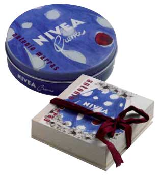
Marras has used the same ingredients in order to redesign the packaging for the special edition of Nivea cream.
The protagonist of this story is a stylised female figure with a retro look and dreamy eyes who changes clothes on every page, while the legendary crème, redesigned with maxi polka-dots on a blue background, continues to peep out from the cut-out window, until, on the last page, the Nivea-doll actually comes into life. Indeed, she can be removed from the book and dressed like the paper dolls we used to play with.
The book is held together with a ribbon made of burgundy cloth and comes in an ecru canvas shopping bag which appears to be hand-drawn. The whole has an extremely sophisticated and well-crafted look and is produced in a limited series of 2,000 numbered pieces sold at a price of 30 euros.
It does not matter what the response is. In this case the fairy tale has a happy ending as both the designer’s fee and the sales profits will be donated to Emergency in order to back an important project: the creation of a children’s surgical ward at Lashkar-gah hospital in Afghanistan.
Antonio Marras, you have dressed the packaging of a historic and highly popular product like Nivea cream in your own style. Can you explain how this partnership began?
The offer to invent a limited edition of the ultra-famous Nivea cream arrived exactly one minute after I had promised myself once again never to accept another offer of work due to having far too much to do. But the instinctive liking I feel for this white cream, that oh-so familiar image and that unmistakeable perfume, meant that, once again, I was unable to keep the promise I had made to myself.
For a curious person and style lover such as I am it was impossible to resist the temptation to “desecrate” this true, immutable icon. Is there anyone anywhere in the world who wouldn’t recognise this blue tin with its white lettering, unchanged for over 50 years, one of which is found in every home? Indeed, it is no coincidence that I wanted to work on the most classic packaging, excluding the handbag version, which is very pretty and practical, but already far too “fashion” and modern compared to the project I had in mind.
The first instinctive idea was to “dirty” the severity of the blue with white polka-dots and to give it a texture thick to the touch. In concocting a box to contain it the idea gradually emerged of a book-object-doll who comes to life on every page. In the end one might say that the container has almost got the upper hand compared to the original object we were asked to work on, taking into account the fact that it all comes in an ecru canvas shopping bag with a print that looks handcrafted.
Speaking of packaging in more general terms what does packaging mean to you within the context of contemporary taste?
For me it’s fundamental! I have bought things merely because I’ve been absolutely fascinated by the packaging that contained them and totally uninterested in the content… On the other hand, I have always paid a great deal of attention to what is required in order to announce and communicate the object. From the very start I have invested a great deal not just in economic terms but, above all, in philosophy and creativity, when designing the invitations to my shows. As I treat my collections as though they were stories to tell, the shows are the backdrop to the story and the invitation is a kind of introduction. The same thing goes for packaging.
What is luxury? A lifestyle, product quality, a mental state…
The word luxury, taken by itself, is meaningless. It is too broad and generic to have a unique and shared meaning. Luxury understood merely as a costly object seems to me to be very far from being a mass phenomenon, above all in these times of real hardship. Only luxury palliatives can be defined in those terms.
Personally, the luxury I most aspire to is time: not free time, mind you, but time to manage to do all those things I would like to do and dedicate more time to.
The world of fashion increasingly dialogues with that of contemporary art. How do you see this relationship considering too your direct, personal experience such as your partnership with artists like Maria Lai, Claudia Losi, Carol Rama and the events which you create every year on the occasion of Trama Doppia?
I think that today these categories should be partly redefined. It is no longer a question of lending or reciprocal interest. What happens is that the boundaries between art and fashion become increasingly blurred to the point that there is a whole swath of intermediate experiences, difficult to classify in one or the other environment. Personally, I have always felt the strong necessity and importance of working on spaces of autonomous creativity. Freedom is a luxury which allows me to create something which is transversal to fashion, something which emerges from independent moments in my life, as in the case of meeting Maria Lai or Carol Rama. Their mode corresponds naturally to what I have always created. I am certainly someone who is lucky to do what he loves: a job which allows me to mix everything, clothes, music, theatre, cinema… I have just thought of an episode involving Maria Lai herself. Once I told her I was going to copy one of her designs. She replied “Art is continuous theft. Don’t worry, I steal from all over the place. When you steal something the work becomes yours”. There, perhaps the relationship between art and fashion could be summed up in that image.
In your opinion, what role does fashion have in our society and which direction is it moving in?
Fashion is one of the most efficient means we have of self-representation and therefore it has an extremely important function, even though for most people, including, sadly, those who hold in their hands the fate of the Italian economy, it is a frivolous and insignificant act. It allows us to announce our ethnic group and political, ideological and cultural affiliations but it also allows us to play with appearances, to construct and deconstruct the identity we wish other people to see. More importantly through fashion we can symbolically elaborate change, passing time, the reality that is transforming us at an increasingly rapid pace. We can agree to leave the past behind, to open the door to the present, to look to the future.
Given the critical economic situation we are forced to face, the need for fashion is destined to have more and more influence on the demand for products distinguished by true identity and unique design.
From this point of view Italy is currently unable to compete with other countries who have made experimentation and innovation their strengths.
Therefore, this sector’s potential for growth seems to me to be linked to its ability to renew itself by expanding its creativity. That is what I wish for the good of the sector and for its positive future development.
In the works of this Catalan artist, packaging is a meaningful container, but also a sharp condemnation of the consumerist world.
Marco Senaldi
The interests of Antoni Muntadas – a Catalan living in New York who has worked as an artist for more than thirty years and is a veteran of Documenta and the Biennials – are directed towards what he, since the 1970s, has called the “media landscape”. By this, he means not so much the invasive presence in the urban landscape of screens, videocameras, advertising hoardings, light-boxes, neon signs and so on, rather the fact that mass communication has eroded the significance of every other form of communication in advanced societies.
All the works created by Muntadas over the years, most of which are gathered together in the large anthological Proyectos which Madrid’s Fundaciòn Arte y Tecnologìa devoted to him in 1998, speak of this theme: the disappearance of meaning in an age when it has become easier and easier to transmit it in many forms.
In This is not an Advertisement of 1985, for example, he used the most famous advertising screens in the world, those in Times Square, New York, to transmit the phrase which is the title of the work – creating a clear short-circuit of meaning. In another work, Exhibition (1987), he constructed a completely empty exhibition, devoid of exhibits, using only the typical equipment necessary to stage an exhibition: spotlighting for paintings on the walls, a video projector switched on but with no video, pedestals for sculptures, a slide projector, illuminated display cases for drawings, etc. It is clear that with works like this Muntadas is telling us that a large part of the fascination engendered by works in museums is due not so much to their content – which is secondary – as to the elegant surroundings in which they are displayed.
For Muntadas, in this age of mass media, it is a fact that the medium truly ends up being the message, the context imposes itself on the text, the frame becomes more important than the picture and, in the end, becomes a part of it.
In this respect, it comes as no surprise that this artist has devoted much of his attention to the subject of packaging, not so much as a container dominated by its trade mark, or as a vehicle for advertising, rather as a frame which encloses the contents over which, in the end, it prevails. On the other hand, the frame, a component which separates, which marks the difference between interior and exterior, between the contents and the environment surrounding them, between the product and consumer, is also a concept which is of itself interesting, because in its turn it can become a vehicle for new and unforeseen meanings.
Called upon, for example, to think of a project for the Maison du Rhone for contemporary French art, Muntadas rejected large structures for the streets or squares of the city in favour of a much more “modest” solution, but one which loomed equally large in local public life – the production of a bottle (of unlimited production, therefore not to be considered as an artist’s “limited edition”) bearing in relief an image of the Maison itself. As Muntadas himself says, “Deep down, is not the Museum perhaps a form of packaging?”.
But the work which is most surprising in its stark simplicity dates from 1987, and is entitled Generic Still Life. In essence, this is a display, on the shelves of the Gabrielle Maubrie Gallery in Paris, of a series of packaged products, and of their “photographic portrait”, as if they really were works of art. The fact that the products selected do not depend on their external graphic appearance, strictly in black and white, nothing but the name of their contents, undoubtedly gives the exhibit the almost refined and elegant tone of a skilful “conceptual” construction.
The artist himself (whom we met during a workshop in Turin) explains that we are simply dealing with goods which really exist, and which can be bought in any discount store, where they are clearly sold in this way to contain the costs of packaging and graphic design.
«I am more interested in this type of cultural approach to detail than to grand theories», he says, confirming that this still life work is in effect part of a larger project on “generics”, or rather on those objects, facts or meanings which, through habit or weakness, we have ceased to consider as “specific” and therefore worthy of attention.
«In Generic Still Life there was a slight reference to the Merda d’Artista by Piero Manzoni, but also to the Spanish canvases of bodegones (Baroque pictures of carafes and bottles); the idea was that of an anonymous product which, if not actually original, takes on another presence, changing its context a little».
Through this attractive displaying of goods in their “generic” form and, even if packaged, totally devoid of decoration, the viewer is forced into contrasting reflections on the status of objects and the desires of the consumer. On the one hand the goods, stripped of the gaudy apparel in which we are used to seeing them on the supermarket shelves, seem grey, monotonous and almost sad, without that seductive appeal which we have been used to for so long. On the other hand, displayed like this, within the aristocratic framework of a fashionable art gallery in a European city such as Paris, they assume an additional value, an aura of artiness which imbues their modest graphic facade with a sense of metaphysical abstraction.
Above all, Generic Still Life demonstrates an extreme formal cleanliness of line which by no means coincidentally recalls Spanish still life of the 17th century, together with an almost Morandian composure – very beautiful features which do not, however, erase the subtle condemnation of the frenetic consumerism which characterises our relationship with objects at this stage in the century.
«I don’t like packaging very much, I’m quite anti-consumerism… If I have to buy something, I get hyper-nervous. The thing that has always surprised me here in the United States is that people go shopping together, as if it is a socialising event; although in Spain, too, you hear people say “vamos de compras” (let’s go and buy)» says the semi-nomadic artist.
«I don’t even like collecting things. The only thing I’ve collected for years – and I’ve got loads of them – are those cards they put in aeroplanes with instructions on how to save yourself. They’re things which nobody reads. Strange, because they would help to save you – if something happened, you’d look really stupid if you hadn’t read the instructions. They are amusing because they are based on figures but, although the message is always the same, the pictures are different; each country and each airline interpret them in different ways, Lufthansa is different from Iberia, Quantas from Alitalia, and so on. They tell you a lot about the culture of the country they come from; but even though the pictures try to be generic and clear, the fact is that this “clarity” is a concept which can change – in some cases, for countries like Korea and Japan, it is downright baroque. This is why I have used them for something I’m working on called On Translation, something I’ve been engaged on since 1997.
What really interests me is this relationship between the standardised and the specific.
I’m also engaged on a work for Barcelona, on the museum merchandising of Mirò. La Càixa, for example, a very large Spanish bank with an intensive cultural program, has taken its logo from a design by Mirò, as has Iberia Airlines, and also the Spanish Tourist Authority, for its advertising. At the Fundaciòn Mirò it’s all merchandising, which goes from plates to t-shirts, from socks to underwear! Then, when I was in Cuba for the Havana Biennial, I saw that the same thing had happened with Che Guevara…In Spain, the museum has exploited the merchandising, there the whole country has used it!».
Muntadas’ charmingly intelligent musings make you think… Are, perhaps, even states, countries and nations being transformed into gigantic packages, with their bold colourful logos and instructions for use, without us, being generically unaware, even noticing?
In Hong Kong the top professionals of graphics go under the name of Kan & Lau. Tradition and the contemporary, East and West combine in the packaging of two reputed Chinese designers.
Sonia Pedrazzini
Kan & Lau Design Consultants is one of the most important graphics agencies in Hong Kong. The studio has been operating since 1976 and its two founders, Kan Tai-keung and Freeman Lau, are two well-known designers who have won many awards and acknowledgements at both national and international level. In 1993 Kan was selected by IDEA as one of the 100 best designers, whereas Lau – leading figure in the industrial design segment – won the Hong Kong “artist of the year” award. The agency concerns itself with design and creativity all round: from advertising to coordinated image, from packaging to industrial design, exhibition design, cultural activities, even public art. Not only that, thanks to a valid team of international, multicultural co-workers, the development of new products covers both the Asian as well as American markets. East and West encounter and meet up in the form of packs, boxes, bottles, products and objects in general, all rigorously highly professional.
Among the array of creations by the two designers some of the more recent deserve a mention, like the trophy for the China Top Ten Benefiting Laureus Sport for Good of the year 2004 – better known as Sports Oscar – made by combining the stylised silhouettes of the athletes in movement, the figures being drawn from the Dao Yin map, one of the oldest testimonies of sporting activities; or the logo of the new CCTV News TV channel, where the English word ‘news’ has been integrated with the Chinese ideogram for correspondent, great care being taken in blending the eastern calligraphy and the western alphabet; or again, the work on the concept and coordinated image of the Chinese children’s clothing brand Aico, where mascots and cloth dolls tip a wink at the graphics of the Japanese Manga.
We interviewed Kan Tai Keung, one of the founder members of the studio and since 2003 lecturer at the Cheung Kong School of Art and Design at the University of Shantou.
Considering the huge economic and social changes underway, how has packaging in China changed over these last decades and how will it change in the future?
China’s economic growth in the last decade was speedy and is there for all to see. Social improvements have helped strengthen local markets as people’s purchasing power increased. Nowadays Chinese enterprises are not only appreciated for the quantity produced, but also for their care for quality of their products. Hence a good product design is fundamental. Place the former in a competitive scenario and you can get a successful local brand. A unique design and packaging contributes to sharpening the competitive edge.
What are the main differences between packaging created by an oriental and a western designer?
I would say that oriental and western designers aim at the same thing. That is to fulfil the basic function of design. Oriental designers have been influenced by the modern western design concept. However, they are better positioned to meet the needs of the oriental market as they are intimately acquainted with oriental living habits. They are more suited for building up the branding culture of local enterprise.
Is it easy to become a successful packaging designer in China?
Packaging design in China is going through a phase of development. There is still huge room for improvement. The industry needs talent to help foster this growth. For example, designers should construct their own ethics and keep up a level of high quality. Moreover, how enterprises cooperate with designers and how they respect the industry is important. The design profession in China is still in its infancy, a lot more still needs to be done.
Could you briefly mention one of your most successful projects?
Our work for Wingwah Cakeshop is a good example. Initially a traditional Chinese bakeshop that only served local customers, after working on the brand identity, designing new packaging and a new brand logo, Wingwah was turned into a modern, international type confectioner, so much so that it has rapidly become one of the most successful Chinese confectionary souvenir and gift stores.
The new brand identity and packaging design helped pave the way for its highly successful market expansion.
On this count, we wish to add to Kan Tai Keung’s words that, as far as the new company logo is concerned, the characters of the name have been inscribed in a square and a circle, respectively corresponding to the shape of a Chinese cake and a full moon.
A peonia is formed at the intersection of the two figures, another historic symbol of the company and thus worthy of mention, inasmuch as, the designer states, when you renew the image of a client you can in no way afford to overlook their origins, their history and their philosophy; in turn, as far as the packaging is concerned, the shop carrier bags, bags for the traditional Chinese sausage and the packs for the “wife” and “mini moon” cakes were all revamped.
The classic “traditional moon cake” only underwent restyling, so as not to impinge on its timehonored image. Indeed, some of the features of the preceding packaging were kept – the color blue with the moon and peonia – but as well as the new logo, other significant improvements have been made.
Very often the world of cosmetics draws inspiration from nature. More than not it is the products that stand out for their fresh and delicate formulas, but, in the case of the young Greek concern Korres, the packaging also manages to transmit “the breath of the Earth” at its best.
Sonia Pedrazzini
Korres natural products is a concern that has been dealing with beauty and nature since 1996, direct emanation of Athen’s leading homeopathic chemists. Currently Korres offers a variety of around 150 body and hair treatments, sun products and herbal based compounds. The ingredients are all naturally derived and high quality; mineral oils and their derivates (such as paraffin) are not used but only vegetable oils compatible with the skin. The silicon based compounds have also been replaced by special vegetable combinations that do not block the pores of the skin but nourish and soften the same. Thanks to advanced extraction technologies, the active principles of the plants remain unaltered and guarantee maximum efficiency. These are the main values around which the concern has built up a success that is growing continuously but, as well as the quality of the product, what strikes one about the pack is the graphics used to clad the solutions. The flacons, tubes and jars are without frills, sober, essential, designed to carry out their functions. The images that cover the same on the other hand are anything but minimal: they are close-ups of flowers, seeds, fruit, herbs instilled with a life of their own. They are visual incursions into the world of nature and its vegetable and mineral contents, that appear different when seen close to; they become abstract patterns, vibrations of color, movement, waves, and are a foretaste of an immersion into a world of wellness.
If packaging ought to express its contents, Korres’ packaging surely goes further, it acts on the psyche and transports the mind far afield. Yet there is not only nature in the photos, but there is also the analytical gaze of the entomologist, who scrutinizes the interstices of the world, and there is the creative gaze of the artist, who freely composes matter. Hence these packaging items are neither naïf, nor are they banal and they poetically represent the cold distance of the scientific approach along with the warmth of life at one and the same time.
Impackt interviewed the art director of Korres natural products Giannis Kouroudis, who is responsible for the company image and winner of many awards and acknowledgements, among which the First Packaging Award & Merit for Corporate Identity 2002, the Golden Star Packaging Design Award 2003, and the First EB-E Award 2004 in packaging and advertising.
What is the concept and the philosophy that lie at the basis of the Korres image?
We have mainly based our approach on minimalist and geometric abstraction; at the same time the company image in its entirety aims at showing quality in aesthetic terms, without in any way overshadowing the natural feature of the product.
How would Korres like to be defined as a cosmetics company?
Our company concept is a well-balanced combination of three basic elements. Firstly, thanks to the company’s pharmaceutical background, every process is well documented and is produced following pharmaceutical type procedures. On top of that, all active ingredients are naturally-derived. The third element is the “joy” that features throughout our entire product range. Our intent is to offer products that are good for you, that are attractive both inside and out, which means that they smell good, have a pleasant texture that of course have nice packaging.
Why did Korres come into being? To satisfy a specific market, to respond to given needs?
Korres natural products was founded in 1996, primarily due to the demand from the customers of the Korres chemist’s for natural and homeopathically compatible cosmetics. Hence, working in that direction, plant extracts with significant medicinal properties were used for the creation of safe and effective herbal products. Now, despite commercial success and broadscale recognition, product development has stayed ingredient-oriented and not marketing-oriented. We assiduously take part in research & development programs, and we are constantly seeking new ideas to best exploit plant properties in cosmetics.
Who is your ideal customer?
At this moment in time our ideal end user is not demographically or socially definable. Our products are intended for men and women of different origins and social standing, persons that share our ideas, common values and even the same aesthetic tastes: we have many consumers and this is why our products are used on markets that are apparently very different from each other.
Can you tell us about your role in the company and how you normally work?
I am the company art director and am responsible for the company’s image in its entirety. My team works on product and communication design, on organising shows and fairs, on merchandising and even on our stationery, all this on a daily basis. I normally develop new products or new concepts along with Gorge Korres, and our working relationship, that also thrives on a strong personal friendship, is very inspiring for both of us.
Can you recall a special feature of your Korres experience?
There is a funny story linked to some of our new brochures and our company calendar, all having been given an intentionally rough finish. Initially some people were led to believe that they were mere proofs or that a mistake had occurred during their binding, and that they weren’t the real product.
Korres has been able to give itself a very strong image thanks also to its packaging: how did you achieve this?
While my influence was certainly decisive, our success is due to the energy of a team of young designers who work at my side and with whom I share common values with. Along with our team George Korres, the designer – Stavros Papagiannis, my colleague Chrysafis and all the members of the general Korres team have all helped build this image by pitching in with their personality and their aesthetic taste.
Who is the photographer who created the striking images that deck your packs?
Our photographer-designer is Stavros Papagiannis, a real talent. He has the task of creating the company image and he is capable of turning a simple idea into a work of art; I mean to say his photos are the starting point for all our concepts.
As art director, what is your point of view on packaging in the cosmetics sector? Are there new trends or behaviours that are worth pursuing?
During the last 15 years, consumers have become more aware of other parameters besides the quality of the product, for example they pay greater attention to how the packaging has been made. This is why design plays an evermore important role on the market in general, and not only in the cosmetics sector.
The above explains why a growing number of manufacturers are paying more and more attention to packaging, a trend heralded by Korres. Indeed predicting future trends is a very tricky business. For us trends are made by people and thus depend aboveall on their values and on a host of personal aesthetic tastes, these being always in the making.
Alan Aboud and Sandro Sodano are the designers that have built and fostered the image in the world of the UK brand Paul Smith, creating top level advertising campaigns, perfumes and packs. Fashion no longer holds any secrets for them and neither does packaging.
Sonia Pedrazzini
It is certainly curious, and we hope a good omen, but this with Impackt is the first interview the two designers have given after the substantial changes made within their agency. In fact Aboud+Sodano has just recently become Aboud Creative, under the direction of Alan Aboud, while Sandro Sodano has preferred to dedicate himself even more fully to photography. This though has not disrupted the timehonored collaboration between the two colleagues, that is indeed continuing to great effect and with further possibilities for both to act more freely and on new projects. Alan Aboud answers our questions.
What is the common ground you share and that led you to decide to work together?
We were both unemployable when we left art school, so an older colleague who used to tutor us, offered for us to freelance from his space in Soho. We stayed in that building for 13 years, after we finally realized that we had to work for ourselves. Sandro’s knowledge and understanding of photographic and fashion helped me a lot, as I was not a particularly fashion conscious person at St Martin’s School of Art.
As I started getting more work from Paul Smith that entailed photography, I increasingly worked with Sandro on these projects, and that is how the collaboration began.
How is your studio organized?
We have evolved from just being a studio with two people, to now a functioning studio with 8-10 staff during busy periods. We offer a one stop service for clients. We design, we art direct, we produce shoots and we retouch images in post production. All activities are in-house, mainly so that I can keep a very close eye on the progress of projects.
Broaching a topic very dear to us: fashion and packaging, in your opinion what importance does packaging design have in the coordinated image of a big fashion maison?
It has very high importance. Presentation of garments and packaging helps increase the perceived value of an object. At the companies that we work with, a lot of money is spent trying to produce the right carrier bag, the right gift boxes for the consumer.
A lot of fashion purchases are gifts, and gift packaging really helps ensure that a customer comes back to shop again and again. If a person is buying a piece of jewelry from a fashion house for £2000, the least they expect is for it to have packaging that protects and also houses that item carefully and as attractively as possible. All garments have ticketing and packaging factored into their unit cost, so it is up to each fashion customer to decide how much they want to put towards packaging. Japanese fashion houses, for me, are the ones who value packaging the most. Even if you buy a tiny item in Tokyo at any store, your purchase is exquisitely packaged and you leave the store feeling special, and also contemplating further purchases.
How do you go about tackling a new packaging project, where do you get your inspiration, what methodology do you use?
Inspiration can come from anywhere. It could be a walk in a gallery, down the street, at a market or watching a film. I am constantly thinking of things to do, and projects to work on. I also am a book addict. I buy so many books, and thrive on their content. I try to avoid buying books on design, with the exception of true greats such as Saul Bass, Herb Lubalin and Robert Brownjohn. All heroes of mine. I carry my camera with me at all times too, especially when I go to New York. It is my favorite place for inspiration. My favorite book store is Dashwood Books, on Bond Street off Broadway. David, the owner, knows my taste and when I leave there each time I visit, I am usually a few hundred dollars poorer!!!
How did your relationship with Paul Smith come into being and how has it evolved in time?
I was in my final year at St. Martin’s School of Art in 1989. The Head Buyer at Paul Smith came to our end of year show, and short-listed me along with some of my friends to come for interview for freelance work. At the time, my specialisation was typography and I had no fashion or art directing skills in my portfolio. I was interviewed, and I was totally the wrong person for the job. Paul liked that, and I was offered some freelance work. I worked three days a week in the beginning and it has grown massively since then. I was lucky to be with Paul Smith at a time that they were massively expanding. I grew with them, and thankfully, my working relationship with the company and especially with Paul has been excellent. There have been some rocky times, but we are all still together after 19 years.
It took Paul a few years to become comfortable with me and to delegate, but now, we speak very often during the week and sometimes a brief consists of a sketch and a few lines of suggestion from him. We have a very good mutual understanding.
For the work done for Paul Smith, did you try to impose your own style, did you make the fashion designer’s style your own, or have you always worked in perfect cooperation and stylistic unity?
I don’t believe that I have a house style at my company, other than a simple, clear well reasoned solution for each piece of work that is output. I believe that as a service industry. designers have a responsibility to their client to further their brand image, and not the design agency’s. We act as a catalyst for image and design solutions. The client briefs us on what they need or what they see is lacking with their product, and we then seek to put the right team together to produce a well reasoned design solution for that specific purpose. Due to the longevity of my relationship with Paul Smith, I am often simultaneously the client and the agency. Very rarely do others make decisions on shoots etc, as I am effectively the brand guardian for the company, as I have helped establish the house style for them. I know, after 19 years, what Paul likes and what he won’t like.
What are the main elements a designer has to consider in designing packaging for the high fashion sector?
The most important question for every project is clarifying who the customer is for the required packaging. Is it a man or woman? What age are they? What other brands would they aspire to? Once one knows the answers to these questions, you can easily start to build up a picture of what is required.
Budget also, nowadays is very important to clarify. One can design the best packaging with bespoke linings etc, but if it is too expensive, the client will not do it. Finance plays a huge part in fashion now, and all fashion houses (successful ones) are governed by financial directors.
For me, luckily, often the simplest design and solution is the best. Luxury sometimes means simplicity, and space.
Do you have a case history or a special or curious anecdote you could relate to us?
Often notes are scribbled by Paul and given to me as a brief. I have kept a lot of them, and often they serve as a good reminder as to how to conduct one’s self in this industry.
After all, Paul started his business properly in 1970, so he has a whole wealth of experience to avail of. However, one day, whilst searching through some of his notebooks for some sketches, I came across one which sums up Paul completely in a way that no magazine article can. This scribble said: “I am at xxxxxx xxxxxxx (famous LA hotel). It’s full of bullshitters and showoffs…”.
He had been dining alone after doing interviews at his new LA store, and was appalled at the some of people that fashion attracted. He is no nonsense in his approach, and very, very down to earth. I like to think of Paul as my mentor in business and life. He shows me ways of conducting myself in a way that is proper, yet honest. He has been surrounded by stars and fame for a long time, but he remains unaffected by it all.
Who are your other customers besides Paul Smith?
I am now working for a company in London called Neal’s Yard Remedies, an organic Apothecary and organic and beauty retailer. They have bring me in as creative director to oversee the whole brand from packaging to store design. It is an immensely rewarding project as the passionately believe in creating products and packaging that does not harm the body or the environment. We inherited a truly iconic bottle and colour way and we are steering them in a way that creates continuity and strength. We also have been working with RIVER ISLAND, a high street company similar to H+M or TopShop. A very different challenge, but rewarding nonetheless.
What other fashion griffes would you like to work for?
I don’t seek to work with many fashion houses, as I think they are mostly too established for me to get involved. I would love to work on a brand that has had better days, and needs some re-invention. One such brand for me is Laura Ashley, an amazing British brand that enjoyed success globally in the 1980s, but sadly since the owner’s death, it has sunk to mediocrity.
Could you tell us something about what you will be working on next?
Next up for the studio are: A new limited edition men’s fragrance for Paul Smith. A book of personal images of mine called ‘Above All Else’, also a collaborative book written by my cousin, Simon Aboud, called TOLD. This is our first collaboration with our satellite company called ABOUD + ABOUD. (www.aboud-aboud.com).
 As they themselves admit, inspiration may strike anyplace anytime … a crumbling wall, a stroke of light, a rusty piece of iron, as in this case, by a trip, for example to Africa.