“Wavy” Spumanti

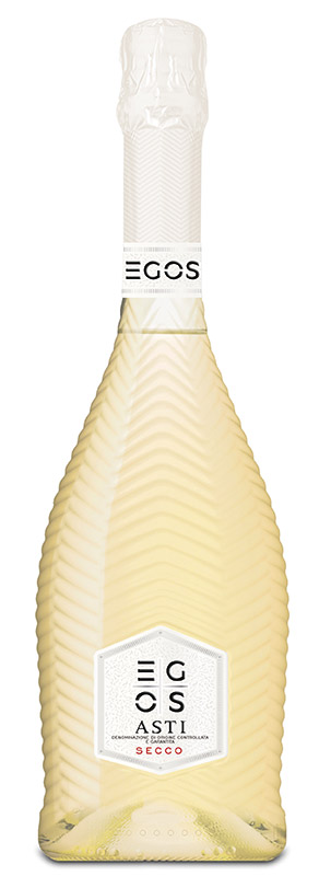
Made of white glass, the new bottle developed by Owens-Illinois for Santero (the winegrowing group of Santo Stefano Belbo, CN) stands out on the shelf, thanks to a decorative wave pattern across the entire container body.
Designed to strengthen the premium positioning of the Egos line – which includes the most prestigious Santero wines – it was produced at the O-I factory in Aprilia (LT), overcoming the numerous technical complexities associated with the shape. The production of the bottle in fact required preliminary studies and a series of adjustments to the production line, to maintain the quality standards that distinguish the glassworks.
The result achieved is a product coherent with the identity and the growth objectives of the Piedmontese winery: the strong visual impact of the packaging and an original aesthetic appearance are in fact indispensable characteristics to consolidate its presence on foreign markets.
The two companies have already collaborated in the past to develop the 2014 “Twist” range.

Premium pack for fruit

SoFruPak Witold Gaj offers a new Premium version of its cardboard packaging SoFruMiniPak®. The novelty is represented by a clear plastic lid, delivered separately, that can be attached to cardboard container either manually or automatically after the fruit has been packaged.
SoFruMiniPak® Premium is designed for berries, stone fruit, tomatoes and mushrooms. Three versions are available: 500, 250 and 125 g.  User-friendly for consumers and packers, the product has patents pending in the EU and USA.

Kimbo Moka Line: more info on the pack

Italians coffee experts? This may not be entirely the case, as emerges from a research promoted by Kimbo* on Italian consumers with insights into the packaging of the various coffee brands. The study is in fact gives a glimpse of a segment dominated by a certain staticity and excessive uniformity in language, which does not provide clear information about the product and its organoleptic characteristics.

In order to bridge this gap, Kimbo has revamped the graphic design of its 9 blends in the various formats available, with the aim of providing the customer with more detailed information, helping them navigate among the many available blends and find the one closest to their tastes and preferences. The new project, devised in collaboration with the Goodmind design agency – Pininfarina Group, also includes some advice on how to enjoy coffee, serve it and store it.

* Research carried out  by Gfk on a panel of 110 consumers in Milan, Padua, Rome and Naples.

Make the invisible visible

Nuceria Group has been involved in the restyling project of the Petti tomato puree line, with the aim of transmitting to the final consumer the excellence of an Italian product and the values that have always distinguished the timehonored food preserve company: the quality of selected raw materials, attention to“green”issues, variety of supply and care in the packaging.
These “intangible” assets have hence been best interpreted by Nuceria, focusing on the maximum transparency of a personalized bottle and a  “no label look” label to show the product in its entirety (“the tomato is at the center” as the claim on the pack aptly states). Without concealing anything, Petti has managed to build a close relationship of trust with the consumer, a receiver of clear and effective communication, which minimizes the risks of erroneous interpretations.

Thanks to the choice of the no label look and the presence of special laminates that make the packaging elegant and attractive, the product has naturally gained a premium positioning.
Lastly, to be underlined  the effectiveness in the packaging phase, in particular the speed of labeling and reduction of machine stops, as well as the savings on production costs and the benefits of recyclability and efficiency resulting from the use of the PET liner as a replacement for silicon paper.