See. Touch. Feel.

A journey of the senses in discovery of unique products: Luxoro opens its own exhibition space at Paper&People, Europe’s largest graphic paper showroom.

“See. Touch. Feel.” Those words evoke an experience that is at once physical and emotive. It is to feeling that Luxoro appeals in adopting these words as the pay-off of the promotional campaign behind a new initiative at the Paper&People showroom in Milan (15 June through to the end of the year). Appearing at what has become a go-to event for design and communications professionals marks an exception for Luxoro, which for the first time presented there paper and board products beyond its standard fair sample selection.

«At what I like to call a “library specialized in beauty”, we wished to create a space of our own, where everyone could see and touch the beauty of labels, packaging and printed products made using the foils of the Kurz Group, for which we are the exclusive distributors in Italy» explained Luxoro CEO Jana Kokrhanek at the popular “vernissage”.

And so the best of graphic decoration was on show, with the precise objective of sharing an experience resulting from a balanced mix of style, innovation and technology «Which – as Kokrhanek points out – is not exclusively targeted at luxury products, but interprets an ideal of beauty that has now become part of the collective imagination.

Basically, we feel ourselves to be “beauty communicators for the printing industry”, and in this we are truly fortunate. What we like to do is explore new ways for familiarizing the market with the endless possibilities of our offer by providing a far-reaching consulting service on everything from selecting materials to identifying the most appropriate decorative effects for a given product. We do this with a sincere desire to pique the curiosity of potential users».

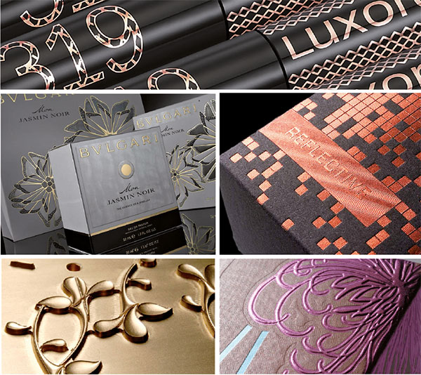
THE LUXORO SPACE AT PAPER&PEOPLE

It features an urban style and a deconstructed visual concept that highlight a selection of the finest decoration (packaging, labels, covers, inserts).

Visitors can find plenty of Hinderer+Mühlich plates, veritable works of art in copper that light up the paper with reliefs, engraving and micro- and nano-incisions for both hot foil stamping and dry applications.


Man cannot live on bread alone

Is it a provocation or merely just for fun? What thin thread of logic unites a coffee tin with the Cartier brand or a bag of flour with Prada?

The exhibition Wheat is Wheat is Wheat, currently at the Museum of Craft and Design, San Francisco, attempts to look into the role of designer and that of consumer in an era of mass “signature” compulsion.

One cannot deny that the fine images of prosaic food such as: salami, yoghurt, coffee, milk, eggs etc. clad (appropriately said) with the brands most loved by the fashion buffs of all climes – Prada, Gucci, Nike, Apple, Tiffany, LV to cite but some, arouse curiosity.

peddy_mergui_luxury_brand_food_350_webThis is luxury packaging, recognisable by the graphics, colors, details, especially reconstructed by the Israeli artist-designer Peddy Mergui on conventional broadly consumed products, and for this very reason with the power (the power of the brand!) to make salami appear even tastier, flour more refined, coffee even more aromatic.

But beyond curiosity, what remains?

As the selfsame artist suggests on his website, Wheat is Wheat is Wheat leaves more questions than answers.


chanel_500_WEB

eddy_mergui_luxury_brand_food_500_web

salami3_500_WEB

Boxes (d’artiste) and bubbles

Founded in 1729, Ruinart is the oldest champagne producer in the world.
The first to use ancient caves carved out of the stone beneath the city of Reims in order to age its wines. The first to store its bottles, starting in the 18th century, in wooden crates and the first to reinstate the traditional champagne bottle.

With these things in mind, the Dutch designer Piet Hein Eek created the wooden crates for Ruinart’s Blanc de Blancs.
And naturally his Nordic style is very “eco-chic”.


In order to avoid unnecessary waste and optimize transport while minimizing the solution’s environmental impact, the designer conceived and built a trapezoidal chest whose profile has been appropriately refashioned, with a series of minimal touches, against the physical space occupied by the bottle.

What results is a truncated pyramidal crate which, – in addition to serving as a designer packaging – with its shape reminiscent of the keystone in an arch, as if it were a recurring architectural feature (or a piece of “Lego”), can be stacked in a very compact manner and used to create grandiose scenic installations.


In line with Eek’s typical approach, the wood used in the crates is recycled, but in order to better reflect the colors of Blanc de Blancs an essence of pine was patiently selected in hues of pale gray, white and cream and then treated on the surface with lacquers to make a precious finish. Each case has been handmade in the studios of Piet Hein Eek, in Geldrop, near Eindhoven, and has been signed and numbered to make it a unique item, like the bottle it contains.

video