Kissabel: red interior

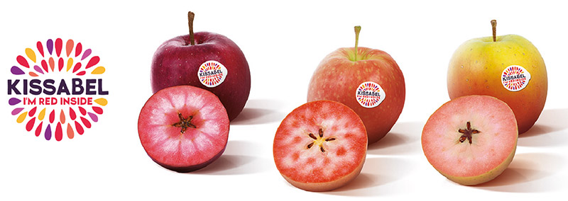
Telling a completely new and unique story: that of a traditional fruit on the outside but that hides a sensational red pulp with an exceptional flavor. This was the task performed by RobilantAssociati, the branding and strategic design company, which worked on the strategy and positioning of the Kissabel apple brand, the result of natural crossings of wild red pulp and traditional apples, completely GMO-free.
With a clearer corporate identity and a naming recordable all over the world, the Kissabel brand summarizes the value and character of genuineness and naturalness.
The logo and the house style represent an explosion of nature, a real kaleidoscope of emotions, sensations and tastes, capable of involving, seducing and surprising. And the payoff “I’m red inside” communicates the warmth of true passion.

Kissabel, the new brand of red pulp apple launched by Ifored (International Consortium which brings  together 14 of the leading apple producers from 5 continents).

Compostable coffee pods with CCM

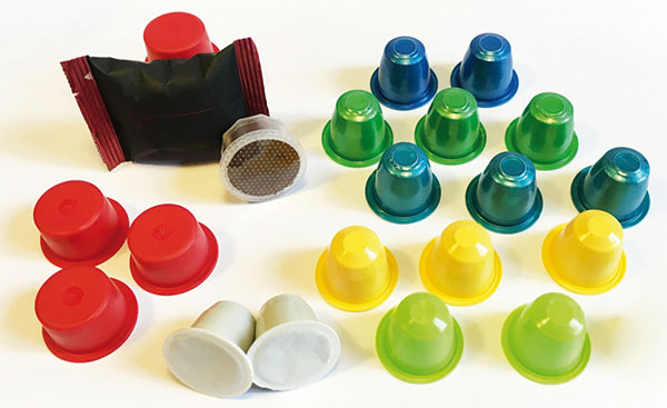
Sacmi intercepts the strong expansive dynamics of the coffee segment in capsules, proposing an unprecedented application of its CCM (continuous compression moulding) technology, used world-wide in the production of beverage capsules.

Started up in 2014, the R&D project that has led to the application of this technology to coffee packaging is confirmed as the solution that guarantees the lowest running costs of the industry thanks to reduced cycle times, reduced consumption and to the complete guarantee of process repeatability. Decisive for the result, the opportunity that compression technology provides  in handling  each cavity independently, thus allowing maintenance on off-line dies with minimum machine stops. A multilayer solution is also being studied.

Full-fledged sports drink

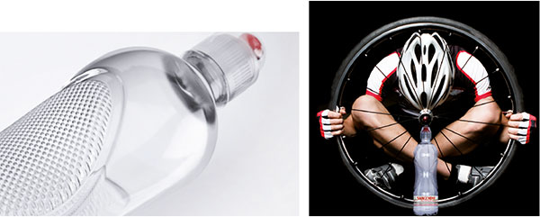
Acque Minerali d’Italia and PET Engineering continue to work together following the success of the Norda Exclusive project for the HO.RE.CA. sector. PET Engineering has been put in charge of the restyling of the bottle for Sangemini Sport (65 cl).

Project objective: to make a clear and distinctive vehicle for the produt’s peculiar positioning, no longer to be considered an ordinary mineral water, but rather as a full-fledged sports drink, bringing it in line with the brand’s new look, which has been updated to better reflect the compan’s corporate image.

In order to ensure immediate recognizability by the target consumer – in this case atheletes and more generally anyone who exercizes – the packaging developed by PET Engineering takes its inspiration from the robust and compact shape of the canteens used by cyclists and marathon runners.

The reclosable anti-drip valve cap, squeezable grip and carbon look milling that recalls the material used to build sporting bikes confers a markedly technical feel to Sangemini Sport’s new look, perfectly representing the image of the official water of Giro d’Italia 2017.

Carlo Pessina, CEO of Acque Minerali d’Italia Group, expresses his satisfaction with the project’s results.

«Packaging is an increasingly important element in the marketing of mineral water and beverages generally, especially when it identifies a specific target consumer, expressing the close relationship between product functionality and consumption behavior. That’s why for the Sangemini Sport 65 cl. We wanted an innovative packaging with a strong personality, able to represent the product’s identity and valorize its positioning on the market».

Containers for liquid with reduced environmental impact

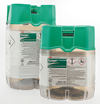
Developed for Dow AgroSciences liquid crop protection formulations  thanks to their features the tanks developed by RPC Promens Industrial and RPC Promens Innocan guarantee improved logistics and reduced environmental impact.

The 10 and 15-liter bespoke PET containers feature a safety top specifically designed for storage and stacking, and eliminates the need for an outer cardboard case.

The square design ensures high strength, durability, as well as improved handling for the end user: The centered neck of 63 mm is compatible with closed transfer systems and allows easy pouring, while bore seal safety caps (to be separated when recycling) dramatically reduce operator exposure to the concentrated product.

Lighter than about 30% of the HDPE cans used so far, they provide a further and significant benefit: The optimization of the  pallet load and subsequent transport by truck that, along with weight reduction, leads to a  20% carbon footprint reduction per litre throughout the entire life cycle of the container.

When the shape strengthens the brand

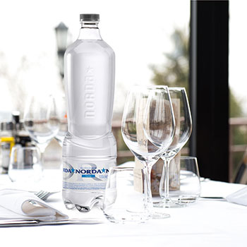
A recently formed holding, which controls the historic Norda, San Gemini and Gaudianello brands , the Acque Minerali d’Italia Group is launching a new proposal for the HO.RE.CA industry: The Exclusive line of its leading Norda brand, in the half a litre and one-litre PET versions.

The group has assigned the design of the new packaging to the Treviso based company PET Engineering, recognized nationally and internationally for its elegant and sophisticated PET bottles designed for the restaurant sector, with two Packaging Oscars two World Star and two World Beverage Innovation Awards to its credit.The Exclusive Norda design, in addition to expressing a premium positioning, embodies the Group’s innovative drive.

The new shape, unique and distinctive not only for the HO.RE.CA. sector but for the entire mineral water segment, has broken with the classical forms to which the consumer has become accustomed to: two asymmetrical parts of different sections and height are harmoniously connected by a wave, that acts as a structural and aesthetic element, associating all the products in Norda’s range PET containers.

The design definition stage is followed the prototyping and laboratory test phase, to verify the mechanical performance of the container; the project then ends with the supply of the blow moulds and the start-up of the container in line.

The company’s unique vertical expertise in the field of PET packaging and their integrated approach combinging design, engineering and industrialization, has allowed PET Engineering to meet the functional, technical and logistics prerequisites as well as the strategic marketing needs of its customer.

A good game lasts a long time (so too the box)

Playing for  Quercetti family started out as a passion, then became a profession  and soon  developed into a fine skill. It all started out in 1947 with a motorized horse that at a gallop…

Alessando Quercetti began his experience as designer and builder of toys at Inco Giochi, a small Turinese concern.
His first creation, Galoppa, a horse with rider that really gallops, was such a success that it enabled him to turn his passion into a company, Quercetti, that soon became a famous name in the Italian toy industry.

In 1953 Alessandro created and patented in Italy the most representative product of the brand, a re-edition of an old French game, the famous “pegs”. This simple game, optimized in its construction and aesthetics, soon became a  worldwide success, a true and proper cult, still played today by children all around the globe.

Quercetti, that  in conceiving and designing toys, always chose to give absolute priority to the end user, the child, enjoyed many other successes.
The game  indeed is not only seen as a pastime, but as an important tool that aids growth, building an open and elastic mind, helping the child to make decisions; it is an object with such a strong educative potential that it always demands great attention and study.
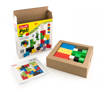
Quercetti_POLI_internoNaturally, in the philosophy of this company, packaging too covers a fundamental role. Starting from last year, for all its new references, Quercetti has in fact innovated the packs both inside and outside.
The inside of the box is made in recycled cardboard and the packs have been made to be functional while offering minimum bulk, the pieces are assembled logically and coherently in a compact space and the descriptive sheet (a classic instruction manual) has been replaced with a “user guide” in the form of a poster, made in special water resistant paper.
The graphics have also changed and white has been adopted as the basic color on all packs, to make the name and the characteristics of the product stand out.

Every line, what is more, features a band in the Italian colors bearing the wording “Made in Italy” to highlight the pride of being one of the few toy producing companies still capable of creating everything  in the  “Bel Paese”.
Award-winning sky-blue

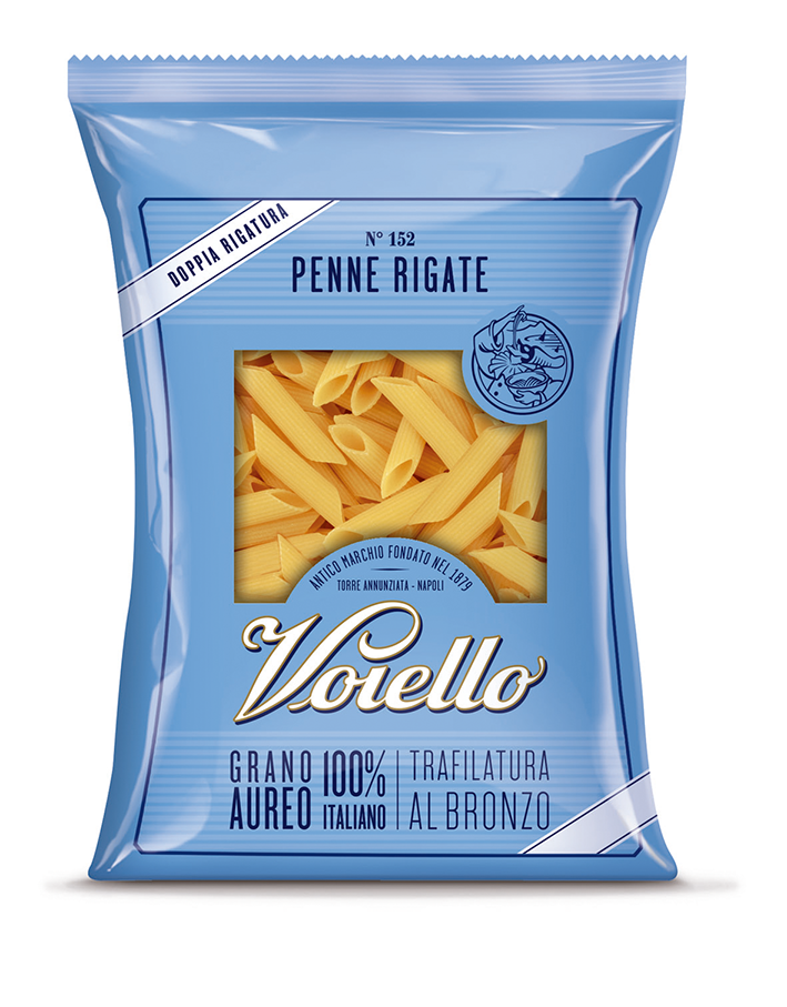
After a disastrous world cup, we need to console ourselves, for example with a good plate of pasta. Voiello reclads and wins awards and wins over palates.

Voiello, one of the oldest and most famous Italian brands, has always offered a broad choice of pasta formats made with the best grain and following the rules of tradition. Of late though, the image has been hard put to render merit to the premiumness of the products, hence making a project rebranding necessary, this in order to reiterate the brand’s leadership in the high segment of the market.

The task was assigned to the FutureBrand consultancy company that, abovealll working on the graphics, the logo, the color and the shape of the window, has revamped the packaging system of the entire Voiello range.

Spaghetti_FRONTE_webThe new packaging is part of a broader communication plan that, using different platforms, has been devised to best diffuse all the values of the brand.

«Working on a brand that harks back to 1897 gave us the opportunity of exploring the visual codes of that time and study the original Voiello packs» Chiara Pomati, Creative Director of FutureBrand explains. «Indeed those visual codes, so rich in personality, were a main source of inspiration for our creative work».

The result is a simple but all the same refined design, that draws on the history of Voiello and turns it into a synonym for quality, playing on both elements of the past as well as contemporary ones. Voiello speaks by way of its pack and speaks about its pasta with direct, immediate phrases that highlight the pluspoints of the product, reassuring the consumer and reiterating its own savoir faire. The Voiello project won the first prize in the NC awards “Brand Identity” category assigned last May.

Pasta fans are duly thankful.

The elegance of packaging

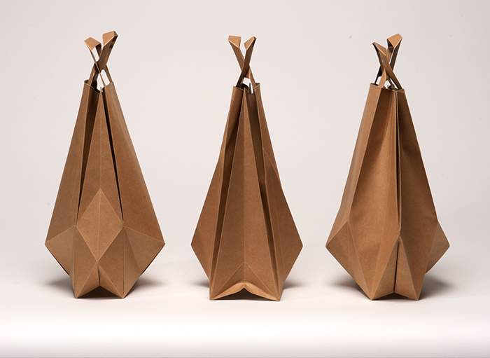
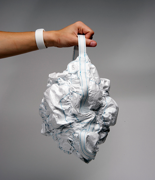
The classic carrier bag, reinterpreted by the skilled hands of the Dutch designer Ilvy Jacobs, takes on refined and elegant forms of a light, humble and ephemeral packaging origami, becoming a chic and original accessory. Ideal for someone who feels like going to the supermarket in high heels.

Ilvy Jacobs holds a diploma in Product Design but her specialty is creating bags inspired by the world of packaging and that adopt the qualities, materials and functions of the same.

jacobs_paperbag_500_web

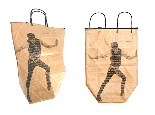
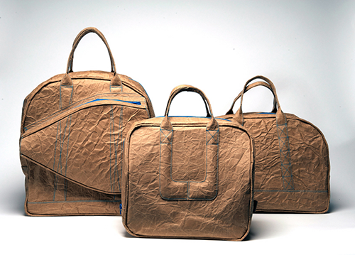
jabocs_ilvy03_500_webjabocs_cordbag3_500_web

In Ilvy’s work the conceptual and research aspects (like in the series of “Cordbags” that hark back to the artist Christo’s work of “wrapping up the world”, and for which she uses bags in Tyvek, a material that can look a lot like paper with which she manages to emphasize the aesthetic appeal of the object)

But also the theme of sustainability is always present (like for example her leisure time activity “Sport crunchbags”, made of a special material, paperboard laminated to cloth, that, like a sophisticated eco-leather, reshapes the silhouette of these highly particular sports bags.

Going back to the elegant origami Foldbag, it costs 25 euros and can be ordered from website specialised in paper products bl-ij.nl. or directly from its creator. Perhaps with her signature as brand.