In Hong Kong the top professionals of graphics go under the name of Kan & Lau. Tradition and the contemporary, East and West combine in the packaging of two reputed Chinese designers.
Sonia Pedrazzini
Kan & Lau Design Consultants is one of the most important graphics agencies in Hong Kong. The studio has been operating since 1976 and its two founders, Kan Tai-keung and Freeman Lau, are two well-known designers who have won many awards and acknowledgements at both national and international level. In 1993 Kan was selected by IDEA as one of the 100 best designers, whereas Lau – leading figure in the industrial design segment – won the Hong Kong “artist of the year” award. The agency concerns itself with design and creativity all round: from advertising to coordinated image, from packaging to industrial design, exhibition design, cultural activities, even public art. Not only that, thanks to a valid team of international, multicultural co-workers, the development of new products covers both the Asian as well as American markets. East and West encounter and meet up in the form of packs, boxes, bottles, products and objects in general, all rigorously highly professional.
Among the array of creations by the two designers some of the more recent deserve a mention, like the trophy for the China Top Ten Benefiting Laureus Sport for Good of the year 2004 – better known as Sports Oscar – made by combining the stylised silhouettes of the athletes in movement, the figures being drawn from the Dao Yin map, one of the oldest testimonies of sporting activities; or the logo of the new CCTV News TV channel, where the English word ‘news’ has been integrated with the Chinese ideogram for correspondent, great care being taken in blending the eastern calligraphy and the western alphabet; or again, the work on the concept and coordinated image of the Chinese children’s clothing brand Aico, where mascots and cloth dolls tip a wink at the graphics of the Japanese Manga.
We interviewed Kan Tai Keung, one of the founder members of the studio and since 2003 lecturer at the Cheung Kong School of Art and Design at the University of Shantou.
Considering the huge economic and social changes underway, how has packaging in China changed over these last decades and how will it change in the future?
China’s economic growth in the last decade was speedy and is there for all to see. Social improvements have helped strengthen local markets as people’s purchasing power increased. Nowadays Chinese enterprises are not only appreciated for the quantity produced, but also for their care for quality of their products. Hence a good product design is fundamental. Place the former in a competitive scenario and you can get a successful local brand. A unique design and packaging contributes to sharpening the competitive edge.
What are the main differences between packaging created by an oriental and a western designer?
I would say that oriental and western designers aim at the same thing. That is to fulfil the basic function of design. Oriental designers have been influenced by the modern western design concept. However, they are better positioned to meet the needs of the oriental market as they are intimately acquainted with oriental living habits. They are more suited for building up the branding culture of local enterprise.
Is it easy to become a successful packaging designer in China?
Packaging design in China is going through a phase of development. There is still huge room for improvement. The industry needs talent to help foster this growth. For example, designers should construct their own ethics and keep up a level of high quality. Moreover, how enterprises cooperate with designers and how they respect the industry is important. The design profession in China is still in its infancy, a lot more still needs to be done.
Could you briefly mention one of your most successful projects?
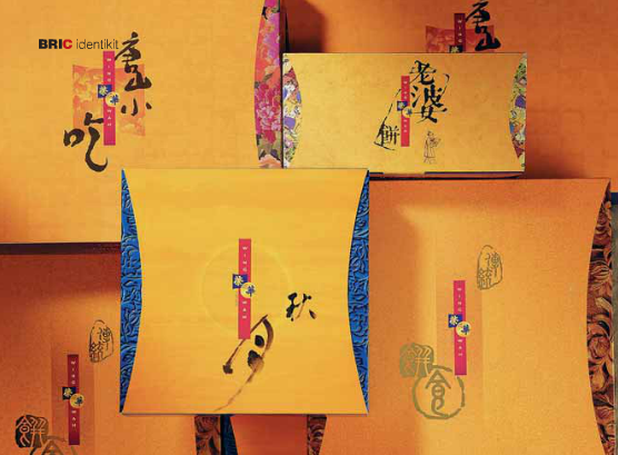
Our work for Wingwah Cakeshop is a good example. Initially a traditional Chinese bakeshop that only served local customers, after working on the brand identity, designing new packaging and a new brand logo, Wingwah was turned into a modern, international type confectioner, so much so that it has rapidly become one of the most successful Chinese confectionary souvenir and gift stores.
The new brand identity and packaging design helped pave the way for its highly successful market expansion.
On this count, we wish to add to Kan Tai Keung’s words that, as far as the new company logo is concerned, the characters of the name have been inscribed in a square and a circle, respectively corresponding to the shape of a Chinese cake and a full moon.
A peonia is formed at the intersection of the two figures, another historic symbol of the company and thus worthy of mention, inasmuch as, the designer states, when you renew the image of a client you can in no way afford to overlook their origins, their history and their philosophy; in turn, as far as the packaging is concerned, the shop carrier bags, bags for the traditional Chinese sausage and the packs for the “wife” and “mini moon” cakes were all revamped.
The classic “traditional moon cake” only underwent restyling, so as not to impinge on its timehonored image. Indeed, some of the features of the preceding packaging were kept – the color blue with the moon and peonia – but as well as the new logo, other significant improvements have been made.


