Launched in 2007, Monocle is an exclusive English magazine that covers topics ranging from international business and economics to culture and design. Monocle online has in short time become a valuable source of news and updates for the global market. What’s more, in order to guide it’s reader’s tastes and keep “an eye and an ear on the world”, Monocle has also opened a radio station and a store, with a selection of truly unique products.
Products such as the line of perfumes Scents 1, 2 and 3, produced exclusively by the perfume maker of Commes des Garçons, Antoine Maisondieu. The fragrances are inspired by unique and special atmospheres.
Scent number 1, for example, called Hinoki, recalls a still spring morning spent soaking in the baths of Kyoto’s famous Tawaraya Ryokan; the second, Laurel, on the other hand, is meant to capture memories of a sojourn in the ancient city of Batroun in Lebanon, the aroma of an ancient Mediterranean garden punctuated by the warm and strong essence of the laurel leaf.
Sugi (Japanese cedar) is the third fragrance, with a delicate, clean and energizing aroma, a blended scent that combines ingredients like the Mediterranean cypress, the pepper tree of Madagascar, the Florentine iris, the Virginia cedar and the vetiver of Haiti.
The packaging recalls the magazine’s elegant style, retro and contemporary at the same time. A few typographic marks, minimalist etchings on white, black or cream background, reminiscent of the unmistakable style of Fornasetti. Lacking any ostentatious decoration, understatement is preserved in the most typical English fashion. One would be hard pressed to do better for a perfume released by a periodical.
But that’s another story.
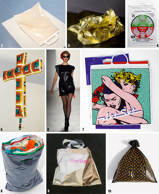
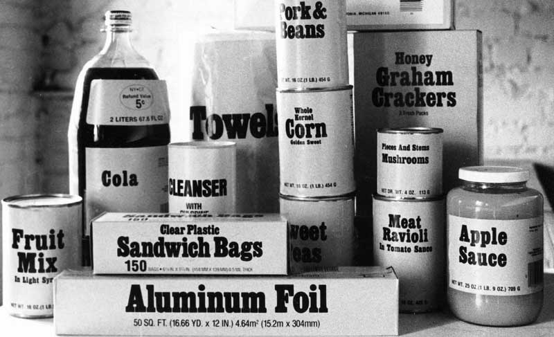
Eternally present, for good and for bad, plastic bags are in many ways the prime symbol of our globalised society. Now even in a museum, carrier bags the likes of which have never been seen, between art, sustainability and design, a show that invites reflection.
The show that has just finished at the mudac – musée de design et d’arts appliqués contemporains, Lausanne, is one which, facing off stories of day-to-day life with art and design, reveals how the humble carrier bag can also become object of ones desires.
Comprising some thirty items, the show brings together international designers and artists and highlights the history behind the plastic bag seen through the lense of culture, aesthetics and politics. Cult packaging or rubbish, revered or slighted, the plastic bag splits opinions and reveals the consumer behaviour of the people who use them.
If on the one hand due to its graphic contents and iconic power it can bolster our status and our identity, on the other, excessive and improper use (especially in terms of its disposal) causes problems of environmental decay that cannot be ignored.
And thus, thanks to film clips and debates on possible alternatives and on the evolution of materials, and via installations, sculptures, photos, paintings and objects – not only contemporary works but also pieces from private Swiss collections, like Joseph Beuys’ bag made in 1972 for the installation Büro für Direkte Demokratie durch Volksabstimmung at Documenta Kassel – this show, original and well-conceived, has been capable of carrying out a critical, indepth analysis on a packaging item that is as banal as it is impossible to ignore.
Beauty, contents and containers: an interactive map for reading the contemporary world.
Packaging. A mixed blessing. Fatal attraction- you either love it or you hate it – that indissolubly forever binds us to goods.
In an evermore versatile and impelling way, packaging today constitutes the link between society and the world of industry, it is a bridge that connects territories that appear distant and yet that constantly interrelate.
As far as beauty is concerned, for over 45 years cosmetics and high-end Italian products have found a befitting setting in the Cosmoprof fair, place in which the atmosphere and the spirit of the times can be grasped close to; cosmetic packaging (along with food packaging) is in fact an absolute indicator of the changes in our lifestyles, intercepting the way trends are evolving, interpretation of the most advanced biotechnological studies.
By now you cannot separate a scent or a cream from the image that its packaging communicates – whether this belongs to a mass or a niche market, both if one is dealing with a new cosmoceutical finding or a biodynamic treatment. It is through the ways of interpretation offered by packaging that “pleasure goods” are able to appear more emblematic and intriguing. The task of the packaging hence is to adequately interpret the story that lies behind the development of a new cosmetic product, it being the duty of Cosmoprof to show it off at its best.
In other terms, one can say that it is indeed packaging that defines our daily experience, acting as a fact-finding interface, mass-medium through which we not only gain information but with which we form our taste, express our judgement, build our image. It is not by chance that it is considered an important worktool and motive of interest for many specialists, but that has also become an incredible field in which to experiment for artists and designers, directors, philosophers, intellectuals, writers and poets. Packaging marks out the folklore of post-industrial man and woman and to all effects has become a form of popular culture. You can no longer escape it.
As demonstrated by the magazine Impackt, that from 2002 to 2009 gathered and highlighted the reasons for so much attention, pinpointing the surprising connections between packaging and the liquid society in which we move; but also by uncovering and recounting exemplary as well as peculiar cases.
Well beyond the materic nature of the products and the physical nature of the product process, for Impackt packaging has always been a sign to be interpreted, a phenomenon to be investigated, an expressive means to be shared. Through packaging in turn Impackt has been able to grasp and transmit the most interesting aspects of our contemporary way of life and, to make the same accessible, it has become an alternative tool and way of interpretation.
Today, exploiting the opportunities made available by technology, Impackt again comes to life in the images of this interactive Map achieved along with Cosmoprof/Cosmopack, in a play of references between paper and the web that underlines the importance of a concept and of creativity, capable of going beyond the set pattern of things.
Framing the QR code on the image of the Map with smartphone, you enter into the world of Impackt, as ever a valid “tourist guide” conceived to cross the real and mental panoramas of the world of packaging.
Because if you aren’t born “”Impacktian“”, you still have the chance of becoming one.
Not only does “good packaging” save the product, but also the feeling with consumers.
We’ve spoken about “immaterial” elements of a pack many times, with special reference to brand communication, the product used to convey cultural messages, etc. Now, even when talking about safety one simply can’t avoid noticing that, as well as the chemical/physical properties of a product, “good packaging” is designed to safeguard certain invisible, intangible elements, such as aromas, flavours, colors, the general aspect of the product and even the feeling that links it to each consumer.
Aromas, for example, can be a pleasant experience, if a perfume, but things change dramatically if they’re too strong and pervasive, invading the surrounding atmosphere.
The producer of Roquefort Société – the cheese with its strong aroma that one either loves or hates – is an expert on the matter.
Those who hate this particular cheese are quite happy to dine (temporarily) in the presence of the cheese, but once the wrapping has been opened and the cheese is left in the fridge, its strong aroma pervades and invades every other item in the fridge. Full merit, therefore, to the Roquefort Société packaging solution: a two-level pack plus foam cushion for virtually hermetic sealing.
On the other hand, when the flavour and aroma are the object of veneration, as in the case of cigars, the consumer feels that the producer has a sort of moral duty to avoid any loss in intensity and quality. The individual aluminium screw-top pack used by certain brands, plus the classic cellophane wrapping, has the defect of making the product less visible, but at the same time it protects the cigar from light and lost aroma, meaning that it should guarantee quality for loyal consumers. We’ve used the conditional tense here as, in practice, once the cigar has reached its destination safely, it has to face (like all other products) the harsh shock of reality and the foibles of the smoker, plus the fact that each individual perceives the flavours and aromas differently… meaning that it’s practically impossible to guarantee that the cigars have a single, uniform flavour/aroma.
Packaging becomes deceptively discrete and silent (even mimetic), when the aesthetic aspects of the product need to be guaranteed, something that’s very important for the Japanese market. Colorful-ru chewing-gum, for example, have their main characteristic embodied in their name, an absolute priority. In this case, what the company’s actually selling isn’t a new fruit flavour or less sugar and low calories, but rather a color experience. The main value to be protected is therefore the availability of the chewing-gum in a range of colours and organised by shade, ranging from light beige to dark burgundy. It’s thus worth the risk of over-packaging to guarantee stable positioning of the product. Thus, as well as an external wrapper (naturally transparent), the pack also includes a tiny plastic rack that forces the chewing-gum into a sorted order, from the moment of packaging to final and complete consumption.
In the pharma industry, product safety (chemical and physical) is, of course, crucial and unavoidable. In fact, administration methods over recent years have been dictated, to a certain extent, by the packaging. For example, if we recall the old classic glass pipette.
However, if we want to consider invisible immaterial safety, which deals with consumer psychology and his/her feeling for the product, we shouldn’t be surprised by the criticism coming from women for a certain type of packaging. This has happened with certain contraceptive pills, while perfectly guaranteeing the product, the producers had started to eliminate the use of the printed calendar that used to help women to take the Pill regularly.
Even if each woman is aware that certain guarantees – such as memory – are intangible and uncertain (as it’s a given fact that all women have forgotten to take the Pill at least once). Even the younger consumers, who aren’t accustomed to the traditional use of the product, have criticised this move, calling it psychological terrorism: their mental certainty was obvious compromised.
To conclude, maybe it’s just the infancy sector that can allow to play with the perception of safety. The huge lollipop disguised as a space weapon is conceived as a sweet-product and then, via its packaging, a weapon for attack/defence. Of course, it’s not true, and yet thanks to this combination of violence and sweetness, young consumers start to become familiar with the volatility of feelings and the absence of certainty in the real world. This sugary weapon can, at the same time, offer a feeling of strength and goodness, turning each child into a new Robin Hood. So, like this famous character, each child can spread a bit of “sweetness” on the face of his classmate and so ably cross the thin line that separates naive cruelty and extreme goodness.
The toy industry today is governed by some special rules these days, but there’s still a doubt for all the other products: is packaging really just a container without any other responsibility, apart from the protection of the goods within?
Maria Gallo designer, Co-ordinator for the Master in Packaging Design 2006 at the Istituto Europeo di Design (Milan).
Contemporaneity, the design project, packaging: free-spoken reflections of one of the most acknowledged exponents of contemporary design, Karim Rashid.
Sonia Pedrazzini
Karim Rashid is an Anglo-Egyptian designer who grew up in Canada and is resident in New York.
He is a multifaceted and prolific designer, he has designed all kinds of things, from cosmetics to furniture, to products for the home, to objects, to lights, clothes. He has imposed his creative touch on sectors such as design, graphics, communications, art, music (he is even a popular DJ) and his products have been used in films and in programs on MTV. Rashid’s work is much appreciated and sought-after by the big international brands (including, to cite but some, Sony, Armani, Shiseido, Prada, Issey Miyake, Yahoo) but also by young concerns that make design and innovation their own winning force, like the Californian concern Method, for which the designer has created dispensers and flacons revolutionary in concept and unusual in shape and use, pleasing to touch and appealing to the eye.
But not only this. His design projects are on show in the most important museums and art galleries the world over. He has also written, published, taught and held conferences around the world.
Karim Rashid considers himself a cultural provocateur and does not hesitate to express his ideas on design, on objects and on the contemporary world with force and conviction.
Karim, what is a “design project”?
I must define design. Design is not superfluous decoration. Design is not a bonsai arrangement, or hand painted decoration on flowerpots, this is all arts and craft. To design is to create, fashion, execute, or construct according to plan – to conceive and plan out in the mind, to make a drawing, pattern, or sketch for a specific program. Therefore it is a methodically planned program not an incidental craft. Design is really to develop a construct, a new condition for our manufactured world. I really define design as addressing and fulfilling our contemporary needs and desires. Design is also not about old styles or replicating past decoration but it is about developing contemporary solutions that are about the modus in which we live. A company today that engages designers and is design driven, deals with the social, political, creative, aesthetic and behavioural issues of today, not of the past. Today in a consumer society we do not need a lot but we desire a lot. Design is not anymore problem-solving but a way of developing solutions to these desires, to our poetic, aesthetic, emotional, and cultural aspirations. Design is also the means to progress and innovation, and design is a necessity for companies to develop goods that meet these new consumer expectations. If a company does not perpetually innovate today they cannot survive on the global playing field that has now opened and is here to stay. One cannot think locally anymore.
Did you have an ideal project (not necessary in design) that you had the possibility to realize?
I am proud to go beyond the industrial design field.
I have shown artwork now for five years (Sandra Gering gallery, Deitch Projects NYC, Elga Wimmer gallery NYC and many museums such as the Institute of Contemporary Art) and have been published in art reviews but the art world has trouble taking me seriously especially when you can buy my democratic products for very little. I am one of the few designers in the world that produces and shows fine art and I am proud of crossing that boundary.
I am also making music, film, and fashion. My real desire is to see people live in the modus of our time, to participate in contemporary world, and to release themselves from nostalgia, antiquated traditions, old rituals, meaningless kitsch. If human nature is to live in the past, to change the world is to change human nature. I realized that design has the power to radically change social, political, and human behavior, that design was a means to shaping our betterment, to sculpt a world of ease, a world, of beauty of intelligence, and of comfort, I realized that design is a term that describes the notion of contemporaneity, that when we refer to design, we are speaking about addressing contemporary issues, that we are shaping “the now”. When I was young imagined a world that is robotic, where all our objects and products would be produced without laborious hand labor. I also saw a world that would be seamless with technology, a place where we could communicate audibly, visually, in real time everywhere, anywhere, and I saw our environments as intelligent, energetic, hyper aesthetic places. I also believed that new visions of building, cars, products, furniture, clothing, art, would be really inspiring digital, infostethic, and I went to Expo 1967 in Montreal almost everyday with my father and brother and the world I saw being shaped by people like Buckminster Fuller, Sarrarin, Colani, Nelson, and so many others was the world that I was hoping I would grow up into. AND THAT WORLD IS HERE and even more beautiful, more digital, more visceral, more behavioral, more communicative, more phantasmal than ever and I want to continue that mission, so that we all can embrace and engage our contemporary world.
Concerning creativity and design. Do you follow a particular method when designing your products?
Every project has slightly different methodologies. About 50% of the time the ideas come to me during the first meeting; but I believe in a rigorous process so I try many concepts, many many sketches, researching processes, technologies, material, human behaviors and strangely I arrive back at the first idea. And with other projects it takes many concepts to get the perfect idea. I am inspired by words, by philosophy, by art, by popular culture, by music, by everyday life, by computers, and digital programs and tools and technology. But technology should now be seamless with the production of goods, the material, with the design process, and with the disruption, and recycling of the product. But it is not imperative that the consumer knows this. I think that the object should just play its human role and the technology take a back seat in making it democratic, high performance, poetic, and behavioral.
How do you see our future world?
Design will be our common landscape where it will not make a difference where something is made, who made it, but instead that it is experimental, behavioral, smart, seamless, soft, and human.
I believe that the new objects that shape our lives are transconceptual, multi-cultural hybrids; objects that can exist anywhere in different contexts, that are natural and synthetic, that are inspired through telecommunications, information, entertainment, technology, new behavior and production. Our object culture can captivate the energy of this contemporary universal culture of the digital age. The birth of new industrial processes, new materials, global markets all lend inspiration to reshaping our lives.
And about packaging?
It is time that all our products become beautiful and smart regardless of cost. Even the cheapest packages should be aesthetic! In the 21th Century every package is being reconsidered and designed. I believe that packaging is very necessary and can bring a greater, more engaging experience to people. Generally bottles in cosmetics become more important than the fragrance. But in cosmetics one is selling immateriality and there is so much work, expense, and complexity in creating scents, that the package must be the ambassador of that scent and communicate its essence. Essentially one is selling something immaterial that is complex and abstract so the bottles gives a fragrance, identity, brand, and a sense of the material interpretation.
Bottles have been overly embellished for hundreds of years and became quite monumental. Historically all products were far more decorative and ornate than objects today. They spoke of ritual, religion, class, luxury, royalty, and iconoclasm. Today high design gets relegated to a perfect rectangle; this is boring, we need a bottle that semantically speaks about the scent and attitude.
I designed many packages that have second functions (and utility) so that you never throw them out. I started this trend in cosmetic packaging.
I love designing cosmetics. I feel very comfortable in this field but I stay broad so that I never specialize in any field. I do not believe in specialization. I think that the world is borderless and I navigate between all the professions of Design, architecture, art, interiors, products, furniture, exhibitions, accessories, clothing, etc. Blurring these boundaries affords me to see each area, each typology differently and in a new way and each project inspires the next.
You designed the Prada monodose cosmetics, what can you tell us about that?
The concept of the Prada monodose packaging was the concept of travel, our nomadic existence, and being flexible to carry only one-time use doses that could be never be tainted by the outside air, so there are no germs or bacteria, so that you use perfectly fresh, concentrated, pure amounts that are no more than what is needed. So if you go on a trip you just take what you need, or if you go out at night, or to the office, you only take the right, perfectly sanitized amount. The packaging was complex and we developed 38 different small ampules, bottles, and vials, that were all developed from scratch being unlike existing packaging. It was a 3 year project with a great deal of engineering and research.
What is the role of objects in our society?
In the excrescence of goods, and the system of objects, the possibility of over-consuming, of addition, and immediate satisfaction of consumption is dangerous. We surround ourselves in life with effigies, objects, products, to find meaning in our existence, and to create a sense of memory, of presence, and of belonging. But we also consume to occupy time and to fulfil some strange need of reward and ego. We will forever have objects in our world, and I am not advocating not consuming them but rather being hyper conscious of our things and love and enjoy them. If not, we had better do without them. Objects denote our time, place, and relationship with the outside world and others. Objects can have a phenomenal relationship with our daily lives and us and at the same time objects can be perpetual obstacles in our life, complicating it, and creating stress. To add more to one’s life, one can also subtract or remove, so that instead of consuming, one “deconsumes”, a theory of addition by subtraction where less can be more. Yet not a minimal or reductive approach but instead, a way of enriching ones life, of increasing experiences through beautiful things, through things that we love, to edit our choices and have a richer life – ultimately creating the most important luxury of the 21st century-: free-time. If we can remove banalities, frustrations, time-consuming scenarios, with time on our hands we can spend more time thinking, creating, loving, being, and use our time in a more constructive way, taking on a more contributive role.
This could also just make us happier beings in that we are too bombarded with pettiness, with mediocre issues, with banal experiences.
A form of growth by subtraction.
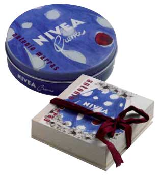
Sometimes it happens that high and low meet in the middle, that luxury and the mass market intersect, that haute couture and packaging join forces and generate worth. It happens above all when the protagonists of the new edition of Nivea Glam are a cult cream and a visionary couturier such as Antonio Marras.
Sonia Pedrazzini
Marras’s style is unmistakeable, both in the world of fashion – where he is a unique case in Italy with his imaginative and unconventional idea of fashion – and in those other cultural and artistic activities in which this tireless creative man is constantly involved.
The key elements of his work are the story, ornament and a revival of craftsmanship.
At the root of every collection there is always a narrative idea, a story, often focussing on people and events linked to Sardinia, the place where he has chosen to live and work, far from large cities and the most important centres of finance.
Recurring and deeply-felt themes are identity and difference, travel, nostalgia and loss but what makes his clothes speak, what constitutes its communicative aspect, is ornament, for which the designer declares an unbridled passion.
Thanks to ornament the form may involve us emotionally and physically. This leads to a genre of fashion, such as that of Marras, which is lavish with details, sartorial works which require extraordinary manufacturing techniques and often call on the knowledge of the artisans of Ittiri, keepers of the Sardinian tradition of embroidery.
Story, ornament, craftsmanship.
Marras has used the same ingredients in order to redesign the packaging for the special edition of Nivea cream.
The protagonist of this story is a stylised female figure with a retro look and dreamy eyes who changes clothes on every page, while the legendary crème, redesigned with maxi polka-dots on a blue background, continues to peep out from the cut-out window, until, on the last page, the Nivea-doll actually comes into life. Indeed, she can be removed from the book and dressed like the paper dolls we used to play with.
The book is held together with a ribbon made of burgundy cloth and comes in an ecru canvas shopping bag which appears to be hand-drawn. The whole has an extremely sophisticated and well-crafted look and is produced in a limited series of 2,000 numbered pieces sold at a price of 30 euros.
It does not matter what the response is. In this case the fairy tale has a happy ending as both the designer’s fee and the sales profits will be donated to Emergency in order to back an important project: the creation of a children’s surgical ward at Lashkar-gah hospital in Afghanistan.
Antonio Marras, you have dressed the packaging of a historic and highly popular product like Nivea cream in your own style. Can you explain how this partnership began?
The offer to invent a limited edition of the ultra-famous Nivea cream arrived exactly one minute after I had promised myself once again never to accept another offer of work due to having far too much to do. But the instinctive liking I feel for this white cream, that oh-so familiar image and that unmistakeable perfume, meant that, once again, I was unable to keep the promise I had made to myself.
For a curious person and style lover such as I am it was impossible to resist the temptation to “desecrate” this true, immutable icon. Is there anyone anywhere in the world who wouldn’t recognise this blue tin with its white lettering, unchanged for over 50 years, one of which is found in every home? Indeed, it is no coincidence that I wanted to work on the most classic packaging, excluding the handbag version, which is very pretty and practical, but already far too “fashion” and modern compared to the project I had in mind.
The first instinctive idea was to “dirty” the severity of the blue with white polka-dots and to give it a texture thick to the touch. In concocting a box to contain it the idea gradually emerged of a book-object-doll who comes to life on every page. In the end one might say that the container has almost got the upper hand compared to the original object we were asked to work on, taking into account the fact that it all comes in an ecru canvas shopping bag with a print that looks handcrafted.
Speaking of packaging in more general terms what does packaging mean to you within the context of contemporary taste?
For me it’s fundamental! I have bought things merely because I’ve been absolutely fascinated by the packaging that contained them and totally uninterested in the content… On the other hand, I have always paid a great deal of attention to what is required in order to announce and communicate the object. From the very start I have invested a great deal not just in economic terms but, above all, in philosophy and creativity, when designing the invitations to my shows. As I treat my collections as though they were stories to tell, the shows are the backdrop to the story and the invitation is a kind of introduction. The same thing goes for packaging.
What is luxury? A lifestyle, product quality, a mental state…
The word luxury, taken by itself, is meaningless. It is too broad and generic to have a unique and shared meaning. Luxury understood merely as a costly object seems to me to be very far from being a mass phenomenon, above all in these times of real hardship. Only luxury palliatives can be defined in those terms.
Personally, the luxury I most aspire to is time: not free time, mind you, but time to manage to do all those things I would like to do and dedicate more time to.
The world of fashion increasingly dialogues with that of contemporary art. How do you see this relationship considering too your direct, personal experience such as your partnership with artists like Maria Lai, Claudia Losi, Carol Rama and the events which you create every year on the occasion of Trama Doppia?
I think that today these categories should be partly redefined. It is no longer a question of lending or reciprocal interest. What happens is that the boundaries between art and fashion become increasingly blurred to the point that there is a whole swath of intermediate experiences, difficult to classify in one or the other environment. Personally, I have always felt the strong necessity and importance of working on spaces of autonomous creativity. Freedom is a luxury which allows me to create something which is transversal to fashion, something which emerges from independent moments in my life, as in the case of meeting Maria Lai or Carol Rama. Their mode corresponds naturally to what I have always created. I am certainly someone who is lucky to do what he loves: a job which allows me to mix everything, clothes, music, theatre, cinema… I have just thought of an episode involving Maria Lai herself. Once I told her I was going to copy one of her designs. She replied “Art is continuous theft. Don’t worry, I steal from all over the place. When you steal something the work becomes yours”. There, perhaps the relationship between art and fashion could be summed up in that image.
In your opinion, what role does fashion have in our society and which direction is it moving in?
Fashion is one of the most efficient means we have of self-representation and therefore it has an extremely important function, even though for most people, including, sadly, those who hold in their hands the fate of the Italian economy, it is a frivolous and insignificant act. It allows us to announce our ethnic group and political, ideological and cultural affiliations but it also allows us to play with appearances, to construct and deconstruct the identity we wish other people to see. More importantly through fashion we can symbolically elaborate change, passing time, the reality that is transforming us at an increasingly rapid pace. We can agree to leave the past behind, to open the door to the present, to look to the future.
Given the critical economic situation we are forced to face, the need for fashion is destined to have more and more influence on the demand for products distinguished by true identity and unique design.
From this point of view Italy is currently unable to compete with other countries who have made experimentation and innovation their strengths.
Therefore, this sector’s potential for growth seems to me to be linked to its ability to renew itself by expanding its creativity. That is what I wish for the good of the sector and for its positive future development.
Makeup almost never lie, though they always deceive
The word ” makeup” conceals an inauspicious and misleading significance. It conjures up a superficial process, an outward transformation, leading us to believe that there is another truth, a reality, hidden underneath what is applied like a mask to veil the imperfections of reality and to enhance the appearance of the wearer by falsifying it. Due to this masquerade, which I hold to be a sort of universal legacy, our attitude toward makeup has remained deeply ambivalent. On the one hand, we are left pleasantly surprised and charmed, while at the same time, we view it as a camouflage that hides the true Self of the wearer from the eyes of onlookers, a sign of weakness conveyed through an inappropriate show of strength.
In reality, things aren’t quite so simple. It doesn’t take much to figure out that this true Self under the mask of makeup is itself a charade and a disguise (a little bit like the “natural and genuine” fruits and vegetables grown with biological farming methods, as opposed to the “imitation and artificial” fruits and vegetables grown using pesticide ” makeup ” and chemical preservatives. Of course, in truth, we recognise that so-called “biological farming methods” are equally based on a series of techniques and procedures that yield a product suitable for large scale distribution; use of the term “genuine” here is questionable, even more so after a spate of scandals shed light on the spuriousness of some producers brandishing the biological label). Who or what exactly is this true Self of the wearer? Freud holds that we can reach a definition of ourselves (in response to the query, “who am I?”) only after a series of successive identifications. This means that in order to know who we are, we have to look back on a photo gallery of all the people we have ever met, loved, loathed, desired, or envied from our early childhood to the present. Clearly, such a gallery would also include fantasy personages: Hollywood actors, pop stars, television heartthrobs, and others we have identified with over the years. So, we are simply a summation of a series of images deep inside ourselves. We are a very personal and original end product, in the same way that we are a fusion of different spiritual beings. It is simply preposterous to ask who or which is the real one.
If this is really how it stands, then what purpose do makeup serve? What end do we achieve by making ourselves up? The answer is simple: for a certain period of time, we decide to bring to life one of the many “spiritual selves” that comprise our identity; we animate it to have it perform a specific function, which may be to elicit admiration and desire (which is true in our western societies) or denote an aggressive or a threatening intention, as was the practice in traditional societies.
As soon as the seductive purpose or the threatening objective loses importance, the personality drawn out can return to its place among the others, without it remaining dominant over the personas.
So, then, makeup almost never lies, although it always deceives.
It doesn’t lie because it always reflects a true aspect of the wearer; it always deceives because it incarnates a single aspect, allowing it to prevail over all the others and giving the false impression that this is the only one.
The warrior is not only a warrior: he is also a farmer, father or other figure; a woman is not only a femme fatale; she may also be a mother, housewife, or companion.
Nevertheless, it is still not sufficient to explain what it really means to apply makeup and, in particular, if this process is still possible today. If it’s true that makeup is not a simple falsification to disguise the truth, but always and only represent one of the personalities of the person using them, then we must remember that in order for this process to have any sense, it must be socially defined. makeup is an unparalleled way to represent the symbolic order of belonging: there is nothing less easily exported and nothing more characterising.
And in fact, unlike works of art, maquillage cannot feed simply off the creative energy of the wearer; it must draw its source of principal inspiration from a series of well-defined experiences. We apply makeup by following a definite model and the success of the action is measured on the basis of the social efficiency that it achieves. Applying makeup is a symbolic and real practice. All this is much more understandable when we reflect on how easy it is for anybody to notice the showiness of excessive makeup, as if each one of us possessed a specific and absolutely iron-clad set of aesthetic rules.
In the case of makeup, like no other product, does the old adage “beauty is in the eye of the beholder” become “beauty is what meets precise social needs.” Its seductive power depends on the culture where it is used. The makeup used by women in the more primitive societies charm the members of their groups, and yet are viewed as grotesque in ours. The experience is rarely exported with success. The femme fatale and the warrior are models produced by a cultural system that guides the wearer in applying makeup. But what happens when these models cease to exist? When the social system no longer provides points of reference that are not obverse (which don’t represent anything but the gaze of the wearer)? The result is that makeup becomes impossible to use because there is no set reference system; we are left without expressive means, we don’t know what feelings to stir up nor who to refer to.
Another result is that we switch from makeup to non-makeup, from communicating seduction to the seduction of non-communication. The distinction of the gender is lost and the face of the wearer is not left empty or without paint and powder, but allows itself to be covered by mysterious signs whose mystery lies in the fact that theirs is a language without classification, a series of senseless images, like Pollock’s famous dripping paintings: the art work is still there, but it is a non-painting, where only the gesture remains – as if incomprehensible ideograms were written for the pure delight of leaving a sign on the paper.
Antonio Piotti, psychologist, has published (with M. Senaldi) Lo Spirito e gli Ultracorpi, Franco Angeli 1999 and Maccarone m’hai Provocato, Bulzoni, 2002.
In the works of this Catalan artist, packaging is a meaningful container, but also a sharp condemnation of the consumerist world.
Marco Senaldi
The interests of Antoni Muntadas – a Catalan living in New York who has worked as an artist for more than thirty years and is a veteran of Documenta and the Biennials – are directed towards what he, since the 1970s, has called the “media landscape”. By this, he means not so much the invasive presence in the urban landscape of screens, videocameras, advertising hoardings, light-boxes, neon signs and so on, rather the fact that mass communication has eroded the significance of every other form of communication in advanced societies.
All the works created by Muntadas over the years, most of which are gathered together in the large anthological Proyectos which Madrid’s Fundaciòn Arte y Tecnologìa devoted to him in 1998, speak of this theme: the disappearance of meaning in an age when it has become easier and easier to transmit it in many forms.
In This is not an Advertisement of 1985, for example, he used the most famous advertising screens in the world, those in Times Square, New York, to transmit the phrase which is the title of the work – creating a clear short-circuit of meaning. In another work, Exhibition (1987), he constructed a completely empty exhibition, devoid of exhibits, using only the typical equipment necessary to stage an exhibition: spotlighting for paintings on the walls, a video projector switched on but with no video, pedestals for sculptures, a slide projector, illuminated display cases for drawings, etc. It is clear that with works like this Muntadas is telling us that a large part of the fascination engendered by works in museums is due not so much to their content – which is secondary – as to the elegant surroundings in which they are displayed.
For Muntadas, in this age of mass media, it is a fact that the medium truly ends up being the message, the context imposes itself on the text, the frame becomes more important than the picture and, in the end, becomes a part of it.
In this respect, it comes as no surprise that this artist has devoted much of his attention to the subject of packaging, not so much as a container dominated by its trade mark, or as a vehicle for advertising, rather as a frame which encloses the contents over which, in the end, it prevails. On the other hand, the frame, a component which separates, which marks the difference between interior and exterior, between the contents and the environment surrounding them, between the product and consumer, is also a concept which is of itself interesting, because in its turn it can become a vehicle for new and unforeseen meanings.
Called upon, for example, to think of a project for the Maison du Rhone for contemporary French art, Muntadas rejected large structures for the streets or squares of the city in favour of a much more “modest” solution, but one which loomed equally large in local public life – the production of a bottle (of unlimited production, therefore not to be considered as an artist’s “limited edition”) bearing in relief an image of the Maison itself. As Muntadas himself says, “Deep down, is not the Museum perhaps a form of packaging?”.
But the work which is most surprising in its stark simplicity dates from 1987, and is entitled Generic Still Life. In essence, this is a display, on the shelves of the Gabrielle Maubrie Gallery in Paris, of a series of packaged products, and of their “photographic portrait”, as if they really were works of art. The fact that the products selected do not depend on their external graphic appearance, strictly in black and white, nothing but the name of their contents, undoubtedly gives the exhibit the almost refined and elegant tone of a skilful “conceptual” construction.
The artist himself (whom we met during a workshop in Turin) explains that we are simply dealing with goods which really exist, and which can be bought in any discount store, where they are clearly sold in this way to contain the costs of packaging and graphic design.
«I am more interested in this type of cultural approach to detail than to grand theories», he says, confirming that this still life work is in effect part of a larger project on “generics”, or rather on those objects, facts or meanings which, through habit or weakness, we have ceased to consider as “specific” and therefore worthy of attention.
«In Generic Still Life there was a slight reference to the Merda d’Artista by Piero Manzoni, but also to the Spanish canvases of bodegones (Baroque pictures of carafes and bottles); the idea was that of an anonymous product which, if not actually original, takes on another presence, changing its context a little».
Through this attractive displaying of goods in their “generic” form and, even if packaged, totally devoid of decoration, the viewer is forced into contrasting reflections on the status of objects and the desires of the consumer. On the one hand the goods, stripped of the gaudy apparel in which we are used to seeing them on the supermarket shelves, seem grey, monotonous and almost sad, without that seductive appeal which we have been used to for so long. On the other hand, displayed like this, within the aristocratic framework of a fashionable art gallery in a European city such as Paris, they assume an additional value, an aura of artiness which imbues their modest graphic facade with a sense of metaphysical abstraction.
Above all, Generic Still Life demonstrates an extreme formal cleanliness of line which by no means coincidentally recalls Spanish still life of the 17th century, together with an almost Morandian composure – very beautiful features which do not, however, erase the subtle condemnation of the frenetic consumerism which characterises our relationship with objects at this stage in the century.
«I don’t like packaging very much, I’m quite anti-consumerism… If I have to buy something, I get hyper-nervous. The thing that has always surprised me here in the United States is that people go shopping together, as if it is a socialising event; although in Spain, too, you hear people say “vamos de compras” (let’s go and buy)» says the semi-nomadic artist.
«I don’t even like collecting things. The only thing I’ve collected for years – and I’ve got loads of them – are those cards they put in aeroplanes with instructions on how to save yourself. They’re things which nobody reads. Strange, because they would help to save you – if something happened, you’d look really stupid if you hadn’t read the instructions. They are amusing because they are based on figures but, although the message is always the same, the pictures are different; each country and each airline interpret them in different ways, Lufthansa is different from Iberia, Quantas from Alitalia, and so on. They tell you a lot about the culture of the country they come from; but even though the pictures try to be generic and clear, the fact is that this “clarity” is a concept which can change – in some cases, for countries like Korea and Japan, it is downright baroque. This is why I have used them for something I’m working on called On Translation, something I’ve been engaged on since 1997.
What really interests me is this relationship between the standardised and the specific.
I’m also engaged on a work for Barcelona, on the museum merchandising of Mirò. La Càixa, for example, a very large Spanish bank with an intensive cultural program, has taken its logo from a design by Mirò, as has Iberia Airlines, and also the Spanish Tourist Authority, for its advertising. At the Fundaciòn Mirò it’s all merchandising, which goes from plates to t-shirts, from socks to underwear! Then, when I was in Cuba for the Havana Biennial, I saw that the same thing had happened with Che Guevara…In Spain, the museum has exploited the merchandising, there the whole country has used it!».
Muntadas’ charmingly intelligent musings make you think… Are, perhaps, even states, countries and nations being transformed into gigantic packages, with their bold colourful logos and instructions for use, without us, being generically unaware, even noticing?
In Hong Kong the top professionals of graphics go under the name of Kan & Lau. Tradition and the contemporary, East and West combine in the packaging of two reputed Chinese designers.
Sonia Pedrazzini
Kan & Lau Design Consultants is one of the most important graphics agencies in Hong Kong. The studio has been operating since 1976 and its two founders, Kan Tai-keung and Freeman Lau, are two well-known designers who have won many awards and acknowledgements at both national and international level. In 1993 Kan was selected by IDEA as one of the 100 best designers, whereas Lau – leading figure in the industrial design segment – won the Hong Kong “artist of the year” award. The agency concerns itself with design and creativity all round: from advertising to coordinated image, from packaging to industrial design, exhibition design, cultural activities, even public art. Not only that, thanks to a valid team of international, multicultural co-workers, the development of new products covers both the Asian as well as American markets. East and West encounter and meet up in the form of packs, boxes, bottles, products and objects in general, all rigorously highly professional.
Among the array of creations by the two designers some of the more recent deserve a mention, like the trophy for the China Top Ten Benefiting Laureus Sport for Good of the year 2004 – better known as Sports Oscar – made by combining the stylised silhouettes of the athletes in movement, the figures being drawn from the Dao Yin map, one of the oldest testimonies of sporting activities; or the logo of the new CCTV News TV channel, where the English word ‘news’ has been integrated with the Chinese ideogram for correspondent, great care being taken in blending the eastern calligraphy and the western alphabet; or again, the work on the concept and coordinated image of the Chinese children’s clothing brand Aico, where mascots and cloth dolls tip a wink at the graphics of the Japanese Manga.
We interviewed Kan Tai Keung, one of the founder members of the studio and since 2003 lecturer at the Cheung Kong School of Art and Design at the University of Shantou.
Considering the huge economic and social changes underway, how has packaging in China changed over these last decades and how will it change in the future?
China’s economic growth in the last decade was speedy and is there for all to see. Social improvements have helped strengthen local markets as people’s purchasing power increased. Nowadays Chinese enterprises are not only appreciated for the quantity produced, but also for their care for quality of their products. Hence a good product design is fundamental. Place the former in a competitive scenario and you can get a successful local brand. A unique design and packaging contributes to sharpening the competitive edge.
What are the main differences between packaging created by an oriental and a western designer?
I would say that oriental and western designers aim at the same thing. That is to fulfil the basic function of design. Oriental designers have been influenced by the modern western design concept. However, they are better positioned to meet the needs of the oriental market as they are intimately acquainted with oriental living habits. They are more suited for building up the branding culture of local enterprise.
Is it easy to become a successful packaging designer in China?
Packaging design in China is going through a phase of development. There is still huge room for improvement. The industry needs talent to help foster this growth. For example, designers should construct their own ethics and keep up a level of high quality. Moreover, how enterprises cooperate with designers and how they respect the industry is important. The design profession in China is still in its infancy, a lot more still needs to be done.
Could you briefly mention one of your most successful projects?
Our work for Wingwah Cakeshop is a good example. Initially a traditional Chinese bakeshop that only served local customers, after working on the brand identity, designing new packaging and a new brand logo, Wingwah was turned into a modern, international type confectioner, so much so that it has rapidly become one of the most successful Chinese confectionary souvenir and gift stores.
The new brand identity and packaging design helped pave the way for its highly successful market expansion.
On this count, we wish to add to Kan Tai Keung’s words that, as far as the new company logo is concerned, the characters of the name have been inscribed in a square and a circle, respectively corresponding to the shape of a Chinese cake and a full moon.
A peonia is formed at the intersection of the two figures, another historic symbol of the company and thus worthy of mention, inasmuch as, the designer states, when you renew the image of a client you can in no way afford to overlook their origins, their history and their philosophy; in turn, as far as the packaging is concerned, the shop carrier bags, bags for the traditional Chinese sausage and the packs for the “wife” and “mini moon” cakes were all revamped.
The classic “traditional moon cake” only underwent restyling, so as not to impinge on its timehonored image. Indeed, some of the features of the preceding packaging were kept – the color blue with the moon and peonia – but as well as the new logo, other significant improvements have been made.
From the vacuum packed armchair to the “supercandy”, packaging as a container of goods is dead. Its place has now been taken up by an invisible, but at the same time even more present emotional interface.
Maria Gallo
The leading lights of the mythical images pertaining to commerce, colored, sensual and attractive packaging, that convert the shelves of the supermarkets into psychedelic Wunderkammer, have for some years now been undergoing a slow but radical change. A process that probably already began in the eighties when, while all the same in some sectors such as perfumery but not only that, the imperative was to “amaze”, some packaging already launched timid signs of change. That was just before the launch of the provocative female busts with girdles of the perfumes of Jean Paul Gaultier. At the same time Oréal launched its new line for the young of its hair products Studio Line, with containers clear-cut and simple in their shape, with colored minimalist graphics that stand as clear quotations of Mondrian’s primary squares.
Certainly still too little to start talking about the beginning of the end, but a precise indication as to the way to be taken: packaging, that up to then had been a purely functional container for merchandise, at the most decked with appealing graphics so as to be eye-catching, was on the point of changing into a sort of crystal ball where the consumer was not shown the real world (which we have before our eyes) but the fantastic universe of the paradisian sensations of merchandise. A sort of tongue-twister of images in which one could lose oneself, at least up until their metamorphosis into waste.
Every product has followed its own way, but for many of them the death of the wrapping was an obligatory stage in the process of transformation.
Some emblematic examples are the Comme des Garçons perfume bottles: oval in clear glass, set down like rocks, closed by small anonymous black tops; the flacons were hermetically sealed in transparent vacuum bags.
Today some five years on, the same bottle is covered in a candid white crotchet vestment bearing a set of wings. The “stone” and its new dressing are once again throttled by a vacuum pack.
Apparent anonymity also for the pack for the Body Shop, Lush or Shu Uemura products, that for some years now have been selling their soaps, creams, eye shadows and powers in transparent cases, in standard flacons and jars or even by the kilo or that is loose, as was the case forty years ago for pasta and sugar.
Evidently, for some companies, the value of the brand and the world built around it has become more important than the single product. Thus the packaging protagonist has been converted into a packaging-tool by way of which the consumer accesses the world or brands. This means that the era of access described by Jeremy Rifkin as the great revolution by which, in the new economy, more than possessing an item of goods, it will be evermore important to get to a service (be this a subscription to an Internet provider or a car to be used three days a week) could already be said to have begun, only we haven’t noticed it yet.
Already in 1985 Vodka Absolut launched an operation that, from then on has involved hundreds of artists and designers from all around the world in order to reinvent to infinity their anonymous bottle. In this way a sort of artistic network has been set up where the consumer not only takes part by visiting itinerant exhibitions, but also by buying the vodka. Even so today, this emblematic product, is launching new signs. In the latest advertising in fact the bottle is present in all its “normality”, offering an almost aseptic showing of its sham functionality: some captions, with relative arrows, explain to the consumer the meaning of each writing, symbol or image present on the bottle. Quotation or an about-turn in trends? It is too early to say.
What is more “the aseptic” is one of the categories that is most exploited in the packaging marching towards transformation. A category with scenic presence strong enough even to inspire the creation of true and proper commercial empires.
Non brands such as Muji, the Japanese shopping chain that sells a bit of everything, from beer to chairs to clothing, created in 1980 with the slogan “lots of ways of taking your fancy”, imposes the overall minimalism of the merchandise as the only rule of being “part of the family”, this naturally also including the packaging. Set up in Japan, today Muji has many sales outlets in London and Paris.
The Ikea brand can be considered as one of the archetypes of the minimal pack, what is more applied to a field, that of furnishing, that has always had a troublesome relationship with packaging, in general for good reason; objectively though its minimalism has never ever turned into seduction.
Against this there is a piece of furnishing history, the UP5 armchair designed in 1969 by Gaetano Pesce for B&B, the primary packaging of which, a PVC film within which the armchair was sealed and vacuum compressed like a slice of processed cheese, played a leading role in the overall product. Once you opened the PVC bag, the air returned slowly to the cells of the foam and the armchair once more took shape.
Minimalism, the reduction of shape and material, the skilful use of technological features, for example vacuum technology, in the end become metaphors for the skin of the product that can be shown direct to the customer overcoming the medium of the packaging as occurred in the past.
The same result can even be attained by going in the reverse direction, as Nestlé did with their Polos and with mini Smarties. Here it can in fact be shown how packaging can also die due to an excessive presence, by the will to inform on a gigantic level. We have an example in the tale The purloined letter by Edgar Allan Poe, in which the Queen’s letter is “hidden” by placing it where it can be seen most (the embarrassing document is “hidden” by simply putting it there where it can be seen, amidst other innocent missives). In the same way the gigantic Polo in white polypropylene, that contains the actual small sweets, disappears to our eyes as packaging and becomes a precious and seductive testimonial of the product philosophy. It is hard to find someone who has had the courage to throw away this little/great piece of everyday pop art.
But if the merchandise burst in like bodies on the commercial scene, it goes without saying that they will also end up as coming under the tough law of life and death.
However there is someone who has seriously decided to play with death, finally breaking down one of the greatest taboos in merchandising. We are speaking of the “adbuster group”, the subversives of global trade that for some years now, every year organise a “no-buy day” as a sign of protest against prevailing consumerism. The unwilling tool of one of their shock campaigns has been the camel that for many years now, has promoted Camel cigarettes. In its honour an alter ego has been created, that in truth, is not in the best of health, called Joe Chemo, that has in fact become one of the leading lights of the anti advertising campaign invented by adbuster. As the name suggests, the poster contains a comic strip with a camel with flebos inserted in its body as it wanders around, with its eyes half-shut, along the hospital corridors: the image suggests that, after having smoked so much, Joe Chemo is now dangerously ill and is about to end his days. It is clear that the death of the camel would immediately mark the death of one of the most famous packaging items in the world. In October of the year 2000 on the adbuster’s Internet sight bore the request for contributions be able to purchase a large space in order to be able to display Joe Chemo. But already then the cigarette producers had unleashed their legal campaign. To this date we do not know whether the market of the force of the image has won.
All the same death is a prelude to the advent of something new, perhaps unexpected, but not for this necessarily horrendous. So, rather than viciously attacking those that have chosen to give voice to a cardboard camel, the companies might do well to deal with the cultural mutations if, also in the future, they wish that their cans continue to be part of our everyday fantasies.