When the shape strengthens the brand

A recently formed holding, which controls the historic Norda, San Gemini and Gaudianello brands , the Acque Minerali d’Italia Group is launching a new proposal for the HO.RE.CA industry: The Exclusive line of its leading Norda brand, in the half a litre and one-litre PET versions.

The group has assigned the design of the new packaging to the Treviso based company PET Engineering, recognized nationally and internationally for its elegant and sophisticated PET bottles designed for the restaurant sector, with two Packaging Oscars two World Star and two World Beverage Innovation Awards to its credit.The Exclusive Norda design, in addition to expressing a premium positioning, embodies the Group’s innovative drive.

The new shape, unique and distinctive not only for the HO.RE.CA. sector but for the entire mineral water segment, has broken with the classical forms to which the consumer has become accustomed to: two asymmetrical parts of different sections and height are harmoniously connected by a wave, that acts as a structural and aesthetic element, associating all the products in Norda’s range PET containers.

The design definition stage is followed the prototyping and laboratory test phase, to verify the mechanical performance of the container; the project then ends with the supply of the blow moulds and the start-up of the container in line.

The company’s unique vertical expertise in the field of PET packaging and their integrated approach combinging design, engineering and industrialization, has allowed PET Engineering to meet the functional, technical and logistics prerequisites as well as the strategic marketing needs of its customer.

Africa-struck

Cristina Simen and Emanuela Sauve are two interior designers who, after various trips to Africa, stricken by so much beauty, decided to share their passion offering a collection of objects and accessories decorated with African motifs. Among other items, flacons, bottles, tetrabriks, various packs that, instead of ending up as rubbish….
A contamination that we love.

Cristina and Emanuela live and work in Rome and Milan; their professional training was traditional (fake marble, fake wood, trompe l’oeil and everything regarding classical decoration) learned at the prestigious Institut Supérieur de Peinture Van der Kelen in Brussels. It is there where they met and have been working together for ten years in total accord, developing ideas and projects and daring to experiment even on extremely orthodox ground.

suavesimen_3_rossi_WEBAs they themselves admit, inspiration may strike anyplace anytime … a crumbling wall, a stroke of light, a rusty piece of iron, as in this case, by a trip, for example to Africa.
The colors, drawings, the WAX fabrics – printed using a special wax technique – their imaginative way of recycling poor objects destined to be thrown away started off the creative process that led them to create a collection indeed called AFRICA.

This immediately led to the painting of table sets, placemats and centrepieces decorated like the African fabrics that fascinated them so much: and then coffee tables/trays, plates, bags in light wood. Lastly, a series of vases created from packaging of various types: plastic detergent containers or  cardboard milk cartons, carefully chosen and subsequently decorated and painted.

A new dress, simple and to great effect, to embellish and give new life to what we usually  all too hastily throw away.
Next time, think things over a little more carefully, the apparel makes the man. The same also goes for the packaging.

Back to basics

Why not rediscover the pleasure of holding a bar of scented soap? The solidity of an object that gradually melts between our fingers, that we can spread over our skin, like a caress, that seduces us with a minimal, ephemeral but highly elegant packaging.

London Fields Soap Company is an East London company that, in an era of innovative, liquid and creamy detergents, has the ambition of relaunching the classic soap bar of the past.
London_soap_05_WEBTo do so it turned to One Darnley Road, a young company of designers who worked on the identity of a brand coherent with handmade and sustainable, craft and biological products but also to better represent “the aesthetics of cleanliness”, products that ‘looked nice’.

All London Fields Soap Company products are made in small lots, at zero km, in Hackney, East London. Main ingredients include tea and peppermint (ingredients so good you would want to eat them, company head Tabitha Kleinert claims!).

For the new brand, that had to combine craftsmanship and a modern sensitivity, a typical Art-Deco atmosphere, comprising graphics (especially those of the fabrics) and  typographical characters, somewhat updated, were resorted to.
London_soap_01_WEB
The packaging too draws inspiration from a local tradition: London’s East End, in fact, boasts a long tradition of textile design and manufacture. You only need cite, for one and for all, the historic silk and satin manufacturer Warner & Sons, that for over two hundred years has produced wonderful fabrics for the Queen and the nobles of the United Kingdom.

God save the soap

A good game lasts a long time (so too the box)

Playing for  Quercetti family started out as a passion, then became a profession  and soon  developed into a fine skill. It all started out in 1947 with a motorized horse that at a gallop…

Alessando Quercetti began his experience as designer and builder of toys at Inco Giochi, a small Turinese concern.
His first creation, Galoppa, a horse with rider that really gallops, was such a success that it enabled him to turn his passion into a company, Quercetti, that soon became a famous name in the Italian toy industry.

In 1953 Alessandro created and patented in Italy the most representative product of the brand, a re-edition of an old French game, the famous “pegs”. This simple game, optimized in its construction and aesthetics, soon became a  worldwide success, a true and proper cult, still played today by children all around the globe.

Quercetti, that  in conceiving and designing toys, always chose to give absolute priority to the end user, the child, enjoyed many other successes.
The game  indeed is not only seen as a pastime, but as an important tool that aids growth, building an open and elastic mind, helping the child to make decisions; it is an object with such a strong educative potential that it always demands great attention and study.

Quercetti_POLI_internoNaturally, in the philosophy of this company, packaging too covers a fundamental role. Starting from last year, for all its new references, Quercetti has in fact innovated the packs both inside and outside.
The inside of the box is made in recycled cardboard and the packs have been made to be functional while offering minimum bulk, the pieces are assembled logically and coherently in a compact space and the descriptive sheet (a classic instruction manual) has been replaced with a “user guide” in the form of a poster, made in special water resistant paper.
The graphics have also changed and white has been adopted as the basic color on all packs, to make the name and the characteristics of the product stand out.

Every line, what is more, features a band in the Italian colors bearing the wording “Made in Italy” to highlight the pride of being one of the few toy producing companies still capable of creating everything  in the  “Bel Paese”.

Award-winning sky-blue

After a disastrous world cup, we need to console ourselves, for example with a good plate of pasta. Voiello reclads and wins awards and wins over palates.

Voiello, one of the oldest and most famous Italian brands, has always offered a broad choice of pasta formats made with the best grain and following the rules of tradition. Of late though, the image has been hard put to render merit to the premiumness of the products, hence making a project rebranding necessary, this in order to reiterate the brand’s leadership in the high segment of the market.

The task was assigned to the FutureBrand consultancy company that, abovealll working on the graphics, the logo, the color and the shape of the window, has revamped the packaging system of the entire Voiello range.

Spaghetti_FRONTE_webThe new packaging is part of a broader communication plan that, using different platforms, has been devised to best diffuse all the values of the brand.

«Working on a brand that harks back to 1897 gave us the opportunity of exploring the visual codes of that time and study the original Voiello packs» Chiara Pomati, Creative Director of FutureBrand explains. «Indeed those visual codes, so rich in personality, were a main source of inspiration for our creative work».

The result is a simple but all the same refined design, that draws on the history of Voiello and turns it into a synonym for quality, playing on both elements of the past as well as contemporary ones. Voiello speaks by way of its pack and speaks about its pasta with direct, immediate phrases that highlight the pluspoints of the product, reassuring the consumer and reiterating its own savoir faire. The Voiello project won the first prize in the NC awards “Brand Identity” category assigned last May.

Pasta fans are duly thankful.

Man cannot live on bread alone

Is it a provocation or merely just for fun? What thin thread of logic unites a coffee tin with the Cartier brand or a bag of flour with Prada?

The exhibition Wheat is Wheat is Wheat, currently at the Museum of Craft and Design, San Francisco, attempts to look into the role of designer and that of consumer in an era of mass “signature” compulsion.

One cannot deny that the fine images of prosaic food such as: salami, yoghurt, coffee, milk, eggs etc. clad (appropriately said) with the brands most loved by the fashion buffs of all climes – Prada, Gucci, Nike, Apple, Tiffany, LV to cite but some, arouse curiosity.

peddy_mergui_luxury_brand_food_350_webThis is luxury packaging, recognisable by the graphics, colors, details, especially reconstructed by the Israeli artist-designer Peddy Mergui on conventional broadly consumed products, and for this very reason with the power (the power of the brand!) to make salami appear even tastier, flour more refined, coffee even more aromatic.

But beyond curiosity, what remains?

As the selfsame artist suggests on his website, Wheat is Wheat is Wheat leaves more questions than answers.


chanel_500_WEB

eddy_mergui_luxury_brand_food_500_web

salami3_500_WEB

The elegance of packaging

The classic carrier bag, reinterpreted by the skilled hands of the Dutch designer Ilvy Jacobs, takes on refined and elegant forms of a light, humble and ephemeral packaging origami, becoming a chic and original accessory. Ideal for someone who feels like going to the supermarket in high heels.

Ilvy Jacobs holds a diploma in Product Design but her specialty is creating bags inspired by the world of packaging and that adopt the qualities, materials and functions of the same.

jacobs_paperbag_500_web

jabocs_ilvy03_500_webjabocs_cordbag3_500_web

In Ilvy’s work the conceptual and research aspects (like in the series of “Cordbags” that hark back to the artist Christo’s work of “wrapping up the world”, and for which she uses bags in Tyvek, a material that can look a lot like paper with which she manages to emphasize the aesthetic appeal of the object)

But also the theme of sustainability is always present (like for example her leisure time activity “Sport crunchbags”, made of a special material, paperboard laminated to cloth, that, like a sophisticated eco-leather, reshapes the silhouette of these highly particular sports bags.

Going back to the elegant origami Foldbag, it costs 25 euros and can be ordered from website specialised in paper products bl-ij.nl. or directly from its creator. Perhaps with her signature as brand.


The Crystal Skull

Inspired by the legend of the crystal skulls, actor Dan Aykroyd (ex Blues Brothers) and artist John Alexander have designed the bottle for Crystal Head Vodka with the specific intention of cladding one of the purest vodkas in the world with an outstanding packaging.

Crystal Head Vodka is famous for its selected ingredients of the highest quality, additive free and distilled four and filtered seven times over. Over the last three steps it is purified through 500 million year quartz crystals, the famous “Herkimer diamonds”, found only in very few places in the world.

These quartz crystals are the most valuable, clear and powerful of all the known ones; they seem to have the ability to absorb and radiate energy, and allow one to reach high spiritual vibrations; they are attributed powerful metaphysical properties and are said to be of help in astral voyages because they connect the cosmic to the physical plain.
The mysterious thirteen crystal skulls of a popular Mayan legend were said to be made from this very type of quartz crystal compound. The legend has now been disproven from a scientific point of view, but still very involving and appealing, to the point of being a great cue for excellent marketing.

And it is inspired by this myth that Aykroyd and Alexander devised a glass bottle shaped like a skull that has already become cult. The prototype was built by the Milanese glassworks Bruni and the entire design process lasted more than two years and has had to overcome enormous complexities, but, as it seems, it was worth the effort.
crystal_50_rolling_web

After garnering a huge commercial success, the “Crystal Skull” has been in fact chosen by the legendary Rolling Stones as the official vodka for the celebration of their 50 years on stage. Crystal Head Vodka and Universal Music have therefore designed a limited edition box set that presents itself as a display case with zipper, which incorporates the cover of the legendary 1971 album Sticky Fingers. Inside are the distinctive skull-bottle, a cap-jewel engraved bearing the famous Rolling Stones logo and two compilations of live tracks recorded exclusively for this special edition.

In 2013 Crystal Head Vodka was awarded the Gold Medal at the Salon Prodexpo, Moscow, even beating the best Russian vodkas.
The crystal skull is definitely bringing luck.

Les Pet Petits. New sustainable craftwork.

Questions of design and environmentalism. Plastic products in general and mineral water bottles in particular are accused of being the greatest “pollutants” if left in the ecosystem. But has anyone thought about how to turn things around and transform a drawback (in the ‘green’ way of course) – the virtually infinite lifespan of PET – into an advantage: a series of very cool, artistic and long lasting bracelets.

Wojciech Łanecki is a Polish designer and entrepreneur whose wishes create products with a strong emotional charge and bearers of values such as: respect for the environment and for manual work, care for craft quality in the era of mass production, focus on sustainability.
The Les Petits Pet bracelets well represent all this, being new concept contemporary “jewels” in that  they derive from the creative reuse of PET bottles.
lesPETpetit_e3ee_WEB

These objects, however, not only arise from the intent of promoting ecology and recycling but also aspire to being appealing, glamorous and fashionable.

Due to their aesthetic minimalism derived from the work of young artists, these colorful, lightweight ornaments suit  all styles and outfits; they are available in eight colors and two sizes, and are made by hand with great attention to quality.

Each piece has been painstakingly crafted down to the last detail, including the packaging that contains them, a round box whose graphic and material codes portray contemporariness and the “green” spirit.
Something seemingly luxurious but at a very, very democratic price.
which is what “sustainability” is all about.

Mascara behind the scenes

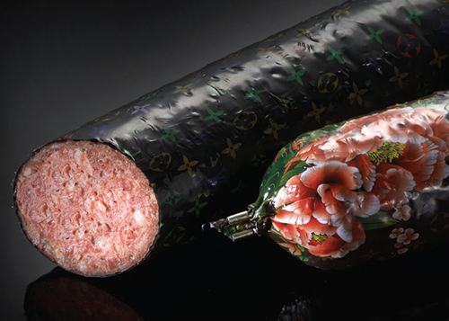
A packaging must always come to terms with the product it contains, especially in the field of cosmetics. But what is hidden behind a simple “blink of an eye”? Answers from Renato Ancorotti, president of Ancorotti Group, an R&D leader that creates makeup and skincare products for the most important international brands. Sonia Pedrazzini

What successes have you had in the world of cosmetics?
I began in makeup production in 1984 when I founded Gamma Croma.
In the beginning things were adventurous and intense, the experiences of a tiny business of three people.
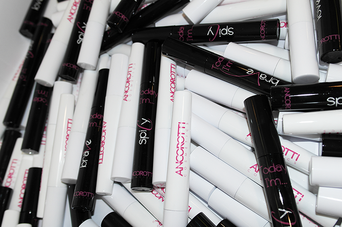
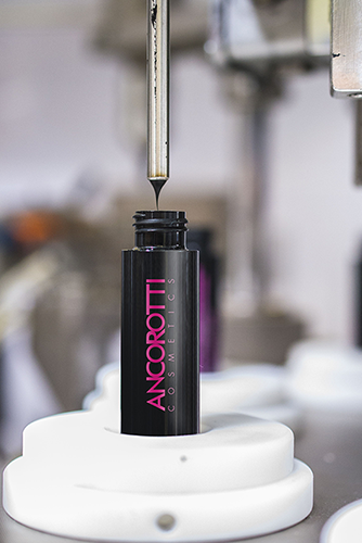
In 2008, when I sold off my shares, we were 350, and the company had become the world’s number two player. A year later I came back to the sector, founding Ancorotti Cosmetics with my daughter Enrica. Unlike Gamma Croma, which produced a little of everything in the way of makeup products, we decided to specialize in mascara, which is absolutely the most difficult makeup product because it combines a brush, packaging and formula that must be perfectly balanced. The formula, in particular, is extremely delicate in this case, and without optimal conditions it can easily lose its necessary properties.

Ancorotti_mascara_WEB

Few people imagine how much work and professionalism is required behind the scenes to produce a mascara. How does Ancorotti Cosmetics operate, and who are its main customers?

Without naming names, we can affirm that we produce the most widely sold mascara in Europe, as well as the most sold in Russia; we have also overtaken part of the notoriously difficult French market. We pursue all market ranges and sell in Italy as well as abroad. Wherever customs fees are high, we send only the formula which is then packaged on-site. In other cases, the customer supplies the pack and we fill it with our product and put it on the market.
The trend will in any case always be that of offering a full service, even going so far as to ask the customer who wants to buy only in bulk to supply a few packaging samples, so that we can test it with the formula. This is in order to be sure that the product we are supplying will be adequately preserved.
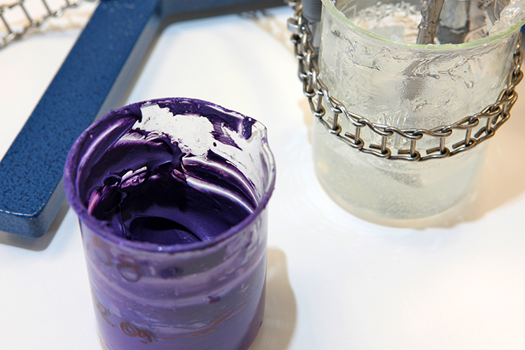
It’s not a given, in fact, that the best formula and the best packaging, when put together, will result in the best mascara. For every type of formula there will thus be a specific brush – whose fibers will be determined by the viscosity and density of the mascara –, a particular reducer to establish the quantity released, and even the material of the packaging will have to be carefully adjusted and tested for compatibility with the formula in its stable form.

Ancorotti_fill_service_WEB_okIn cosmetics, what most fascinates you in a packaging solution?
Today what I find most striking is quality; but also the ability of those who, in a sector such as ours, manage to create new objects without by this innovation altering the ritual, the act of putting on makeup. With Mascara, for example, you open it and you use it in a certain way, it’s always been the same way; changing these gestures seems to me impossible. Thinking about packaging, I would like it to be heavy and important, made of modern and sensuous materials capable of conveying refinement, value, emotion. Applying mascara has become for many women a daily ritual, just as they use body care products like soap, toothpaste, creams… In sum, cosmetics play a “social” role in our lives and behind it all lies technical complexity, research and the prevailing atmosphere of the concern involved: these factors are less visible, but for me they are the more intriguing.

What suggestions would you make for a packaging designer or concern producing cosmetics packaging?
Designers need first of all to have a profound knowledge of the sector for which they design; they need to have technical knowledge, know the materials and processes, but also the humility necessary to sit down with a concern and its technicians in order to develop the product within the correct limitations imposed by feasibility.
The concern, for its part, needs first of all to ensure that its product respects all parameters of quality, as well as to demonstrate more attention to the world of design, which is often seen as vacuous: I’m sure that if a designer of great substance worked with the cosmetics sector we would have some pleasant surprises.

There is plenty of talk about “Made in Italy”. How are we perceived abroad as far as concerns cosmetics?
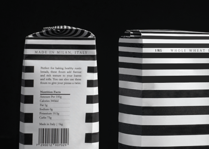
In recent years, the value of our image has been considerably enhanced. Italian style is well received, not only in food, fashion and design, but also in cosmetics. Perhaps not everyone is aware that 70% of the world’s outsourced makeup production occurs in Italy, and that our skill is prized, especially in this area of Lombardy.
Production in Italy is certainly the necessary condition for considering a product “Made in Italy”, but that alone does not suffice: it’s necessary that the product be made with certain characteristics. The foreign customer expects from us high quality, in the vein of Ferrari or Brunello Cucinelli, but for the Made in Italy moniker something else is needed, a sort of certification guaranteeing the level of quality of Italian production.

And which, in your opinion, are the talents in the cosmetic sector that should be better known to us Italians as well?
Dario Ferrari, president and founder of Intercos, is definitely the point of reference of this excellence. His concern is number one worldwide, a veritable beacon of product research and development that has managed to offer customers innovative and high quality marketing and product solutions.
In Italy, outsource contracting is no longer mere grunt work, a matter of supply, but entails research on the cutting edge. It’s a comfort to know that a great many of the most exclusive products currently on the market, with very prestigious brands, are conceived and created in Italy.

With the foundation of Ancorotti Cosmetics India, you have made a decisive leap in scale. What is this division in charge of? Compared to western markets, what are the major challenges?
We created this division in order to satisfy the needs of the emerging markets of India and Asia and to produce cosmetics on-site formulated according to specific requirements. We are partnered 50% with Indian concerns, so that we always have our finger on the pulse of the situation and know, for example, which products sell best in that part of the world, which at the moment are products for lips. Mascara is, in fact, still little used by Indian women, who are only discovering it now. It’s a complex market that is continuously evolving, not only from a strictly industrial standpoint, but also due to the public’s sensitivity with regard to cosmetics.
Certainly one of the major problems is dealing with Indian bureaucracy, which is much more complicated than ours, which says a lot, and which consumes a lot of time.

ancorotti_mood

Are the formulas produced directly in India?

At the moment, we prepare them in Italy and transfer them to India, but we are training technicians in order to make our partners autonomous and lead them to create a high quality product. Producing in India means, for us, leaving behind an important legacy in that land, which is to say our experience and knowhow, which will yield fruits from a local concern created for that market. But, to be clear, we will never offshore our Italian business.

Indeed, your desire to reinstate the value of the Italian territory and see its productive forces implemented is also clearly expressed in your promotion of the “Cosmetics Pole”. Could you explain what that is?
At the moment Italy is in the middle of a major crisis, and I see no signs of recovery. I also believe the situation is quite critical because our economy is largely built on small and medium enterprises that are often unprepared for dealing with a crisis such as this one. In this context, I believe organizing as a system is the only panacea: when small businessmen and women and artisans come together and constitute a supply chain, they can achieve a lot. But it’s not enough, for they also need to look abroad and gather the forces necessary to promote their products internationally, since it is impossible to avoid facing the fact that we operate in a globalized and interconnected system.
The “Cosmetics Pole” was formed in 2006 with the very idea of bringing together concerns of the area around the town of Crema engaged in makeup production and packaging. The organization has an ambitious double objective: combining forces in research and development and establishing an ethical code. Indeed, all members are required to grow, not only in terms of turnover, but also with certifications, quality, and especially training, in such a way guaranteeing a base of technicians and experts who speak a common language and have specific knowledge. In light of this, a “product and process industrialization technician” course, conceived by Sogecos and Ancorotti SpA, in collaboration with the Galilei Institute in Crema in order to train technicians for local concerns, is now offered in Crema as of January of this year.